The RadioButton is a subclass of the ToggleButton class and offers the same events, such as Checked, Unchecked, and Indeterminate, and properties, such as IsChecked.
A radio button is used to represent a set of related but mutually
exclusive choices. The user taps on the radio button description text
or glyph to select the control. Only one option from a particular group
may be selected at a time.
RadioButtons that reside in the same container control automatically share the same group. In addition, the RadioButton has a GroupName property, which allows you to override the default behavior and to enforce mutual exclusivity explicitly by restricting those RadioButtons that share the same GroupName to no more than one being checked at a time. This is useful when multiple RadioButtons are placed in different containers but reside in the same logical group, or when multiple RadioButtons reside in the same container but reside in different logical groups. The GroupName property allows you to control the associations between the controls. Consider the following example:
<StackPanel>
<RadioButton Content="RadioButton 1 (group 1)" GroupName="group1" />
<RadioButton Content="RadioButton 2 (group 1)" GroupName="group1" />
<RadioButton Content="RadioButton 3 (group 2)" GroupName="group2" />
<RadioButton Content="RadioButton 4 (group 2)" GroupName="group2" />
</StackPanel>
By specifying the GroupName, you can have the RadioButtons reside in the same ContentControl, yet still operate as two distinct groups.
Data Binding Radio Button Controls to a ViewModel Collection
This example looks at data binding a ListBox.ItemsSource property to a collection of objects in a viewmodel, and you see how to represent each item in the collection as a RadioButton in the view. You also see how to synchronize the IsChecked property of a RadioButton with the ListBoxItem.IsSelected property.
The sample is located in the ButtonExampleView page and the ButtonExampleViewModel in the downloadable sample code. The viewmodel contains an ObservableCollection of a custom DataItem class, as shown:
readonly ObservableCollection<DataItem> radioItems
= new ObservableCollection<DataItem>
{
new DataItem(0, "Item 1"),
new DataItem(1, "Item 2"),
new DataItem(2, "Item 3")
};
public IEnumerable<DataItem> RadioItems
{
get
{
return radioItems;
}
}
The DataItem class is simply a container to hold an object value and an associated piece of text (see Listing 1).
Each DataItem object is represented as a RadioButton in the view. The DataItem’s ToString
method override allows you to display the object easily in the view
without requiring an explicit data binding path expression to the DataItem.Text property.
LISTING 1. DataItem Class
public class DataItem : NotifyPropertyChangeBase
{
object itemValue;
public object Value
{
get
{
return itemValue;
}
set
{
Assign(ref itemValue, value);
}
}
object text;
public object Text
{
get
{
return text;
}
set
{
Assign(ref text, value);
}
}
public DataItem(object value, object text)
{
itemValue = ArgumentValidator.AssertNotNull(value, "value");
this.text = ArgumentValidator.AssertNotNull(text, "text");
}
public override string ToString()
{
return text != null ? text.ToString() : base.ToString();
}
}
The collection of DataItem objects is displayed in the ButtonExampleView using a ListBox. The ListBox.ItemsSource is bound to the collection, as shown in the following excerpt:
<ListBox ItemsSource="{Binding RadioItems}"
SelectedItem="{Binding SelectedRadioItem, Mode=TwoWay}"
ItemContainerStyle="{StaticResource RadioButtonListItemStyle}"/>
By binding to the SelectedRadioItem property, the viewmodel is able to monitor and even to set the IsChecked property of any or all of the RadioButton controls.
To display each item in the collection as a RadioButton, we use a custom ItemContainerStyle called RadioButtonListItemStyle,
which is located in the phone:PhoneApplicationPage.Resources element of
the ButtonExampleView.xaml page. This style defines the ControlTemplate for a ListBoxItem, as shown in the following excerpt:
<Style x:Key="RadioButtonListItemStyle" TargetType="ListBoxItem">
<Setter Property="VerticalContentAlignment" Value="Top" />
<Setter Property="Template">
<Setter.Value>
<ControlTemplate TargetType="ListBoxItem">
<Grid Background="{TemplateBinding Background}">
<RadioButton Content="{TemplateBinding Content}"
IsChecked="{Binding Path=IsSelected,
RelativeSource={RelativeSource TemplatedParent},
Mode=TwoWay}" />
</Grid>
</ControlTemplate>
</Setter.Value>
</Setter>
</Style>
The IsChecked property is assigned using a binding to the ListBoxItem.IsSelected property. In addition, BindingMode is set to TwoWay, so that when the item is checked it will be selected in the ListBox. Conversely, when unchecked by the user or from code in the viewmodel, the items will be unselected in the ListBox.
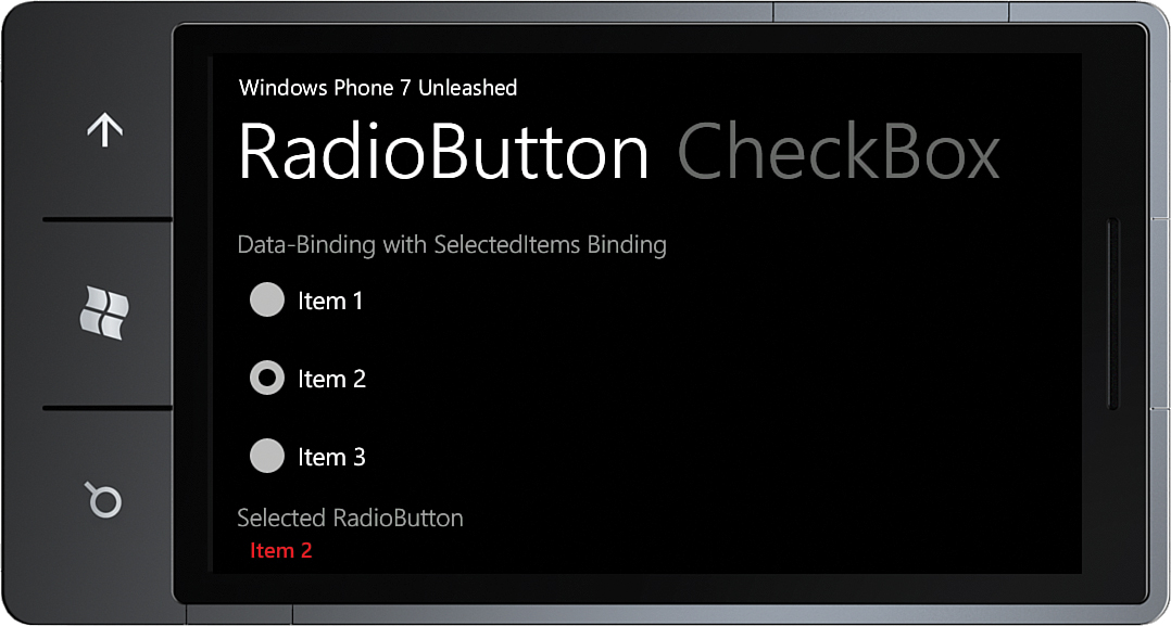
The Content property of the RadioButton is assigned using a TemplateBinding to the Content property of the ListBoxItem. This causes the DataItem in the collection to be assigned to the Content property of the RadioButton. Because the DataItem does not derive from UIElement, the RadioButton renders the DataItem using the ToString method override of the DataItem class (see Figure 1).

FIGURE 1 The DataItem collection is displayed using RadioButton controls.
When a RadioButton is selected, it is assigned to the SelectedRadioItem property in the viewmodel.
Finally, the selected item is displayed using a TextBlock, as shown:
<TextBlock Text="{Binding SelectedRadioItem}"
Style="{StaticResource ValueTextStyle}" />