Receiving Input with Buttons
In most Windows Phone XAML apps, buttons are
the most commonly used element for receiving user input. Ordinarily, a
button initiates an action when a user taps it. Unlike Silverlight for
the browser, the minimum size of the Button
has been increased, making it more amenable to touch. The shape is
usually rectangular, and the standard layout allows for either text or
an image to be displayed as content. Buttons
support three visibility states: rest (the default state), pressed, and
disabled. Unlike Silverlight for the browser, however, there is no
visible focus state.
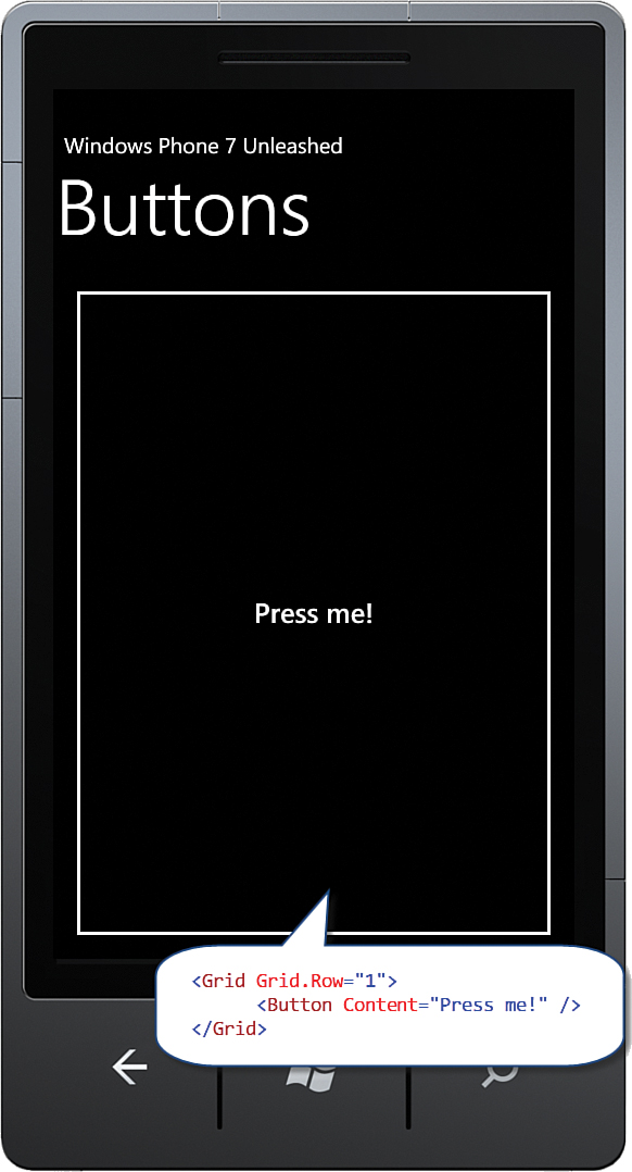
The inherited FrameworkElement.HorizonalAlignment and VerticalAlignment properties both default to Stretch. The Button’s Horizontal and Vertical size, therefore, depends on its parent’s size; the bigger the parent ContentControl the bigger the button. By placing a Button in a Grid, the Button is free to expand to inhabit the entirety of the space provided by the Grid (see Figure 1).

FIGURE 1 By default a Button will expand to inhabit its parent.
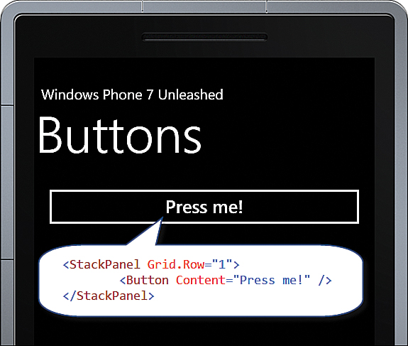
If the parent ContentControl happens to be a StackPanel, the button will not expand farther than the space allowed. By default, the StackPanel arranges its child controls vertically. The StackPanel inhabits the entire width of its parent control, but only uses as much vertical space as it needs (see Figure 2).

FIGURE 2 Button conforms to the vertical size constraints afforded by the StackPanel.
To constrain the button size to the size of its content, set its HorizontalAlignment and VerticalAlignment properties to something other than Stretch. An effective way to do this is by using a style, as shown in the following example:
<Style x:Key="ButtonStyle" TargetType="ButtonBase">
<Setter Property="HorizontalAlignment" Value="Left" />
<Setter Property="VerticalAlignment" Value="Top" />
</Style>
The style can then be applied like so:
<Button Content="Press me!" Style="{StaticResource ButtonStyle}" />