The TiltEffect control is demonstrated in the TiltEffectSample.xaml file. Activating the tilt effect on a page is as easy as adding a PhoneApplicationPage attribute. Every control that responds to a tapping gesture will automatically provide the tilt effect animation.
<phone:PhoneApplicationPage
    x:Class="PhoneToolkitSample.Samples.TiltEffectSample"
    xmlns="http://schemas.microsoft.com/winfx/2006/xaml/presentation"
    xmlns:x="http://schemas.microsoft.com/winfx/2006/xaml"
    xmlns:phone="clr-namespace:Microsoft.Phone.Controls;assembly=Microsoft.Phone"
    xmlns:shell="clr-namespace:Microsoft.Phone.Shell;assembly=Microsoft.Phone"
    xmlns:d="http://schemas.microsoft.com/expression/blend/2008"
    xmlns:mc="http://schemas.openxmlformats.org/markup-compatibility/2006"
    xmlns:toolkit="clr-
namespace:Microsoft.Phone.Controls;assembly=Microsoft.Phone.Controls.Toolkit"
    FontFamily="{StaticResource PhoneFontFamilyNormal}"
    FontSize="{StaticResource PhoneFontSizeNormal}"
    Foreground="{StaticResource PhoneForegroundBrush}"
    SupportedOrientations="PortraitOrLandscape"
    Orientation="Portrait"
    mc:Ignorable="d" d:DesignHeight="768" d:DesignWidth="480"
    shell:SystemTray.IsVisible="True"
    toolkit:TiltEffect.IsTiltEnabled="True">
. . .
The Transitions effects are shown in the TransitionsSample.xaml
file. The Silverlight for Windows Phone Toolkit library gives you two
possibilities: the transition between pages during the navigation and
the transition effect on the page itself. In the TransitionsSample.xaml file (and in all the pages seen until now as well), between the PhoneApplicationPage tags, are the NavigationInTransition and NavigationOutTransition tags, which define the transition effects when the page is loaded and before it is unloaded, respectively.
. . .
    <toolkit:TransitionService.NavigationInTransition>
        <toolkit:NavigationInTransition>
            <toolkit:NavigationInTransition.Backward>
                <toolkit:TurnstileTransition Mode="BackwardIn"/>
            </toolkit:NavigationInTransition.Backward>
            <toolkit:NavigationInTransition.Forward>
                <toolkit:TurnstileTransition Mode="ForwardIn"/>
            </toolkit:NavigationInTransition.Forward>
        </toolkit:NavigationInTransition>
    </toolkit:TransitionService.NavigationInTransition>
    <toolkit:TransitionService.NavigationOutTransition>
        <toolkit:NavigationOutTransition>
            <toolkit:NavigationOutTransition.Backward>
                <toolkit:TurnstileTransition Mode="BackwardOut"/>
            </toolkit:NavigationOutTransition.Backward>
            <toolkit:NavigationOutTransition.Forward>
                <toolkit:TurnstileTransition Mode="ForwardOut"/>
            </toolkit:NavigationOutTransition.Forward>
        </toolkit:NavigationOutTransition>
    </toolkit:TransitionService.NavigationOutTransition>
. . .
The TransitionsSample.xaml
file contains two buttons and two list picker controls. One button
starts the transition effect on the page itself, picking the transition
type from both the list pickers. The other button shows page navigation
transition effects in the same way as described earlier. So let's focus
on the first button and the code behind the Click event.
The See method is
called when the button is clicked so that the selected transition from
the family list picker is started. The code checks whether the selected
transition type (or family) is Roll, because that is the only transition type that doesn't have an associated transition mode. The Roll
effect simply rolls the page in a unique way; there is no way to choose
the way it rolls. On the other hand, the other transition families have
different modes. Those families are Rotate, Slide, Swivel, and Turnstile and support different modes. They are returned from the EnumConverter class that, depending on the transition family, returns a List collection filled with all the supported modes.
Depending on the
selected transition family, a new transition object is created and
associated to the page. The available classes are RollTransition, RotateTransition, SlideTransition, SwivelTransition, and TurnstileTransition. Each class—except the RollTransition class—accepts a transition mode as the class constructor's parameter. Finally, the reference to the PhoneApplicationPage is used to associate the new transition that is started by calling the Begin method. When the transition is completed, the Completed event is raised and the Stop method is called.
private void See(object sender, RoutedEventArgs e)
        {
            string family = (string)Family.SelectedItem;
            string mode = (string)Mode.SelectedItem;
            TransitionElement transitionElement = null;
            if (family.Equals("Roll"))
            {
                transitionElement = new RollTransition();
            }
            else
            {
                transitionElement = TransitionElement(family, mode);
            }
            PhoneApplicationPage phoneApplicationPage =
    (PhoneApplicationPage)(((PhoneApplicationFrame)Application.Current.RootVisual)).Content;
            ITransition transition = transitionElement.GetTransition(phoneApplicationPage);
            transition.Completed += delegate
            {
                transition.Stop();
            };
            transition.Begin();
        }

    public class EnumConverter : IValueConverter
    {
        public object Convert(object value, Type targetType, object parameter,
                              CultureInfo culture)
        {
            string s = value as string;
            if (s == null)
            {
                return null;
            }
            switch (s)
            {
case "Roll":
                   return new List<string>();
                case "Rotate":
                    return new List<string>
                    {
                        "In90Clockwise",
                        "In90Counterclockwise",
                        "In180Clockwise",
                        "In180Counterclockwise",
                        "Out90Clockwise",
                        "Out90Counterclockwise",
                        "Out180Clockwise",
                        "Out180Counterclockwise"
                    };
                case "Slide":
                    return new List<string>
                    {
                        "SlideUpFadeIn",
                        "SlideUpFadeOut",
                        "SlideDownFadeIn",
                        "SlideDownFadeOut",
                        "SlideLeftFadeIn",
                        "SlideLeftFadeOut",
                        "SlideRightFadeIn",
                        "SlideRightFadeOut"
                    };
                case "Swivel":
                    return new List<string>
                    {
                        "FullScreenIn",
                        "FullScreenOut",
                        "ForwardIn",
                        "ForwardOut",
                        "BackwardIn",
                        "BackwardOut"
                    };
                case "Turnstile":
                    return new List<string>
                    {
                        "ForwardIn",
                        "ForwardOut",
                        "BackwardIn",
                        "BackwardOut"
                    };
            }
            return null;
        }
    }
The WrapPanel is shown in the WrapPanelSample.xaml page. Depending on the Orientation
property value, the items are aligned from left to right (or from top
to bottom), breaking them in a new line when the container edge is
reached. Adding to your page is as easy as specifying the WrapPanel tag in the page.
<toolkit:WrapPanel x:Name="wrapPanel" Orientation="Vertical"/>
5. Usage
From Visual Studio 2010,
press Ctrl+F5 and then check that the target output is set to Windows
Phone 7 Emulator. The application deploys to the emulator and starts,
briefly showing the main page, as in Figure 1.
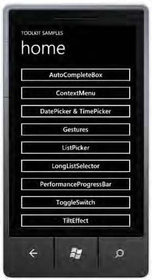
The application is composed of 11
buttons that you can see if you drag up and down the page. If you tap
one button, you will navigate to the related page containing that
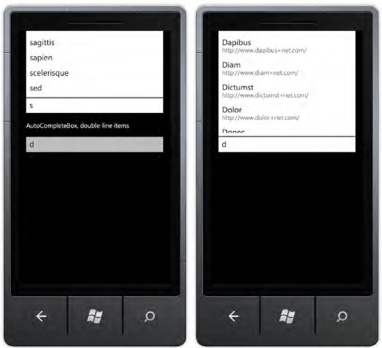
control. For example, to see the AutoCompleteBox in action, tap the AutoCompleteBox button and you will be redirected to the AutoCompleteBoxSample.xaml page (see Figure 2).
You can continue by trying every control and seeing it in action on the related page.