Layouts are Android’s solution to the variety of screens that come
on Android devices: they can have different pixel densities, different
dimensions, and different aspect ratios. Typical Android devices, such as
the HTC G1 mobile phone, even allow changing the screen orientation
(portrait or landscape) while applications are running, so the layout
infrastructure needs to be able to respond on the fly. Layouts are
intended to give developers a way to express the physical relationship of
Views as they are drawn on the screen. As Android inflates the Layout, it
uses the developer requests to come up with a screen layout that best
approximates what the developer has asked for.
Looking a little deeper, layouts in Android are in the form of a
tree, with a single root and a hierarchy of Views. Look back at any of the
XML Layout files in the previous section and you’ll see that the XML tags
create just such a hierarchy, with a screen Layout as the root of the
tree. Each View in the tree is termed the parent of the Views it contains
and the child of the View that contains it. Layout is a two-pass
process:
Measure pass
Traversing the tree from the root, each View in the layout
records its dimensional request—in other words, how much vertical
height and horizontal width it needs to display itself in the final
display.
Layout pass
Again traversing the tree from the root, each parent View
uses the available layout information to position its children as
requested. If the requests can’t be followed explicitly, Android
does its best to make everything fit on the screen. If there are no
requests given, it uses a default set of layout parameters. Each
parent can pass layout information on to its children, telling them
where they are positioned and what screen dimensions they have been
granted (they might get less than they requested).
A Layout is a View itself, so there’s nothing wrong with having
multiple Layouts in a single layout XML file—they just have to be arranged
in a hierarchy. So it’s perfectly valid to have a vertical LinearLayout
that includes a TableLayout as one of its rows.
1. Frame Layout
The Frame Layout is sort of a null layout specification. It
reserves space on the screen for a single View to be drawn, and the View
is always located at the upper left of the space. There is no way to
specify a different location for the View, and there can be only one
View in the Layout. If more than one View is defined in the layout file,
they are just drawn on top of each other, all pinned to the upper-left
corner.
2. LinearLayout
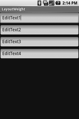
LinearLayouts are used extensively in Android applications, and we used
them in example code earlier. A LinearLayout asks that the contained
Views be layed out as either a series of rows (vertical LinearLayout) or
a series of columns (horizontal LinearLayout). In a vertical LinearLayout,
all the rows are the same width (the width of the widest child). In a
horizontal LinearLayout, there is one row of Views, all the same height
(the height of the tallest child).
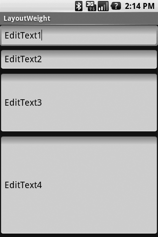
Figure 3
shows an example of a LinearLayout containing four EditTexts. The first
two have no weights assigned. EditText3 has a weight of 1 and EditText4
has a weight of 2. The effect is to make EditText4 twice as big as
EditText3, while EditText1 and EditText2 just split whatever space the
layout leaves over.
Example 1. Vertical LinearLayout resource file
<?xml version="1.0" encoding="utf-8"?>
<LinearLayout xmlns:android="http://schemas.android.com/apk/res/android"
    android:orientation="vertical"
    android:layout_width="fill_parent"
    android:layout_height="fill_parent"
    >
<EditText
    android:layout_width="fill_parent"
    android:layout_height="wrap_content"
    android:text="EditText1"
    />
<EditText
    android:layout_width="fill_parent"
    android:layout_height="wrap_content"
    android:text="EditText2"
    />
<EditText
    android:layout_width="fill_parent"
    android:layout_height="wrap_content"
    android:text="EditText3"
    />
<EditText
    android:layout_width="fill_parent"
    android:layout_height="wrap_content"
    android:text="EditText4"
    />
</LinearLayout>
|

Example 2. Horizontal LinearLayout resource file
<?xml version="1.0" encoding="utf-8"?>
<LinearLayout xmlns:android="http://schemas.android.com/apk/res/android"
    android:orientation="horizontal"
    android:layout_width="fill_parent"
    android:layout_height="fill_parent"
    >
<EditText
    android:layout_width="wrap_content"
    android:layout_height="fill_parent"
    android:text="E1"
    />
<EditText
    android:layout_width="wrap_content"
    android:layout_height="fill_parent"
    android:text="E2"
    />
<EditText
    android:layout_width="wrap_content"
    android:layout_height="fill_parent"
    android:text="E3"
    />
<EditText
    android:layout_width="wrap_content"
    android:layout_height="fill_parent"
    android:text="E4"
    />
</LinearLayout>
|

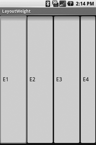
The horizontal layout might not look exactly as you would think:
how come E4 is narrower than the other three? The answer is that there
is a default minimum width for an EditText. If you build and run the
horizontal example and type something into EditText E1, you’ll see that
it expands in width as the line gets longer, which is just what we asked
for with android:layout_width="wrap_content".
In addition to the usual dimensional parameters for child Views
(width, height, padding), you can
include a weight for each child (attribute
android:layout_weight=;weight). The weight tells the
layout manager how you want to use unfilled space, and defaults to a
value of 0. If you specify children with weights greater than zero, the
layout manager will allocate unused space to each child in proportion to
its weight.
Figure 3
shows an example of a LinearLayout containing four EditTexts. The first
two have no weights assigned. EditText3 has a weight of 1 and EditText4
has a weight of 2. The effect is to make EditText4 twice as big as
EditText3, while EditText1 and EditText2 just split whatever space the
layout leaves over.
