As with most technical
products, almost any given characteristic of a product improves with
time or increasing price — or normally both. Many features unique to
luxury cars a decade ago are likely to be standard on average models
today.
With mobile devices, things are no different —
although the pace of change is almost certainly far more rapid than in
the automotive industry! Groundbreaking features in high-end phones (for
example, the accelerometer hardware in the original iPhone) are found
broadly across the mass-market a few years after their initial
development.
That high-end phone's capabilities become commonplace
a year or two later can be a useful rule-of-thumb. Although we should
be cautious about developing solely for glamorous handsets at the
top-end of the market at any given time, by studying those handsets we
get a good sense of what is coming for a larger population of users one
or two years later. And with the average user replacing her primary
mobile device every 18 months or so, the turnover to new devices is
high, and capabilities that were once seen as being niche rapidly become
commodities.
1. Physical Characteristics
Mobile devices long ago reached an overall size and
weight that was suitable to hold and use comfortably, and in this
regard, the physical dimensions of models now change little from year to
year. Despite these ergonomic constraints, product design is in
constant evolution. But as a developer, you are most concerned about
understanding those capabilities and limitations that affect your work.
We look at some of these now.
1.1. Screen Technology
One of the most significant changes that modern
mobile devices have compared to their recent predecessors is the way in
which the screen has changed. The dull and limited screen on a mobile
device even, say, 5 years ago, is a far cry from the glorious
high-resolution and high-color depth that mobile users are increasingly
familiar with today. In the U.S. market, a breakthrough device in this
regard was certainly the Apple iPhone in 2007. Covering nearly the
entire front face of the device, the screen offered what was, at the
time, a considerable resolution of 320 × 480 pixels, with a density of
over 160 pixels per inch. Little more than a year later, such screens
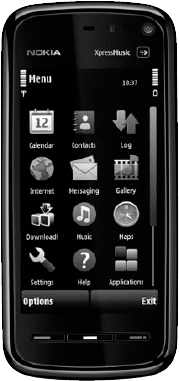
were common on a range of other handsets. Nokia's 5800 XPressMusic,
which was described by some as a mass-market alternative to the iPhone,
offered a 360 × 640 pixel display (230 pixels per inch), as shown in Figure 1.
Things are still moving quickly in screen technology.
The Google Nexus One, released in early 2010, features a large and
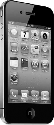
bright 480 × 800 pixel display. Apple's iPhone 4, shown in Figure 2,
was released in mid-2010 and upped the high-end of screen dimensions
even further, to 640 × 960 pixels, and with a dramatically increased
density of over 320 pixels per inch.


For a mobile web developer, this is very exciting.
High resolution means more real estate for graphical designs and
layouts, and higher pixel density means better text legibility and
smoother textures. However, it seems that the physical size of large
mobile device screens has settled at around 3 to 4 inches (on the
diagonal), and this is likely to remain a common characteristic, at
least until retractable or flexible screens emerge.
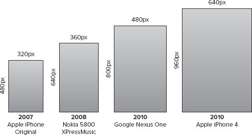
Figure 3
demonstrates just how fast mobile device screens have evolved. The
screens are shown to the scale of their pixels, and yet physically the
two iPhone devices are the same size: The iPhone 4 pixels are a mere
quarter of the size of those of the original.

For a developer, this raises several interesting
considerations. First is the matter of detecting what device your user
is visiting your site with and catering to the diversity of dimensions
accordingly. But pixels themselves are now dropping in size so
significantly that it may no longer make sense to think in terms of that
unit alone. An icon on a new iPhone screen could theoretically appear a
quarter of its size on the original model, making it less legible to
the user.
As this hardware trend continues, you should expect
devices to provide software-based scaling techniques to map CSS and HTML
pixels to suitable physical pixels (and indeed the iPhone 4 does this
in Mobile Safari). This means that developers and designers need to keep
their wits about them when using explicit sizes in their mobile layouts
— especially because it's likely that not all browser vendors will
implement such algorithms in a consistent way.
1.2. Input Mechanisms
Previously limited to simply providing small and
fiddly numeric keypads with one or two control keys, mobile devices have
changed radically with respect to input technologies over the last few
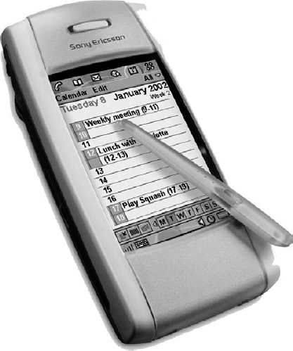
years. Although several manufacturers, notably Palm, HTC, and Sony
Ericsson (whose P800 model from 2002 is pictured in Figure 4),
pioneered models with touch-sensitive screens throughout the decade,
these were generally best used with a stylus or in conjunction with
additional physical keyboards. Devices with dedicated QWERTY keyboards
that either folded or slid out from devices had, for the most part,
niche appeal.

Yet again, the release of Apple's iPhone in 2007
heralded a significant change in the way the industry (and of course
users) thought about user interfaces. Its minimal design of placing a
single button on the fascia expected users to rely purely on using their
fingers on the capacitive screen to interact with the device. Text
entry (whether numeric or alphanumeric) was provided through on-screen
virtual keyboards that became visible when required, and multi-touch
capabilities allowed applications to support such gestures as pinching
and panning.
The success of the iPhone and the ease with which
users appeared to welcome this new input paradigm set a benchmark for
the rest of the mobile industry. Nearly all new high-range and many
mid-range handsets now provide touch-screen input interfaces similar to
the original iPhone's (although Apple's models remain unusual in having
only one main physical button).
This trend is set to continue, and as the cost of
manufacturing touch-screen technology falls, developers should expect
more devices — at all levels of the market — to provide touch screens.
This creates great opportunities to design website interfaces in ways
that capitalize on users' touch, pinch, and swipe gestures and that,
thanks to soft QWERTY keyboards — which are rapidly improving in quality
too — need not be so cautious about relying on textual input.
1.3. Other Hardware Components
Modern mobile devices are comprised of many
components, and technological developments affect them all. The
following are some important areas of rapid evolution for the mobile
device, both currently and likely in the near future:
Cameras —
Most mobile devices now sport digital cameras with anywhere between 3
and 8 megapixel resolution considered a norm. This is undoubtedly set to
rise, as it has done with dedicated camera hardware: At the time of
this writing, many Japanese mobile devices provide camera resolution of
12 megapixels or more. The size of the resulting images is of interest
to mobile web developers as devices start to provide JavaScript API
access to camera hardware.
Location and orientation —
A modern mobile device is increasingly likely to come furnished with a
GPS receiver (which geolocates it), accelerometers (which detect its
motion about an axis), and gyroscopes and a compass (which detect its
orientation and direction). The data produced by these instruments is
also starting to become available via browser APIs, allowing web
developers to use them in sites or location-based services.
Video and TV capabilities
— Although devices have long been capable of playing video clips and
simple streams, improved screens and download speeds make viewing
high-quality video increasingly feasible for many users. High-end
devices now come furnished with HDMI connectivity so that the screen can
be extended onto high-definition television sets. Improved cameras also
improve the quality of user-generated video, and the introduction of a
front-facing camera in Apple's iPhone 4 may re-energize popular interest
in video calling. And while not yet mainstream elsewhere, most handsets
in Japan contain built-in TV tuners for receiving digital terrestrial
broadcasts. Some handsets even come with stands so they can explicitly
be used as viewing consoles.
Near Field Communication —
Still in trials in most parts of the world, devices supporting NFC make
it possible to touch a device (or hold it near) to a fixed terminal to
perform a transaction of some sort. Potential applications obviously
include commerce, ticketing, and other types of presence-based
interactions. The use of NFC is already widespread in the Japanese
market and could provide dramatic business opportunities if it proves
successful elsewhere.
2. Network Technology
Mobile device manufacturers clearly have the Olympic
motto "Faster, Higher, Stronger" in mind when developing their products,
and network speed, throughput, and connection strength are indeed
continuous areas of improvement. Changes to network technology occur on a
slightly slower cycle than some of the other characteristics in a
mobile device (such as screen size, as you've seen). A couple of main
reasons account for this. First, the network usage of a mobile device
has one of the largest impacts on the device's battery life (which is
why the "talk-time" and "standby-time" metrics for a mobile device are
so different), so the support for new network standards is somewhat
constrained by developments in battery and power technology. Second,
support in a device for a new network technology is useless if there is
no network to connect to. And naturally it takes longer to upgrade
mobile carrier infrastructure to a next-generation technology than it
does to upgrade the device alone.
Nevertheless, the advances in latency and throughput
do tend to be significant with subsequent generations of mobile
technology: Long Term Evolution (LTE) networks of the future may be
hundreds of times faster than the 3G and 3.5G networks of today. Most
new mid- and high-end devices now support at least one variant of WiFi,
which also far exceed those speeds. New handsets supporting WiMAX are
also emerging.
Clearly, this has a huge and generally positive
impact on mobile web development. If you can be sure of your users
having low-latency connectors and fast download speeds, your sites and
designs can be richer and larger and yet remain responsive.
NOTE
But as ever, there is a major challenge: You
can't be sure! While it's possible to detect the device being used and
ascertain a maximum theoretical speed — and perhaps even deduce whether
the connection is cellular or WiFi-based, using IP address tables — you
still can't be sure what strength or reliability of connection the user
has. Is she stationary in a coffee shop in a quiet part of town, or
walking briskly through a congested urban cell? The environment can
radically affect the network characteristics.
3. Operating Systems
One final aspect of device evolution that should be
addressed is the mobile device operating system. This comprises the
layer of software that controls the device hardware and provides APIs
for applications to run on that device. However, you may also think of
the whole operating system as including its common user interface
components and default applications that ship with the device, such as
mail clients, web browsers, telephony tools, and so on.
Traditionally, mobile devices have provided fairly
simple embedded operating systems, suited to users performing a small
number of tasks — such as telephony — very efficiently within the
hardware's memory and processing constraints. These operating systems,
such as Nokia's Series 30 and 40 platforms, rarely allow native
third-party applications to be installed (other than via sandboxed
environments such as Java's J2ME) and are generally not promoted to
users as being a particular feature of a given device.
More recently, however, there has been a marked shift
toward more powerful operating systems on mobile devices, again
starting with smart phones at the high end of the market. Most
significantly, these operating systems allow third-party developers to
write and deploy applications (with varying degrees of freedom) to the
devices. These are some of the major modern mobile operating systems:
Symbian —
This operating system, which evolved from being used on PDA devices in
the early 2000s, was one of the first of such platforms. Adopted by
Nokia for its smart phone devices under the moniker "Series 60" and used
by manufacturers such as Sony Ericsson, Motorola, and Sharp, Symbian is
currently the most popular mobile operating system, as measured by
smart phone shipments worldwide and, importantly, is currently going
through the process of becoming open source. Nevertheless, it is
considered to have a steep learning curve for developers who want to
write native apps for it, and it has suffered in popularity in this
respect in comparison to Apple or Android development. Nokia's stated
ambition is to replace Symbian with a new operating system, MeeGo, in
its high-end device portfolio.
RIM's BlackBerry OS and Apple's iOS
— These operating systems are designed for the two companies'
respective devices and are both proprietary. Nevertheless, the ease with
which developers can write native software for these platforms — as
well as the increasing popularity of those devices — has driven a huge
growth in application development for them.
Microsoft Windows Phone
— A family of operating systems (previously also known by the Windows
CE and Windows Mobile brands), Microsoft's operating systems have
generally targeted enterprise-market devices in the United States. It is
currently too early to say how successful its latest incarnation,
Windows Phone 7, will be.
Google Android —
An open-source operating system based on Linux, Android is one of the
most recent mobile operating systems to be launched. Considered by some
to be a significant threat to Apple's iOS platform — partly due to
similarities in the user interface, but also because of the ease with
which developers can write and deploy powerful client apps for it —
Android is already enjoying fast-growing popularity, particularly in
high-end devices sold in the United States.
The relevance of these platforms for a web
developer is just as significant as it is for those writing native
client apps (although naturally, developing services that work across
multiple platforms is much easier with web technologies). Many of these
operating systems, particularly iOS, Android, and Palm's Web OS, were
designed and created in an age when powerful processing, fast networks,
high-quality screens, and touch capabilities were assumed of the
device's hardware — and when the importance of the Web to the mobile
user was already well understood. (And those platforms with an older
heritage, such as Symbian and Windows Phone, are being developed or
superseded quickly to try and catch up in all these respects.)
So it's no surprise that one of the common
characteristics that accompanies all these contemporary operating
systems is the quality of their default mobile browsers. Users of smart
phone devices now expect to be able to read, scroll, zoom, and flick
their way through web pages displayed on bright, clear screens. The huge
strides that have been made in mobile browsing technology have been
driven in large part by the competition between these platforms.
But, for web developers, huge improvements have also come about through cooperation
that has taken place between platforms: it's notable that nearly all
the browsers shipped on these operating systems share a common heritage.
With the exception of Windows Phone (which ships with a mobile version
of Microsoft's desktop Internet Explorer browser), they are all derived
from the open source WebKit project.
So how will the operating system environment evolve
in coming years? Certainly, Apple has a strong grasp of the discerning
mobile market with its iPhone models, and by sharing the operating
system with its iPad tablet device, the company has made a strong bet on
the strategic future of iOS. BlackBerry continues to hold strong sway
in the enterprise sector, but has also made strides in the youth and
text-centric market. With its decision to also use a WebKit-based
browser from v6.0 of the operating system onward, it also continues to
be a more-than-capable web platform.
Surely, Google's Android operating system is a
platform in the ascendency. With the company's strong technical and
financial backing, and in conjunction with a number of popular handset
manufacturers such as HTC, Samsung, LG, and Motorola, the number of
Android-enabled handsets is rising dramatically. The operating system
appears to have an aggressive and exciting technical roadmap and is
expected to become more widespread in years to come.
Microsoft's mobile operating systems have suffered in
recent years through competition with iPhone, Android, and Symbian
handsets. The newest version of the family, Windows Phone 7, has an
entirely new user interface and is intended to recapture some of the
consumer attention lost to rival platforms. Its launch in late 2010 was
heralded positively by critics and developers alike, although it is
still too early to tell how popular the platform will prove with
consumers.
Symbian has also suffered
from unfavorable comparison with the newer operating systems, and in the
United States. at least, its popularity has been affected by Nokia's
fortunes in a competitive market. Felt by some to now be showing its
age, Nokia has announced that its new high-end handsets will, in the
future, be shipped with Microsoft's Windows Phone 7 platform, and
possibly its own experimental offering, MeeGo. Of course, it also
remains to be seen how successful this new strategy becomes, and Symbian
will continue to be present on existing mid- and upper-mid-range
handsets in the Nokia portfolio for several years.