Neither the RepeatButton nor the ToggleButton
controls are abstract. Yet both reside in the
System.Windows.Controls.Primitives namespace, not in the
System.Windows.Controls namespace, indicating that these two controls
are not intended to be used in day-to-day page code.
Repeat Button
The RepeatButton behaves the same as the Button control; however, the RepeatButton’s Tap event is raised repeatedly while it is being pressed, whereas the Button control raises its Tap event once for each user press.
The RepeatButton is used as part of the ScrollBar control, which itself is part of the ScrollViewer control. Unlike Silverlight for the browser, however, which uses the RepeatButton to incrementally scroll content when pressed, the RepeatButton in the ScrollBar serves little purpose on the phone because the ScrollBar is for display purposes only.
The RepeatButton has two main properties:
- Interval—The duration between events, measured in milliseconds. The default value is 250 ms.
- Delay—The duration before the event is raised, measured in milliseconds. The default value is 250 ms.
The RepeatButton can be placed in XAML like so:
<RepeatButton Content="Press me!" Interval="200" Delay="500"
Tap="RepeatButton_Tap" />
Sample Overview
An example for the RepeatButton control can be found in the ButtonExampleView page and the ButtonExampleViewModel in the downloadable sample code. The ButtonExampleView has a RepeatButton that is used to execute the RepeatCommand in the viewmodel, as shown:
<RepeatButton Content="{Binding RepeatCount}" Interval="200" Delay="500"
Command="{Binding RepeatCommand}" />
The Content property of the RepeatButton is populated using a data binding to the RepeatCount property in the viewmodel:
int repeatCount;
public int RepeatCount
{
get
{
return repeatCount;
}
private set
{
Assign(ref repeatCount, value);
}
}
Tapping the RepeatButton causes the RepeatCommand to execute. The RepeatCommand is a public property of the viewmodel, defined as shown:
readonly DelegateCommand repeatCommand;
public ICommand RepeatCommand
{
get
{
return repeatCommand;
}
}
The repeatCommand is instantiated in the viewmodel constructor. When executed, the command increments the RepeatCount property, which updates the RepeatButton’s Content property:
public ButtonExampleViewModel() : base("Buttons")
{
repeatCommand = new DelegateCommand(obj => RepeatCount++);
}
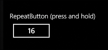
When the button is pressed and held, it causes the RepeatCount to increment periodically, which updates the content of the button (see Figure 1).

FIGURE 1 Pressing and holding the RepeatButton causes a counter to increment.
Toggle Button
The ToggleButton can visually represent two states: pressed or not pressed. When the user taps a ToggleButton, it switches state and stays in that state until tapped again. The ToggleButton is the base class for the CheckBox and RadioButton controls and, as such, is able to represent three states, which includes a third, indeterminate, state.
Note
The terms pressed and not pressed are more readily understandable when talking about the ToggleButton. The ToggleButton, however, contains an IsChecked
property that is used to identify the state of the button. So checked
and unchecked, pressed and not pressed are used interchangeably
throughout this section.
Although the ToggleButton inherits the Tap event from the UIElement class, it has other events that are raised when the state of the button is changed.
The following shows how to create a ToggleButton in XAML:
<ToggleButton Content="ToggleButton"
Checked="ToggleButton_Checked"
Unchecked="ToggleButton_Unchecked" />
Depending on the state of the ToggleButton, one of two events: Checked or Unchecked, is raised when the user presses the ToggleButton.
Setting the ToggleButton.IsThreeState property to true allows the user to set the indeterminate state by tapping the button. If set to false, the only way to return to the indeterminate state is via code.
Note
The name of the ToggleButton.IsThreeState property can be confusing. Even though IsThreeState may be set to false, you can still set the indeterminate state in code. A better name might have been something like UserCanSetIndeterminateState.
The following is an example of a three-state ToggleButton:
<ToggleButton Content="ToggleButton" IsThreeState="True"
Checked="ToggleButton_Checked"
Unchecked="ToggleButton_Unchecked"
Indeterminate="ToggleButton_Indeterminate" />
The ToggleButton.IsChecked property is a nullable Boolean, with true representing checked, false representing unchecked, and null representing its indeterminate state.
While the ToggleButton
can be used to allow the user to cycle through three states, it makes
little sense unless you are providing a custom template to visually
represent the third indeterminate state.
Note
The ToggleButton indeterminate state can be specified in XAML by setting the IsChecked property like so:
<ToggleButton Content="ToggleButton" IsChecked="{x:Null}" />
The Checked, Unchecked, and Indeterminate events detect when the button is tapped and has transitioned to a new state.
Tip
Rather than using the Checked, Unchecked, and Indeterminate events, use the Tap
event to consolidate the logic for all three state changes. It is
usually easier to handle all three state changes in the same place.
The state of the ToggleButton can be determined in a Tap event handler using the ToggleButton.IsChecked property, as shown in the following excerpt:
void ToggleButton_Tap(object sender, GestureEventArgs e)
{
ToggleButton button = (ToggleButton)sender;
Debug.WriteLine("IsChecked:"
+ (button.IsChecked.HasValue
? button.IsChecked.ToString() : "indeterminate"));
}