The CheckBox
control is used to define a binary state and can be used in groups to
display multiple choices from which the user can select one or more
choices. A user can either tap a check box or the associated label text
to select an option.
The CheckBox uses an alternative visual representation than its base class ToggleButton control, though it contains no new members.
CheckBox
supports three visible states: rest, press, and disabled for both
checked and unchecked settings. There is, however, no visible focus
state. In addition to visible states, the CheckBox
control is capable of representing three settings: checked, unchecked,
or indeterminate, along with a disabled visual state for each (see Figure 1). The state of the CheckBox can be retrieved using its nullable Boolean IsChecked property.
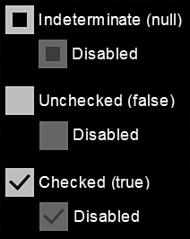
FIGURE 1 The CheckBox control checked states.
The indeterminate state of the CheckBox is commonly used to show that the user has not set the state of the control, or that some data anomaly has been detected.
Sample Overview
An example for the CheckBox control can be found in the ButtonExampleView page and the ButtonExampleViewModel, in the downloadable sample code. The ButtonExampleView has a CheckBox that has a two-way data binding to the Checked property of the viewmodel, as shown:
<CheckBox Content="{Binding Checked}" IsChecked="{Binding Checked, Mode=TwoWay}"
IsThreeState="True" />
The viewmodel’s Checked property is a nullable Boolean:
bool? isChecked;
public bool? Checked
{
get
{
return isChecked;
}
set
{
Assign(ref isChecked, value);
}
}
When the user taps the CheckBox, it transitions to the next state and updates the viewmodel’s Checked property (see Figure 2).

FIGURE 2 A CheckBox control, with its IsChecked property set to true.
Data Binding Check Boxes to a ViewModel Collection
This example looks at data binding a ListBox.ItemsSource property to a collection of objects in a viewmodel, and you see how to represent each item in the collection as a CheckBox in the view. You also see how to synchronize the IsChecked property of a CheckBox with the ListBoxItem.IsSelected property. Finally, you investigate how to bind to the ListBox.SelectedItems property, which is not readily achievable with the Windows Phone SDK out-of-the-box!
The sample for this section is located in the ButtonExampleView page and the ButtonExampleViewModel, in the downloadable sample code. Again, the viewmodel contains an ObservableCollection of a custom DataItem class:
readonly ObservableCollection<DataItem> checkBoxItems
= new ObservableCollection<DataItem>
{
new DataItem(0, "Item 1"),
new DataItem(1, "Item 2"),
new DataItem(2, "Item 3")
};
public IEnumerable<DataItem> CheckBoxItems
{
get
{
return checkBoxItems;
}
}
The collection of DataItems is displayed in the ButtonExampleView using a ListBox. Each DataItem is represented as a CheckBox. The ListBox.ItemsSource is data-bound to the collection, as shown in the following excerpt:
<ListBox ItemsSource="{Binding CheckBoxItems}"
SelectionMode="Multiple"
ItemContainerStyle="{StaticResource CheckBoxListItemStyle}"
unleashed:SelectedItems.Items="{Binding SelectedCheckBoxItems}" />
To allow multiple CheckBox controls to be checked simultaneously, the ListBox.SelectionMode property of the ListBox is set to Multiple.
We cannot bind to the ListBox.SelectedItems property because it is not a DependencyProperty. As a workaround, the attached property SelectedItems.Items is used to bind to the SelectedCheckBoxItems property of the viewmodel.
By binding to the SelectedCheckBoxItems property, you can monitor and set the IsChecked property of any or all of the CheckBox controls in the view.
To display each item in the collection as a CheckBox you use a custom ItemContainerStyle called CheckBoxListItemStyle,
which is located in the phone:PhoneApplicationPage.Resources element of
the ButtonExampleView.xaml page. This style defines the ControlTemplate for a ListBoxItem, as shown in the following excerpt:
<Style x:Key="CheckBoxListItemStyle" TargetType="ListBoxItem">
<Setter Property="VerticalContentAlignment" Value="Top" />
<Setter Property="Template">
<Setter.Value>
<ControlTemplate TargetType="ListBoxItem">
<Grid Background="{TemplateBinding Background}">
<CheckBox Content="{TemplateBinding Content}"
IsChecked="{Binding Path=IsSelected,
RelativeSource={RelativeSource TemplatedParent},
Mode=TwoWay}" />
</Grid>
</ControlTemplate>
</Setter.Value>
</Setter>
</Style>
The IsChecked property is assigned using a binding to the ListBoxItem.IsSelected property. In addition, the BindingMode is set to TwoWay, so that when the item is checked it is selected in the ListBox. Conversely, when unchecked by the user or from code in the viewmodel, the items will be unselected in the ListBox.
The Content property of the CheckBox is assigned using a TemplateBinding to the Content property of the ListBoxItem. This causes the DataItem in the collection to be assigned to the Content property of the CheckBox. Because the DataItem does not derive from UIElement, the CheckBox renders the DataItem using the ToString method override of the DataItem class (see Figure 3).
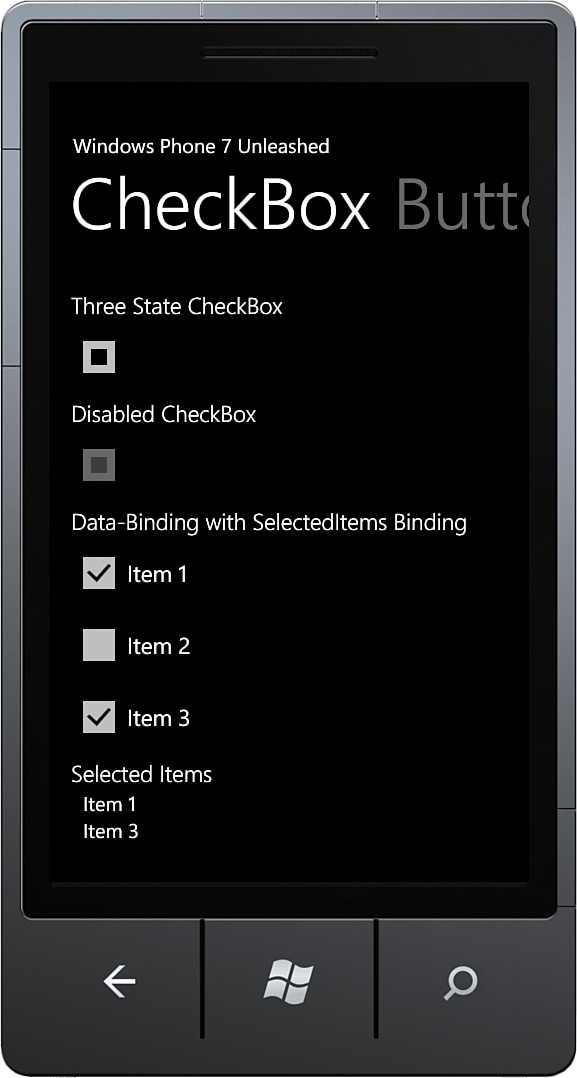
FIGURE 3 DataItem collection is displayed using CheckBox controls.
When a CheckBox is checked or unchecked, it is added to or removed from the list of SelectedCheckBoxItems property in the viewmodel:
readonly ObservableCollection<DataItem> selectedCheckBoxItems
= new ObservableCollection<DataItem>();
public ObservableCollection<DataItem> SelectedCheckBoxItems
{
get
{
return selectedCheckBoxItems;
}
}
Finally, the selected items are, again, displayed in a ListBox in the view. This time, however, they are displayed not with a CheckBox, but a TextBlock; as shown:
<ListBox ItemsSource="{Binding SelectedCheckBoxItems}">
<ListBox.ItemTemplate>
<DataTemplate>
<TextBlock Text="{Binding}"
Style="{StaticResource NormalTextStyle}" />
</DataTemplate>
</ListBox.ItemTemplate>
</ListBox>
Note
The TextBlock.Text data binding expression {Binding} indicates that value of the Text property is set to the result of calling the ToString method of the DataItem.
Data Binding to ListBox.SelectedItems
Recall that the previous example used the SelectedItems.Items attached property to enable data binding to the SelectedItems property of the ListBox control. We do this because the ListBox.SelectedItems property is not a DependencyProperty, which means it cannot be the target of a data binding.
The downloadable sample code contains a SelectedItems class, which enables data binding to the ListBox.SelectedItems property (see Listing 5.2).
The SelectedItems class contains two dependency properties: an ItemsProperty and a SelectedItemsBehaviorProperty. The ItemsProperty is used to specify the source property of the DataContext and is used to assign the selected items to the ListBox’s DataContext. When the SelectionChanged event of the ListBox is raised, the DataContext’s property is updated.
The SelectedItemsBehavior class contains the logic for updating the list of selected items, which also relies on the DataContextChangedListener class that raises an event when the DataContext of the ListBox changes.
An instance of the SelectedItemsBehavior is associated with the ListBox using the SelectedItemsBehaviorProperty.
LISTING 2. SelectedItems Class
public static class SelectedItems
{
public static readonly DependencyProperty ItemsProperty
= DependencyProperty.RegisterAttached(
"Items",
typeof(IList),
typeof(SelectedItems),
new PropertyMetadata(null, ItemsPropertyChanged));
public static void SetItems(ListBox listBox, IList list)
{
listBox.SetValue(ItemsProperty, list);
}
public static IList GetItems(ListBox listBox)
{
return (IList)listBox.GetValue(ItemsProperty);
}
static readonly DependencyProperty SelectedItemsBehaviorProperty
= DependencyProperty.RegisterAttached(
"SelectedItemsBehavior",
typeof(SelectedItemsBehavior),
typeof(ListBox), null);
static void ItemsPropertyChanged(
DependencyObject d, DependencyPropertyChangedEventArgs e)
{
var target = d as ListBox;
if (target != null)
{
GetOrCreateBehavior(target, (IList)e.NewValue);
}
}
static SelectedItemsBehavior GetOrCreateBehavior(
ListBox listBox, IList list)
{
var behavior = (SelectedItemsBehavior)listBox.GetValue(
SelectedItemsBehaviorProperty);
if (behavior == null)
{
behavior = new SelectedItemsBehavior(listBox, list);
listBox.SetValue(SelectedItemsBehaviorProperty, behavior);
}
return behavior;
}
class SelectedItemsBehavior
{
readonly ListBox listBox;
readonly IList sourceList;
public SelectedItemsBehavior(ListBox listBox, IList sourceList)
{
this.listBox = ArgumentValidator.AssertNotNull(listBox, "listBox");
this.sourceList = ArgumentValidator.AssertNotNull(
sourceList, "sourceList");
this.listBox.SelectionChanged += HandleSelectionChanged;
DataContextChangedListener.Subscribe(
listBox, HandleDataContextChanged);
}
void HandleDataContextChanged(
DependencyObject d, DependencyPropertyChangedEventArgs e)
{
UpdateList();
}
void HandleSelectionChanged(object sender, SelectionChangedEventArgs e)
{
UpdateList();
}
void UpdateList()
{
sourceList.Clear();
foreach (object item in listBox.SelectedItems)
{
sourceList.Add(item);
}
}
}
}