Many of the standard user interface components have default view states. Buttons, for example, have the following states:
Radio buttons have these states:
Up
Over
Down
Disabled
Selected Up
Selected Over
Selected Down
Selected Disabled.
These states define the appearance of the component
during various expected user interactions. View state changes within
these components are automatic; you need not specifically add the
ability for a button to change from the Up to the Over state when the
user interacts with it.
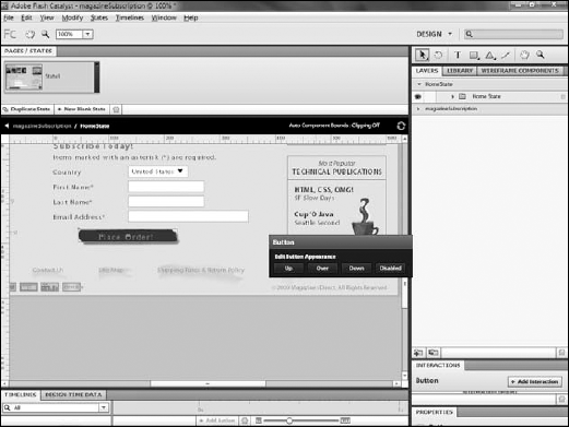
Click a button component.
From the HUD, click either Up, Over, Down, or Disabled.
Regardless of which button you click, you will switch to editing mode
for the component. The state that is initially selected depends on which
button in the HUD you click, but you can always simply select a
different state in the Pages/States panel (see Figure 1).
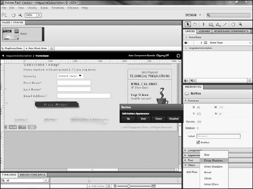
Edit the appearance of the button as desired. In this example, a drop shadow is being added to the button in the Over state (see Figure 2).


Click the name of the application in the navigation bar to exit editing mode on the button.
You now have a button component that
provides visual clues to the user during interaction, an important
aspect of usability. If you wish, you can test the project at this point
by pressing Ctrl-Enter on your keyboard. While the button will not
actually do anything, you will be able to see that its appearance
changes when you mouse over it.