1. Just Add Watercolor
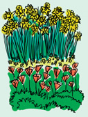
When you finish the line drawing, you can
eliminate the preliminary layers. A quick way is to hide the visibility
of unwanted layers and use the Drop All command in the Layer menu. Now
add a new layer for fresh color. Remember to choose Gel or Multiply for
the composite method. The Digital Watercolor variant provided in the
custom palette for this project is Pointed Simple Water. It is an ideal
choice for applying blobs or streaks of color in as casual and imperfect
a style as your line work. See Figure 1
for my effort. I added a second color layer so I could build up some
tonality here and there. It turns out that the trick of making the
Scratchboard Tool into an eraser works for this Watercolor variant as
well. So, I was able to wipe out areas of color where they weren’t
needed.
Variations
You’ll
need to drop the layers into the canvas to save your finished work in
JPEG, TIFF, or other file formats. But keep the layered version in RIFF
so you can explore some options, now or later. For example, try turning
the opacity of the line layer way down for a more delicate effect. Or
hide the line work altogether for a soft, nearly abstract color study.
Consider creating a completely new line drawing using the color layer as
inspiration. Figure 2 shows my color work with the line layer at 20% and hidden completely.
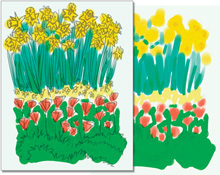
The image with only
color showing makes paper texture obvious. I happened to have the custom
paper I made for an earlier project as the current texture. I didn’t
notice it as I was working, and it’s too late to change now, unless I
want to completely repaint the color layer. It looks okay, but if I had
been paying attention, I would have chosen a more pleasing paper, such
as French Watercolor. Many variants reveal paper texture even if they
don’t have “grainy” in their name.
2. Bayside Scene
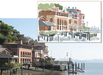
Figure 3
shows a pastel drawing with some ink line accents that I created last
year in Painter IX. The photo source, called Tiburon_Pier.jpg, was taken
in an upscale little town north of San Francisco and shows the city
skyline in the distance. You’ll find it in the Places folder on the CD.
Let’s recreate the drawing together. I expect this variation to be a bit
different because I’m using a newer version of the software, and
because I’m older and wiser. Also, according to some even older and
wiser philosopher, “You can’t step into the same river twice.” I’m sure
that applies to San Francisco Bay.
Prepare!
There
are several things we ought to do before we start to render this scene.
That wide expanse of sky is not very interesting, so let’s minimize it.
Use the Crop tool and your judgment about how much of the image should
be eliminated. I decided to include a bit more of the water and pier
structure on the right side this time.
I also want to work with more exciting colors
for my new variation. You can enrich the muted tones of the photo by
simply increasing saturation. In Painter X, use the Photo Enhance
section of the Underpainting Palette and choose Intense Color. Notice
that the Saturation slider has moved completely to the right for maximum
effect. Users of earlier versions of Painter can accomplish exactly the
same thing with Effects > Tonal Control > Adjust Colors. Drag the
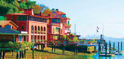
Saturation slider all the way to the right. Figure 4 shows the colorful result, as well as my suggestion for cropping.
Make
a Quick Clone of the prepared photo. Unlike with last year’s version, I
will be using Clone Color, taking color and value information from the
source image, so we won’t need a color set. There is a custom palette
for this project in the Palettes and Libs (libraries) folder on the CD,
called Pastels and Chalk. (Import it with the Custom Palette Organizer.)
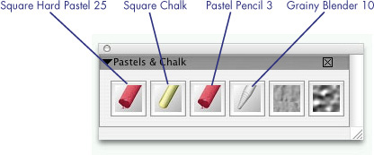
It includes three sizes of drawing tools, a grainy blender, and two
paper textures (Rough Charcoal Paper and Pebble Board). Figure 5
shows this custom palette. The drawing tools are arranged from left to
right in decreasing size. The Square Chalk variant is about 14 pixels.
|
The brush icon in a
custom palette is the icon for the category. I chose a Chalk variant
rather than another Pastel for the middle size, partly to avoid having
three identical icons in a row. I’m pretty sure you can create new icons
to avoid this kind of situation, but I didn’t want to bother.
|
Simplify!
Although we’ll be using dry media and achieve a
very different look, the basic approach used in the trees painting at
the beginning of this lesson still applies. That is, you’ll begin by
reducing the image to simple shapes and add some detail at the end.
The larger the brush (or stick), the less detail
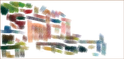
that is possible. Choose Square Hard Pastel 25 and Rough Charcoal Paper
from the custom palette, or just find them on your own. Turn tracing
paper opacity to about 70% so you can see your work more easily. With
Clone Color enabled in the Colors Palette, make some of the (mostly)
horizontal and vertical shapes in the image. Leave plenty of white
space, remembering that less is more, as in Figure 6.
Clarify!
At
this stage, it’s pretty hard to tell what the subject of this drawing
is, but a few more strokes will make things clearer. Continue adding
(mostly) horizontal and vertical dabs, but use a smaller size this time.
The Square Chalk, at about 14 pixels, is ideal for the next level of
development. But wait just a moment. Suppose you add your medium detail
on a new layer. Even better, how about having the first stage of the
drawing on its own layer so it can be reduced in opacity while you work
(letting you see the source photo more easily)?
Turning the canvas image into a layer is not a
problem. Choose Select > All (Cmd/Ctrl+A), Edit > Cut
(Cmd/Ctrl+X), followed by Edit > Paste in Place. This will make the
canvas blank and create a new layer with the canvas contents in the
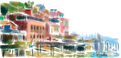
correct position. Now make a new layer for the next stage. Reduce
opacity of the “original” layer to about 50% and stroke in some windows,
pier pilings, and other elements of similar size with the medium-sized
chalk. Don’t forget to enable Clone Color.
Toggle tracing paper often so you can see your
work. You might need to decrease opacity of the tracing paper for faint
items like the pale blue city skyline. Ignore thin lines and tiny
details—you’ve probably guessed we’ll put those on a separate layer.
Switch to the Pebble Board paper when you add strokes for the water. Figure 7 shows the medium details added.
It’s
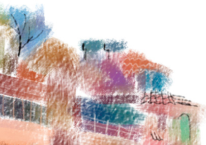
time to add another layer for fine detail. Use the Pastel Pencil 3 to
pick out a few thin lines here and there, such as flag poles and
railings. Don’t use Clone Color for this layer, but do switch between
black and white. Some details require removal of color. Actually, you’re
not erasing, but painting opaque white over existing color or over
other layers. Figure 8 has a close-up of a section with some fine detail added. I really like the patterns made by roof tiles.
I included a Blender variant in the Pastels and
Chalk custom palette in anticipation of a need to soften some of the
edges in the original layer. You’ve been saving each stage of the
project (haven’t you?), so you have nothing to lose by experimenting
with a bit of blending.
Grainy Blender 10 is a good choice for this kind
of softening. You can get some very subtle effects, even when pressing
fairly hard. The rough texture is an important feature of this piece,
and too much smoothing could spoil the effect.
Decisions, Decisions!
Now comes the really
hard part—deciding when you’re done! Add a little sky with your large
Pastel variant, using a couple of shades of blue sampled from the
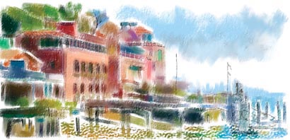
artwork. Soften up some of those edges, too. Figure 9 has my finished artwork. But is it really finished?
Keep your layered
versions for a while at least, making it easy to change things. Changes
include more than adding or taking away painted strokes. For example,
try switching the composite method of the medium detail layer to Gel or
Multiply. All the marks made on that layer will appear darker because
they are combined with the colors on the layer below. Did you reduce
opacity of the first layer when you created the medium details? You
might want to adjust that opacity for the final version, also, to
lighten up the entire image.