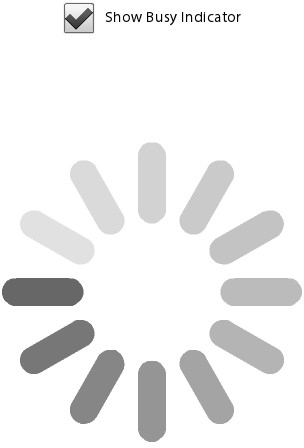
A new component has been added to provide feedback to users within
your mobile application. There is no cursor to show busy status like in
desktop development, so the BusyIndicator component was
added specifically for this reason. Using this component is simple.
Let’s review the code that follows. There is a
CheckBox with the label “Show Busy Indicator” that,
when checked, calls the checkbox1_clickHandler method.
There is a BusyIndicator component with an ID of
indicator and the visible property set to false. Within the
checkbox1_clickHandler method, the indicator’s visible
property is set to the value of the CheckBox. This
simply shows or hides the BusyIndicator. Within the
BusyIndicator, you can set the
height, width, and
symbolColor to suit the needs and style of your
application. The results are shown in Figure 1.
<?xml version="1.0" encoding="utf-8"?>
<s:Application xmlns:fx="http://ns.adobe.com/mxml/2009"
               xmlns:s="library://ns.adobe.com/flex/spark">

    <fx:Script>
        <![CDATA[
            protected function checkbox1_clickHandler(event:MouseEvent):void
            {
                indicator.visible = event.target.selected;
            }
        ]]>
    </fx:Script>

    <fx:Declarations>
        <!-- Place non-visual elements (e.g., services, value objects) here -->
    </fx:Declarations>

    <s:CheckBox label="Show Busy Indicator"
                horizontalCenter="0"
                click="checkbox1_clickHandler(event)" top="10"/>
    <s:BusyIndicator id="indicator" height="300" width="300"
                     verticalCenter="0"
                     horizontalCenter="0"
                     visible="false"
                     symbolColor="black"/>

</s:Application>
