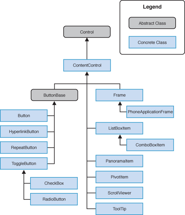
Controls that are derived from ContentControl are able to host a single object. ContentControls include Buttons, ListBoxItems, and containers such as the PhoneApplicationFrame and the ScrollViewer control (see Figure 1).

FIGURE 5.3 Content controls (excludes some mapping related types).
ContentControl has a Content property, whose value can be of any type. The way content is presented in the UI, however, depends on its type and whether a DataTemplate is associated with the ContentControl. The following lists the three ways in which content is presented:
- UIElements—If the object derives from UIElement, the object will be rendered.
- Non-UIElements—If the object does not derive from UIElement, its ToString method is used to retrieve a textual representation of the object. If the ToString method has not been overridden, the result is the fully qualified class name of the object.
- Non-UIElements with an associated DataTemplate—The ContentControl.ContentTemplate allows you to specify a DataTemplate, either as a StaticResource or inline, which is used to display an object. Data binding expressions within the DataTemplate are used to extract the object’s property values and to render them.
To better understand the Content property, let’s look at a commonly used ContentControl: the Button control. With a Button, you can set its Content property to a string, as shown:
<Button Content="Tap me!" />
Unlike the TextBlock control, for example, the Button control does not have a Text property, yet by setting the Content property to a string, the Button displays the string.
Defining the Default Content Property
The Content property is the default property of the ContentControl. The ContentPropertyAttribute
specifies which property of a class can be interpreted as the main
content property when the class is parsed by a XAML processor. This
means that when, for example, a TextBlock is placed as a nested element of a Button, the TextBlock is rendered within the button itself:
<Button>
<TextBlock Text="Press me!" Foreground="Orange" />
</Button>
To further illustrate, the built-in control template for the Button control includes a Border that contains a TemplateBinding to the Content property of the Button, as shown in the following excerpt:
<Border>
<ContentControl x:Name="ContentContainer"
ContentTemplate="{TemplateBinding ContentTemplate}"
Content="{TemplateBinding Content}" />
</Border>
When the Button is rendered using its built-in style, the Content value, whatever it may be, is placed within a Border.
If you examine the source code for the ContentControl using Reflector, you see that a ContentPropertyAttribute is used to indicate to the runtime that the Content property is the default property:
[ContentProperty("Content", true)]
public class ContentControl : Control
{ ... }
When creating your own custom controls, you can decorate a class with a ContentPropertyAttribute to specify a different default property.