There’s a difference in how weight and sex are measured and reported in Figure 2
that is fundamental to all statistical analysis—and to how you bring
Excel’s tools to bear on the numbers. The difference concerns scales of
measurement.
Category Scales
In Figures 2 and 3, the variable Sex is measured using a category scale, sometimes called a nominal
scale. Different values in a category variable merely represent
different groups, and there’s nothing intrinsic to the categories that
does anything but identify them. If you throw out the psychological and
cultural connotations that we pile onto labels, there’s nothing about
Male and Female that would lead you to put one on the left and the other
on the right in Figure 3’s pivot chart, the way you’d put June to the left of July.
Another example: Suppose that you wanted to chart the
annual sales of Ford, General Motors, and Toyota cars. There is no
order that’s necessarily implied by the names themselves: They’re just
categories. This is reflected in the way that Excel might chart that
data (see Figure 4).
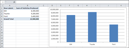
Notice these two aspects of the car manufacturer categories in Figure 4:
Adjacent categories are equidistant from one
another. No additional information is supplied by the distance of GM
from Toyota, or Toyota from Ford.
The
chart conveys no information through the order in which the
manufacturers appear on the horizontal axis. There’s no implication that
GM has less “car-ness” than Toyota, or Toyota less than Ford. You could
arrange them in alphabetical order if you wanted, or in order of number
of vehicles produced, but there’s nothing intrinsic to the scale of
manufacturers’ names that suggests any rank order.
Note
This is one of many quirks of terminology in Excel.
The name “Ford” is of course a value, but Excel prefers to call it a
category and to reserve the term value for numeric values only.
In contrast, the vertical axis in the chart shown in Figure 4 is what Excel terms a value axis. It represents numeric values.
Notice in Figure 4
that a position on the vertical, value axis conveys real quantitative
information: the more vehicles produced, the taller the column. In
general, Excel charts put the names of groups, categories, products, or
any other designation, on a category axis and the numeric value of each
category on the value axis. But the category axis isn’t always the
horizontal axis (see Figure 5).
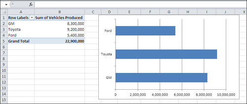
The
Bar chart provides precisely the same information as does the Column
chart. It just rotates this information by 90 degrees, putting the
categories on the vertical axis and the numeric values on the horizontal
axis.
I’m not belaboring the issue of measurement scales
just to make a point about Excel charts. When you do statistical
analysis, you choose a technique based in large part on the sort of
question you’re asking. In turn, the way you ask your question depends
in part on the scale of measurement you use for the variable you’re
interested in.
For example, if you’re trying to investigate life
expectancy in men and women, it’s pretty basic to ask questions such as,
“What is the average life span of males? of females?” You’re examining
two variables: sex and age. One of them is a category variable and the
other is a numeric variable.
In Figures 3 through 5,
you see that numeric summaries—average and sum—are compared across
different groups. That sort of comparison forms one of the major types
of statistical analysis. If you design your samples properly, you can
then ask and answer questions such as these:
Are men and women paid differently for comparable work? Compare the average salaries of men and women who hold similar jobs.
Is
a new medication more effective than a placebo at treating a particular
disease? Compare, say, average blood pressure for those taking an alpha
blocker with that of those taking a sugar pill.
Do
Republicans and Democrats have different attitudes toward a given
political issue? Ask a random sample of people their party affiliation,
and then ask them to rate a given issue or candidate on a numeric scale.
Notice that each of these questions can be answered by comparing a numeric variable across different categories of interest.
Numeric Scales
Although there is only one type of category scale,
there are three types of numeric scales: ordinal, interval, and ratio.
You can use the value axis of any Excel chart to represent any type of
numeric scale, and you often find yourself analyzing one numeric
variable, regardless of type, in terms of another variable. Briefly, the
numeric scale types are as follows:
Ordinal scales are often rankings. They tell
you who finished first, second, third, and so on. These rankings tell
you who came out ahead, but not how far ahead, and often you don’t care
about that. Suppose that in a qualifying race Jane ran 100 meters in
10.54 seconds, Mary in 10.83 seconds and Ellen in 10.84 seconds. Because
it’s a preliminary heat, you might care only about their order of
finish, but not about how fast each woman ran. Therefore, you might well
convert the time measurements to order of finish (1, 2 and 3), and then
discard the timings themselves.
Interval
scales indicate differences in measures such as temperature and elapsed
time. If the high temperature Fahrenheit on July 1 is 100 degrees, 101
degrees on July 2, and 102 degrees on July 3, you know that each day is
one degree hotter than the previous day. So an interval scale conveys
more information than an ordinal scale. You know, from the order of
finish on an ordinal scale, that in the qualifying race Jane ran faster
than Mary and Mary ran faster than Ellen, but the rankings by themselves
don’t tell you how much faster. It takes elapsed time, an interval
scale, to tell you that.
Ratio scales are
similar to interval scales, but they have a true zero point, one at
which there is a complete absence of some quantity. The Celsius
temperature scale has a zero point, but it doesn’t indicate that there
is a complete absence of heat, just that water freezes there. Therefore,
10 degrees Celsius is not twice as warm as 5 degrees Celsius, so
Celsius is not a ratio scale. Degrees kelvin does have a true zero
point, one at which there is no molecular motion and therefore no heat.
Kelvin is a ratio scale, and 100 degrees kelvin would be twice as warm
as 50 degrees kelvin. Other familiar ratio scales are height and weight.
It’s worth noting that converting between interval
(or ratio) and ordinal measurement is a one-way process. If you know how
many seconds it takes three people to run 100 meters, you have measures
on a ratio scale that you can convert to an ordinal scale—gold, silver
and bronze medals. You can’t go the other way, though: If you know who
won each medal, you’re still in the dark as to whether the bronze medal
was won with a time of 10 seconds or 10 minutes.
Telling an Interval Value from a Text Value
Excel has an astonishingly broad scope, and not only
in statistical analysis. As much skill as has been built into it,
though, it can’t quite read your mind. It doesn’t know, for example,
whether the 1, 2, and 3 you just entered into a worksheet’s cells
represent the number of teaspoons of olive oil you use in three
different recipes or 1st, 2nd, and 3rd place in a political primary. In
the first case, you meant to indicate liquid measures on an interval
scale. In the second case, you meant to enter the first three places in
an ordinal scale. But they both look alike to Excel.
Note
This is a case in which you must rely on your own
knowledge of numeric scales because Excel can’t tell whether you intend a
number as a value on an ordinal or an interval scale. Ordinal and
interval scales have different characteristics—for one thing, ordinal
scales do not follow a normal distribution, a “bell curve.” Excel can’t
tell the difference, so you have to do so if you’re to avoid using a
statistical technique that’s wrong for a given scale of measurement.
Text is a different matter. You might use the letters
A, B, and C to name three different groups, and in that case you’re
using text values to represent a nominal, category scale. You can also
use numbers: 1, 2, and 3 to represent the same groups. But if you use a
number as a nominal value, it’s a good idea to store it in the worksheet
as a text value. For example, one way to store the number 2 as a text
value in a worksheet cell is to precede it with an apostrophe: ’2. You’ll see the apostrophe in the formula box but not in the cell.
On a chart, Excel has some complicated decision rules
that it uses to determine whether a number is only a number. Some of
those rules concern the type of chart you request. For example, if you
request a Line chart, Excel treats numbers on the horizontal axis as
though they were nominal, text values. But if instead you request an XY
chart using the same data, Excel treats the numbers on the horizontal
axis as values on an interval scale. You’ll see more about this in the
next section.
So, as disquieting as it may sound, a number in Excel
may be treated as a number in one context and not in another. Excel’s
rules are pretty reasonable, though, and if you give them a little
thought when you see their results, you’ll find that they make good
sense.
If Excel’s rules don’t do the job for you in a particular instance, you can provide an assist. Figure 6 shows an example.
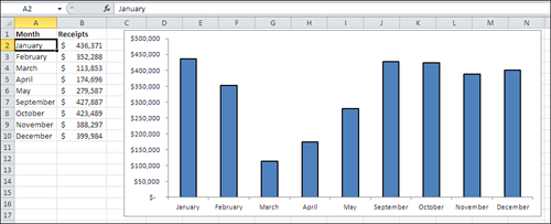
Suppose you run a business that operates only when
public schools are in session, and you collect revenues during all
months except June, July, and August. Figure 6
shows that Excel interprets dates as categories—but only if they are
entered as text, as they are in the figure. Notice these two aspects of
the chart in Figure 6:
The dates are entered in the worksheet cells
A2:A10 as text values. One way to tell is to look in the formula box,
just to the right of the fx symbol, where you see the text value “January”.
Because
they are text values, Excel has no way of knowing that you mean them to
represent dates, and so it treats them as simple categories—just like
it does for GM, Ford, and Toyota. Excel charts the dates accordingly,
with equal distances between them: May is as far from April as it is
from September.
Compare Figure 6 with Figure 7, where the dates are real numeric values, not simply text:
You can see in the formula box that it’s an
actual date, not just the name of a month, in cell A2, and the same is
true for the values in cells A3:A10.
The
Excel chart automatically responds to the type of values you have
supplied in the worksheet. The program recognizes that the numbers
entered represent monthly intervals and, although there is no data for
June through August, the chart leaves places for where the data would
appear if it were available. Because the horizontal axis now represents a
numeric scale, not simple categories, it faithfully reflects the fact
that in the calendar, May is four times as far from September as it is
from April.