It may not be a household name, but OneNote
has built up a hard-core following in the years since it was first introduced
to Office back in 2003. Its freeform note entry, automatic saving, and the
later introduction of linked notes and online collaboration in 2010, endeared
it to note-takers.
With online and app-based upstarts such as
Evernote increasingly encroaching on its patch, OneNote needs to stage a
fight-back. It starts as we’ve come to expect, with the new Metro-inspired UI
seeming to herald a dramatically different piece of software. The reality once
you’ve peered past the new interface, however, is that it’s business as usual
for OneNote.
Slim pickings
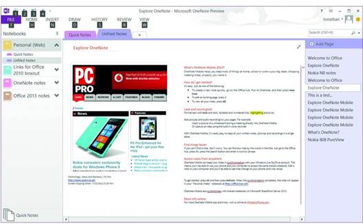
Look closely at the redesigned ribbon
toolbar and you'll find it plays host to the same tools as before, although
there has been a little reorganization. The Share menu, for example, has been
replaced with the History tab, and some tools moved onto the Home tab.

The user interface is organized in the
familiar way, too, with a handful of cosmetic alterations. Notes take up the
majority of the working screen area - the panel for navigating pages within
notebooks remains to the right - with a series of section tabs running along
the top and page navigation down the right.
The Notebooks navigation panel works a
little differently: it used to live in a collapsible panel to the left of the
screen, but has now been moved into a dropdown, launched from a small
downward-pointing arrow below the current notebook title.
Where there are new features, they're
minor. The ability to create Excel tables directly in OneNote is more useful
than the old flat table tool. Embedded spreadsheets and Visio diagrams can now
be edited, with changes reflected in the notebook automatically.
And there's extended support for touch. As
with the rest of the new Office apps, tapping a small button in the Quick
Access Toolbar lets you add the touch mode button, which enlarges some toolbar
elements and spaces out icons on the ribbon.
OneNote for Metro
The most significant development with
OneNote surrounds not new features, but a new addition to the OneNote family.
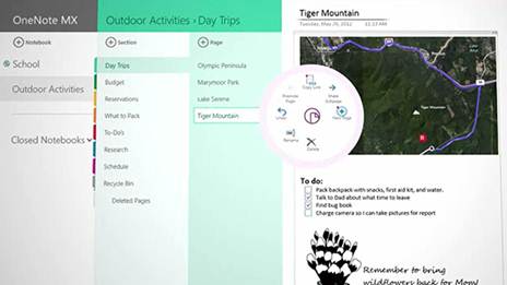
Alongside Office 2013 for desktop will debut a separate Metro app called
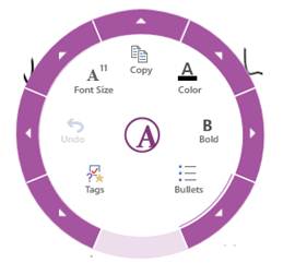
OneNote MX, and the most interesting aspect of this app is its radical menu
system. Dubbed the radial menu, this is a turbo-charged menu, with formatting
such as font type and size arranged in a circle, and accessed via a button that
pops up whenever you tap an item or highlight text.

OneNote
MX’s radial menu offers a radical take on traditional, flat menu systems.
It looks unusual, and gives access to a
huge range of controls in a very small space; it's no coincidence that this
circular menu fits within the narrower part of a Windows 8 Metro split screen.
But for a system aimed at operation by touch, some of the buttons are
surprisingly small and fiddly. We hope it's refined further by launch time.
Aside from the radial menu, OneNote MX
features very different navigation and search facilities. Making your way
around OneNote's overly-complicated organizational structure (notebooks,
sections and pages) is performed via a series of panels that can be pulled out
from the left-hand side of the screen. These can be hidden to the point where
only links to pages in the current notebook show when you're working, and they
disappear completely when the app is split- screened in Windows 8.
As with most Metro apps, searches are
performed using the Windows 8 Search Charm, accessed with a swipe of a finger
from the right or by shunting the mouse pointer into the top right- hand corner
of the screen.
Elsewhere, though, it's disappointing.
Functionally, OneNote MX echoes many of the desktop version's features: it
links to the cloud via SkyDrive or SharePoint, allowing synchronized access to
notes on whatever device you're using; it allows you to type, insert pictures,
and scrawl notes with a finger or stylus. But certain key features are missing.
It won't recognize and index text in photos when they're inserted, and you
can't record audio notes or make quick screen clippings.

It
looks different, but OneNote 2013 isn’t blessed with many standout new
features.
Verdict
We hope there's more to come from OneNote
MX when the final version ships because elsewhere it's pretty slim pickings.
And with the desktop version also gaining few significant features of note, it
looks like OneNote enthusiasts are going to be disappointed with what Office
2013 brings.