BoundField Controls
BoundField controls are used by data-bound controls (such as AxGridView, AxGroup, ASP.NET GridView, and DetailsView)
to display the value of a field through data binding. They are
displayed differently depending on the data-bound control in which they
are used. For example, the AxGridView control displays a BoundField object as a column, whereas the AxGroup control displays it as a row.
The Enterprise Portal framework provides a number of enhanced AxBoundField controls that are derived from ASP.NET-bound field controls but integrated with the Dynamics AX metadata.
Table 1 describes the AxBoundField controls.
Table 1. AxBoundField Controls
| Type | Purpose |
|---|
| AxBoundField | You use AxBoundField to display text values. The DataSet, DataSetView, and DataField properties define the source of the data. |
| AxHyperLinkBoundField | You use AxHyperLinkBoundField to display hyperlinks. You use the MenuItem property to point to a Web menu item in the AOT for generating the URL and the DataSet, DataSetView, and DataField properties to define the source of the data. If the Web menu name is stored within the record, you use DataMenuItemField instead of MenuItem. |
| AxBoundFieldGroup | You use AxBoundFieldGroup to display FieldGroups defined in the AOT. The DataSet, DataSetView, and FieldGroup properties define the source of the data. |
| Other BoundFields | You use AxCheckBoxBoundField to display a boolean field in a check box, AxDropDownBoundField to display a list of values in a drop-down menu, and AxRadioButtonBoundField to display a list of values as radio buttons. For all these properties, you use DataSet, DataSetView, and DataField to define the source of the data. For a radio button, you use RepeatDirection to define whether the radio button should be rendered horizontally or vertically. |
Depending on the field type, BoundFieldDesigner automatically groups fields under the correct BoundField type. The BoundField type displays text that allows you to control the lookup behavior through the LookupButtonDisplaySettings property and the lookup event.
Web Parts
Web parts are pluggable and reusable Windows
SharePoint Services components that generate HTML and provide the
foundation for the modular presentation of data. Web parts are easily
integrated to assemble a Web page and support customization and
personalization. Enterprise
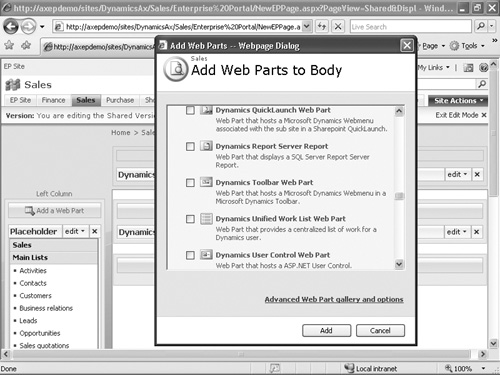
Portal comes with a standard set of Web parts, including the following,
that expose the business data from Dynamics AX:
Dynamics User Control
Used for hosting any ASP.NET control. The Dynamics User Control Web
part points to a Managed Web Content Item that secures the Web control.
The Dynamics User Control Web part can serve as a provider, a consumer,
or both when connected with other Web parts. The Web part role property
defines the role and is used to pass or record context and refresh the
control using AJAX without the entire page being refreshed.
Dynamics Infolog Web Part
Used for displaying Dynamics AX Infolog messages on the Web page. When
you create a new Web part page, Enterprise Portal page templates
automatically add the Infolog Web Part to the new Web part’s header
zone. Any error, warning, or information message Dynamics AX generates
is automatically displayed by the Dynamics Infolog Web Part. If you need
to display some information from your Web User Control in the Dynamics
Infolog Web Part, you need to add the message to the C# proxy class for
the X++ Infolog object.
Dynamics Page Title
Used for displaying the page title and the browser title. When you
create a new Web part page, the Dynamics Page Title Web part is
automatically added to the title bar zone. By default, the Dynamics Page
Title Web part displays the title information specified in the PageTitle property of the Page Definition
node in the AOT. If no page definition exists, the page name is
displayed. You can override this default behavior and make this Web part
get the title from any other Web part in the Web page by using a Web
part connection. For example, if you’re developing a list page and you
want to display some record information, such as Customer Account and
Name as the page title, you can connect the Dynamics User Control Web
part that displays the grid to the Dynamics Page Title Web part. When
you select a different record in the customer list, the page title and
the browser title change to display the currently selected Customer
Account and Name.
Dynamics QuickLaunch
Used for displaying navigation links on the left side of pages in
Enterprise Portal. When you create a new Web part page, the Dynamics
QuickLaunch Web part is automatically added to the Left Column zone if
the template that you chose has this zone. The Dynamics QuickLaunch Web
part displays the Web menu set in the QuickLaunch
property of the Web module in the AOT for that page. All the pages in a
given Web module (subsite) display the same left navigation.
Dynamics Left Navigation
Used to display page-specific navigation instead of module-specific
navigation if necessary. You would then use the Dynamics Left Navigation
Web part instead of the Dynamics QuickLaunch Web part.
Dynamics Toolbar Used to display the toolbar at the page level. The Web menu property points to the WebMenu
node in the AOT. The toolbar is generally connected to the Dynamics
User Control Web part, which displays a grid or form for taking action. You
can write code in the Web User Control displayed by the Dynamics User
Control Web part to control the toolbar behavior rendered by the
Dynamics Toolbar Web part.
Dynamics unified Worklist Used to display workflow action, alert notification, and tasks, generally in the Role Center or on the Home page.
Dynamics Report Server Report Used to display SQL Server Reporting Services for Dynamics AX.
Cues Used to display information as a visual paper stack in Role Centers.
Quick Links Used to display shortcuts to frequently used menu items in Role Centers.
Business Overview Used to display KPIs and historical comparisons in Role Centers.
Figure 4 shows the Add Web Parts dialog box in Enterprise Portal.
