Enterprise Portal has a
built-in set of ASP.NET controls you can use to access, display, and
manipulate Dynamics AX data. It also includes APIs for programmatic
access to data and metadata, a C# proxy class framework to access
Dynamics AX business logic, and helper classes and a Visual Studio
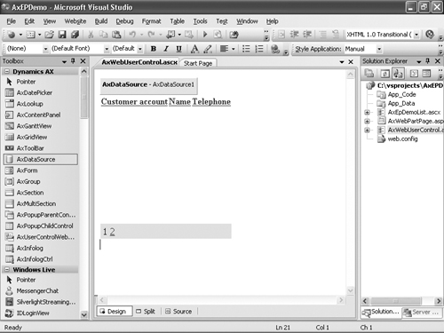
add-in for adding and importing files to and from the AOT. Figure 1 shows a sample Visual Studio project for Enterprise Portal development.

AxDataSource
Data sets you create in the AOT are exposed to ASP.NET through the AxDataSource control. AxDataSource
abstracts the data store and the operations that can be performed on
the data, from connecting to or reading/writing from the data store. You
can associate ASP.NET data-bound user interface controls with AxDataSource through the DataSourceID
property. Using this standard ASP.NET data binding, you can rapidly
develop user interface logic without needing specific domain knowledge
about how to connect to or access data from Dynamics AX. Because AxDataSource
takes care of the data access from Dynamics AX, developers don’t have
to worry about data access and can focus on the business aspect.
The data source control is simply a container for one or more uniquely named views (AxDataSourceView). All the logic is encapsulated in this DataSourceView-derived class. AxDataSourceView
implements all the functionality to read and write data. The data-bound
control can identify the set of enabled capabilities and display the
right set of user interface controls and enable or disable them. You use
the DataMember property of a data-bound control to select a particular view. AxDataSourceView
maps to the data set view. So for each dynamic data set view based on
the number of data sources and the type of join, you get an equivalent
number of AxDataSourceView in the AxDataSource control to which any data-bound control can bind.
The data source control also supports filtering
records within and across other data source controls and data source
views. When you set the active record on the data source view within a
data source control, all the child data source views are also filtered
based on the active record. You can filter across data source controls
through Record Context. In Record Context, one data source control acts
as the provider of the context, and zero or more data source controls
act as consumers. One data source can act as both provider and consumer.
When the active record changes on the provider data source control, the
record context is passed to other consuming data source controls, and
they apply that filter as well. You use the Role and ProviderView properties of AxDataSource for this purpose. One Web User Control can contain any number of AxDataSource controls. Only one of them can have the property Role set to Provider. Any number of them can be set to Consumer.
You can use the DataSetViewRow object to access the rows in a DataSetView. The GetCurrent method returns the current row.
DataSetViewRow row = this.AxDataSource1.GetDataSourceView("View1").DataSetView.
GetCurrent();
|
The GetDataSet method on AxDataSourceControl specifies the data set to bind. The DataSetRun property provides the run-time instance of the data set, and you can use AxaptaObjectAdapter to call the methods. So to invoke methods defined in data sets from a Web User Control, you would use the following code.
this.AxDataSource1.GetDataSet().DataSetRun.AxaptaObjectAdapter.Call("method1");
|
AxGridView
The AxGridView
control displays the values of a data source in a table format in which
each column represents a field and each row represents a record. With AxGridView, you can select, sort, group, expand, filter, edit, and delete items. AxGridView extends the ASP.NET GridView
control and lets you provide selection, grouping, expansion rows,
filtering, context menus, and other enhanced capabilities within the
Dynamics AX Enterprise Portal user interface.
AxGridView also includes built-in data modification capabilities. Using AxGridView with the declarative AxDataSource, you can easily configure and modify data without writing a single line of code. AxGridView also has many properties, methods, and events that you can easily customize with application-specific user interface logic.
You can find the full set of properties, methods, and events for GridView and AxGridView on MSDN. Listed here are some of the AxGridView properties you’ll likely use most often:
AllowDelete If enabled and if the user has delete permission on the selected record, AxGridView displays a Delete Selected Item button and allows the user to delete the row.
AllowEdit If enabled and if the user has update permission on the selected record, AxGridView
displays Save and Cancel buttons on the selected row and allows the
user to edit and save or cancel edits. When a row is selected, it
automatically goes into edit mode, and edit controls are displayed for
all columns for the selected record where the AllowEdit property for the column is set to true.
AllowGroupCollapse If grouping is enabled, this setting allows the user to collapse the grouping.
AllowGrouping
If set to true, and a group field is specified, the rows are displayed
in groups and sorted by group field. Page size is maintained, so one
group might span multiple pages.
AllowSelection If set to true, the user can select a row.
ContextMenuName If ShowContextMenu is enabled, ContextMenuName defines the name of the Web menu in the AOT to be used as a context menu when the user right-clicks the row.
DisplayGroupFieldName Gets or sets a value that indicates whether the GroupFieldName is displayed in the group header text of a group view of a GridView control. The default is true.
GroupField Data field that is used to group GridView. This property is used only when AllowGrouping is set to true.
GroupFieldDisplayName Display name for the group field used in the display <GroupFieldDisplayName> : <GroupFieldValue>. If a name isn’t specified, by default the label of the GroupField renders in group view. This property is used only when AllowGrouping is set to true.
ShowContextMenu If set to true, displays the Web menu defined in the ContextMenuName property as the context menu when the user right-clicks the row.
ShowFilter If set to true, displays the filter control in AxGridView.
ExpansionColumnIndexesHidden A comma-separated list of integers, starting with 1, that represents which columns to hide from the expansion row.
ExpansionTooltip The tooltip displayed on the expansion row link.
ShowExpansion
Specifies whether an expansion is available for each row in the grid.
When set to true, the expansion row link is displayed for each row in
the grid.
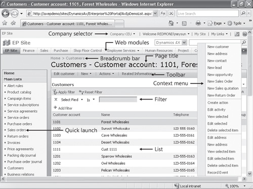
Figure 2 shows a sample list page with the filter control and context menu set.

ContextMenu
The ContextMenu
object also allows you to add menu items and separators at run time. It
provides methods to remove menu items and resolve client or Enterprise
Portal URLs. You can access the ContextMenu object from AxGridview.ContextMenu.
ActionMenuItemClicked, ActionMenuItemClicking, and SetMenuItemProperties are three ContextMenu events.
SelectedIndexChanged, DataBound, and Row* events are AxGridView
events for which you commonly write code to specify actions to take
when the selection is changed, to inspect and change styles when data is
rendered, and to react when rows are modified, respectively.