1. Navigational Lists
A desktop website
normally relies heavily on the spacious real estate of the browser
screen to provide navigational tools to traverse the site: a main menu
across the top of the page, with perhaps other levels of navigation
embedded in sidebars down the edge of the page. This is particularly
common for CMS-based sites, and WordPress, Drupal, and Joomla! feature
default templates with primary and secondary navigation options.
A mobile website — even one
targeting high-end browsers — has less chance to decorate the screen
with navigational elements. Even if the pixel resolution of a
large-screen device is high, the ratio of physical finger to clickable
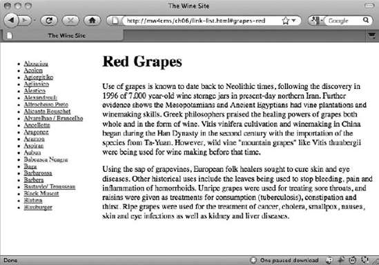
link size becomes an important constraint. A series of twenty 14px-high
links, say, in a sidebar menu on a desktop site (as shown in Figure 1)
is easily read and accurately clicked by a mouse-wielding user. But the
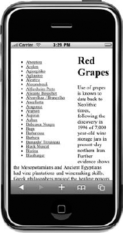
same list on a mobile screen would be painstaking: A touch-screen user
(as in Figure 2)
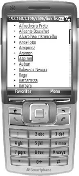
would find it hard to accurately select a link in the middle of the
list with her finger, and a user with a cursor-based device (as in Figure 3) would have to scroll down through the list link by link merely in order to highlight it.
Contrast this experience with a navigation list that has been styled specifically for a mobile device. Figure 4
shows the same list, but it is styled to resemble the native user
interface of the device. It's not necessarily recommended that you style
your website to mimic a particular brand of mobile operating system
(as, after all, it will look out of place on another handset), but the
design pattern will be familiar to the user, whatever his device.
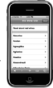
The most critical difference
here is the amount of space dedicated to each link. The items stretch
the width of the screen — so they can be clicked by the thumb of the
hand holding the device just as well as the index finger of the other —
and, at 45 pixels, they are significantly taller, both in terms pixels
and physically on the screen. (The pixels-per-inch ratios of common
smart phones are not significantly higher than laptop or desktop
screens.)
The impact of jumbo-sizing lists
of links like this (and borrowing principles from the device's operating
system user interface) significantly affects the way you lay out the
rest of the page and indeed the site itself. One consequence is that the
pages of dedicated mobile sites become a one-dimensional affair: With
the navigation taking up the full width of the screen, users expect to
not have to pan right to see further content. Indeed, a mobile page is
almost always a tall and skinny structure and almost never deliberately
exceeds the width of the device's screen.
The risk that this raises is
that if the menu is of any reasonable length, it is likely to push any
other material on the page down significantly. A menu of 20 links (at 45
pixels each!) exceeds the length of two full screens and is a decent
scroll's distance away from the top of the page.
On the desktop version of
the site, you can have a long menu and a fair portion of content on the
screen at the same time (as in the desktop version in Figure 3). The mobile designer's challenge, however, is to negotiate the way in which the user can view both the navigation and
the content of the site, while appreciating that the two elements are
probably not going to reside well on the same page. In the earlier
example, you can see an isolated link placed at the top that takes the
user to view the body text about red wines in general. It certainly
would not have been appropriate to place the large body of text after,
before, or to the right of the primary menu.
2. Decorating Menus
If you are going to use
full-width navigation elements, then there may be plenty of room to
decorate the links themselves. Unless the text of the link is very long
(in which case either the server or the style sheet should somehow
truncate it accordingly), there should be space both left and right of
the link to help the user understand the behavior or purpose of the
link.
One proven and popular pattern
is to place an icon of some sort to the left of the link, and, if the
device's style sheet support allows it, an arrow on the right that
indicates the nature of the link. The icons can be of reasonable size —
in the iPhone example earlier, there are more than 40 pixels to play
with: plenty of room for a 32px by 32px icon with some nice padding, for
example. The choice of icons for your site is entirely a matter of
taste, aesthetics, and sympathy for the overall look and feel of the
site. You may be tempted to mimic the look and feel of one particular
mobile operating system and replicate its iconography, but again this
runs the risk of looking unusual on a different platform. Using the
standard Apple "settings" icon for the preference page of your site will
look lovely on an iPhone screen, but unfamiliar on others. It's far
better to choose an agnostic and consistent icon family to use
throughout your site, either designed specifically for your site, or
stock sets, such as the mobile-specific Helveticons (http://helveticons.ch) or Glyphish (http://glyphish.com).
The right side of the
navigation element is a good place to indicate the sort of link. You may
want to distinguish among a link that brings up another nesting of the
menu hierarchy, a link that brings up a document on your site, and a
link that leaves your site altogether. The latter is quite an important
indication, because you have no control over the presentation — and in
particular the suitability for a mobile device — of third-party content.
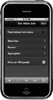
In Figure 5,
for example, a small chevron is used to indicate a nesting within the
site, a round chevron to indicate an external link, and a small eye icon
to show further detail about a particular item.
Please note that many
mobile browsers, particularly those with a WebKit heritage, also support
animations between pages. These include sliding transitions that can be
made to mimic the way that many mobile operating system and music
player menus behave. The use of a horizontal arrow or chevron emphasizes
that the page slides to reach the next level of the hierarchy. A common
behavior is for the link to be highlighted when clicked so the user has
some immediate feedback on the success of the action while the
transition takes place.