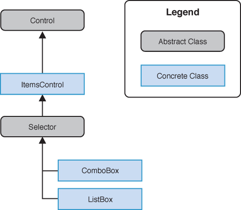
Just as the ContentControl plays host to a single child control, the ItemsControl can have many children. Controls that can contain more than one child usually derive from the ItemsControl class; these include the ComboBox control and, most notably, the ListBox control (see Figure 1).

FIGURE 1 ComboBox and ListBox are derived from ItemsControl.
An ItemsControl allows you to populate its children either directly in XAML or in code using the ItemsControl.Items property, or indirectly using a data binding and the ItemsControl.ItemsSource property.
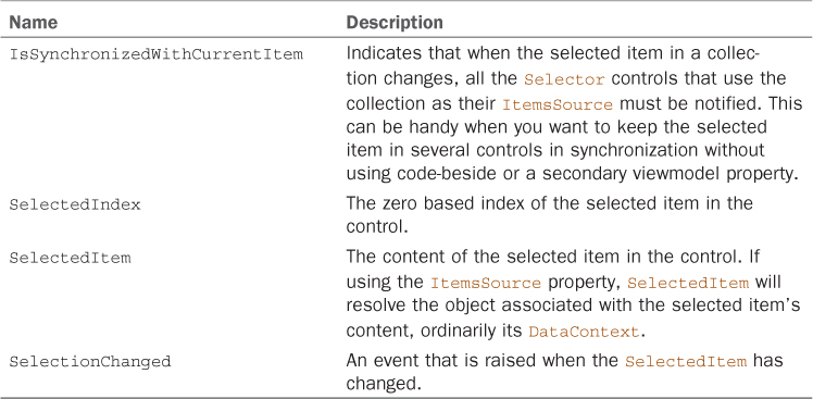
The Selector class extends the ItemsControl to provide the properties and events shown in Table 1.
TABLE 1. Selector Members

ListBox
The ListBox is an items control, which means that you can populate it with items that contain text or other controls.
By default, the ListBox control allows the user to select a single item in the list. Multiple items can be selected if the ListBox.SelectionMode property is set to Multiple (see the previous section on the CheckBox control, where a ListBox was used to display a data bound collection).
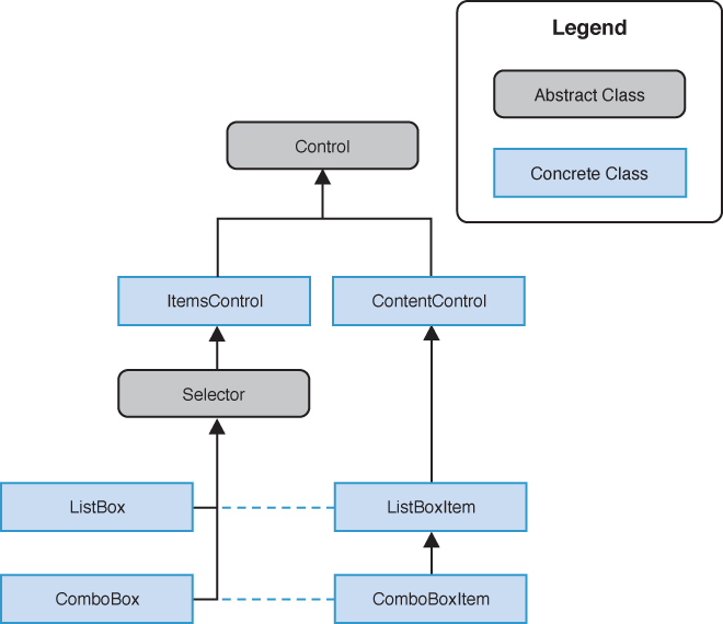
The ListBox control contains a list of ListBoxItem controls. The ListBox control is a remarkably flexible control because it allows you to not only display ListBoxItems, but because the ListBoxItem control is a ContentControl any kind of object can be placed in a ListBox (see Figure 2).

FIGURE 2 ListBoxItem and ComboBoxItem are derived from ContentControl.
In addition, it is unnecessary to wrap content in a ListBoxItem control, as shown in the following excerpt:
<ListBox>
<ListBoxItem>
<TextBlock Text="Item 1" Style="{StaticResource NormalTextStyle}" />
</ListBoxItem>
<ListBoxItem>
<TextBlock Text="Item 2" Style="{StaticResource NormalTextStyle}" />
</ListBoxItem>
</ListBox>
ListBoxItems are created implicitly for each element, making the previous excerpt equivalent to the following:
<ListBox>
<TextBlock Text="Item 1" Style="{StaticResource NormalTextStyle}" />
<TextBlock Text="Item 2" Style="{StaticResource NormalTextStyle}" />
</ListBox>
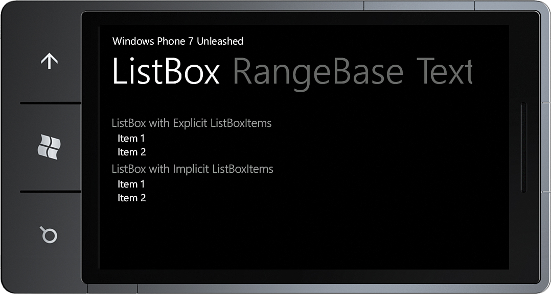
The example depicted in Figure 3 demonstrates that placing a TextBlock, implicitly or explicitly, in a ListBoxItem yields the same results.

FIGURE 3 ListBox with implicit and explicit ListBoxItems.
This works because the ListBoxItem ControlTemplate uses a TemplateBinding to the Content and ContentTemplate properties of the item control. When an item is being displayed, the ControlTemplate places it in a ContentControl, as this excerpt from the built-in ListBoxItem ControlTemplate shows:
<ControlTemplate TargetType="ListBoxItem">
<Border x:Name="LayoutRoot">
<ContentControl x:Name="ContentContainer"
ContentTemplate="{TemplateBinding ContentTemplate}"
Content="{TemplateBinding Content}" />
</Border>
</ControlTemplate>
The ListBox control inherits the Selector.SelectedItem and SelectedIndex properties together with a SelectionChanged event, which allow you to detect when the user selects or deselects an item.
Note
The SelectedItem property is the value of the content item and not the ListBoxItem itself. It is the Content property of the ListBoxItem that is used to resolve the value.
For an example of how to consume the ItemsSource property using a data binding, see the previous sections on the CheckBox and RadioButton controls.
In addition to the selection related properties provided by the Selector class, the ListBox also provides a SelectedItems property, which can be used when using the multiple SelectionMode. The SelectedItems property is, however, not a DependencyProperty, and this means that it is not available for data binding. See the previous section on the CheckBox control for a solution.
ComboBox
Although the ComboBox control exists in the FCL, it is not suitable for use in most cases. The ComboBox
has its origins in desktop UI and is more suited to a mouse-driven UI,
where the user can rely on a high level of precision manipulating the
control using a mouse.
For this reason, the ComboBox does not appear in the Visual Studio Toolbox, and the built-in styles for the ComboBox do not reflect the light and dark themes of the phone.