Formatting Charts
The Chart Tools—Format tab, as shown in Figure 4, enables you to apply formatting to specific chart areas, such as the axes, legend, gridlines, and series.

Formatting Chart Areas
To format specific chart areas, follow these steps:
1. | Select the area of the chart you want to format from the Chart Area drop-down list on the Chart Tools—Format tab.
|
2. | Select
the chart area you want to format from the menu. The options that
appear in the menu vary based on the chart type. For example, a pie
chart doesn’t have axes. |
3. | Click
the Format Selection button to open the Format dialog box. Again, the
exact name of the dialog box and its content varies based on your chart
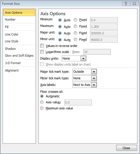
type and what you selected to format. For example, Figure 5 shows the Format Axis dialog box, which opens if you choose to format an axis on a bar chart.

|
4. | Specify your formatting changes in the Format dialog box.
|
5. | Click the Close button to apply your changes, and return to your chart.
|
The Chart Tools—Format tab also offers
features shared with the Format tabs that appear in context when
performing other tasks in PowerPoint, such as applying shape styles and
WordArt styles and arranging chart elements.