Layout
refers to the arrangement of shapes in a connected diagram. If you
think about the way flowcharts, org charts, and network diagrams are
typically laid out, you notice a difference in style that helps with
the meaning and organization of each diagram type.
1. Using Visio’s Layout Features
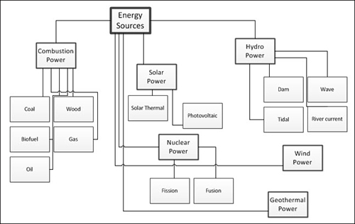
If you look at Figure 1,
you see a well-connected diagram that needs help. Surprisingly, this
diagram has enough information to determine the hierarchy of the
system. The top-level shapes have been rigorously connected to the next
level of shapes, on down the chain. Connectors are glued so that the 1D
Begin handle is at the superior shape, and the 1D End handle is glued
to the inferior shape. To prove that the hierarchy is really there,
I’ve used thicker lines and bigger fonts for higher-level boxes.
Regardless, this diagram is still a mess and needs to be cleaned up.
If I knew in advance all the boxes needed for this
diagram, the Dynamic Grid, AutoConnect could have helped me keep order
as I drew. However, I was working quickly and adding boxes as they
popped into my head. This is a perfectly valid and organic way to work
in Visio.
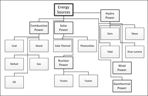
You could try tidying up using Auto Align & Space, as I’ve done in Figure 2. You see that some order is gained, but the overall meaning still isn’t clear.
The trick, then, is to use Visio’s layout features, which you find in the Layout group on the Design tab. Figure 3 shows the heretofore messy energy diagram laid out using the Hierarchy style, chosen from the Re-layout Page gallery.
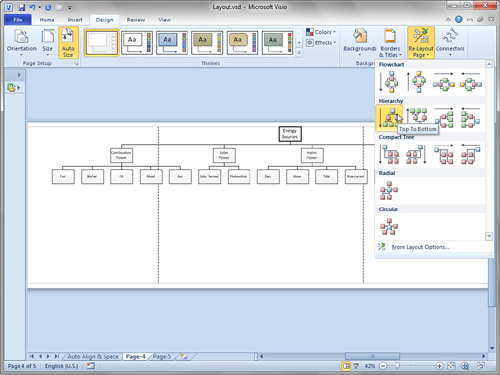
Now, the meaning and hierarchy of the diagram are
clearly visible. The only complaint is that it is a bit wide for such a
small number of shapes—this fairly simple diagram now spills over onto
three pages.
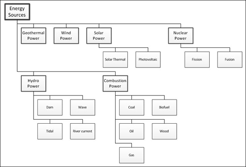
In Figure 3,
notice the Compact Tree layout styles, located just below the Hierarchy
options. Compact tree styles work very nicely for this diagram, as Figure 4
demonstrates. This is an improvement over the previous one because all
the information fits nicely on one page and is more easily seen at a
glance.
Notice the Radial and
Circular groups at the bottom of the Re-layout Page gallery. A circular
arrangement might also work for a diagram like this, although I find
that circular or radial arrangements work better for mind maps and
network diagrams.
As food for thought, Figure 5
shows our example energy hierarchy diagram laid out using the Circular
style. I’ve changed the shapes to circles because I think it looks
better with this arrangement. Note that I changed the shapes by hand;
there’s no magic “change shape” feature.
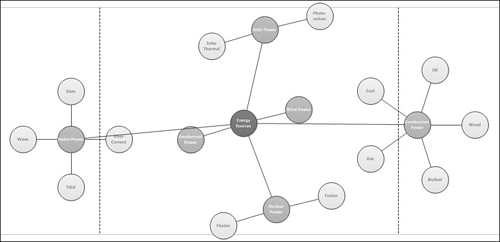
Before I go on, I’d like to call attention to a few points about the circular layout in Figure 5:
The arrangement takes up more space than the Compact Tree layout.
Connectors cross over nodes (the circles), so a bit of hand tweaking is required to perfect the diagram.
The connector style changed from right-angle to straight.
Because
Visio calculates the new layout from existing positions, repeatedly
clicking Circular layout gives you a different layout each time. Some
might frown on this inconsistency; others might enjoy the game of
chance!
Laying
out connected diagrams in Visio is theoretically a matter of clicking a
button or two. Take a moment to try it for yourself and see how it
saves you time, but pay attention to the glitches you run into along
the way as well.