After being neglected in Office 2007's big
"ribbon" shake- up, Microsoft lavished much attention on Outlook in
2010. This time it's back in the shadows, with the changes proving largely
cosmetic.
Those changes are apparent as soon as you
open Outlook - which for the first time can be installed alongside a previous
version of the mail client, Outlook 2013 has been whitewashed, with almost no
visual separation between the ribbon menu at the top and the
Inbox/Calendar/Contacts below. It gives Outlook an incomplete look and, unlike
previous versions, there's no option to alter the color scheme.

Elsewhere, the Windows 8 Metro influence is
apparent. The icons to switch between Mail, Calendar and Contacts modes are
replaced by chunky text labels. Contacts has been renamed People, in another
echo of the corresponding Windows 8 app. Switching between modes invokes an
elegant wipe transition that sees your inbox slide out of view to be replaced
by the Calendar, for example.
Email
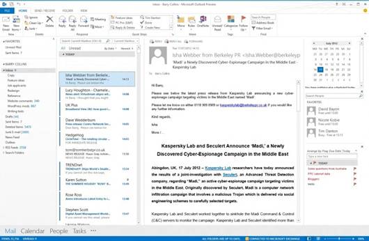
The Outlook 2013 inbox bears more than a
passing resemblance to the Windows 8 Mail app. Unread emails are highlighted
with a blue bar, with the currently selected message in grey. Meanwhile, the
thin rule that separated email messages in Outlook 2010 has been removed,
making it harder to distinguish between messages.
Email gets one of the few standout features
in Outlook 2013: inline replies. This allows you to compose quick replies to
emails from within the inbox Reading Pane; there’s no need to open the message
in a new window as before. A new Delete button that appears when you hover over
messages in your inbox also makes it quicker to clear out the craft. Indeed, if
you’re merely reading, replying to or forwarding messages, you can happily minimize
the ribbon to devote more screen space to messages.
Outlook 2013 also takes advantage of
Windows 8's notifications, alerting users to new messages in their inbox with a
pop-up in the top-right corner of the screen. Compared to the old system tray
alerts, these provide less information, and there's no option to delete
messages directly from the notification pop-up.
The new Site Mailboxes feature may appeal
to businesses: it's an Exchange- based feature that allows you to create a
shared mail folder, calendar and tasks for everyone in a team.

The
whitewashed ribbon interface makes it difficult to separate content and
functions.
Calendar
You don't have to switch to Calendar mode
to glimpse at your diary; it's now possible to hover your mouse over the
Calendar icon and take a quick "peek" at forthcoming appointments.
You still have the option for a pervasive mini-Calendar running down the right-
hand side of the screen, however.
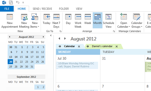
Very little else has changed here. A new
bar marks the time of day across the Daily/Weekly view and a mini-weather
forecast sits below the ribbon.

A
Daily and weekly calendar views now show a timeline, and a weather forecast
appears beneath the ribbon.
People
People is the new name for Contacts, in
many ways duplicating the Windows 8 app. It, too, pulls in contact information
from Linkedln and Facebook and, unlike the Windows 8 People app, cleverly
merges duplicate contacts into one "People Card". Contacts can be set
to automatically update, taking the hassle out of keeping phone numbers and
email addresses up to date.
Favorite People can also be added to the
To-Do bar on the right-hand side of the Outlook window, allowing you to see at
a glance if/when your team members are next free for a meeting.
Touch
Outlook 2013 includes a touch mode that
theoretically makes it easier to use the software on a tablet, although we beg
to differ. The fact that the touch mode is initially available only from an
impossibly small dropdown menu reveals how little thought Microsoft has put
into it. Even when activated, it merely adds a little more white space around
page elements and a series of shortcut buttons. There are hidden touch gestures
that work quite well - pinch to zoom on the Calendar view, for example, neatly
switches between day, week and month views - but referring to Outlook 2013 as a
touch-enabled app in its current state is woefully misleading.
With the much more touch-friendly Mail,
Calendar and People apps in Windows 8 providing full support for Exchange, it’s
easier to use the Metro apps when you don't have a keyboard and mouse to hand.