What constitutes an “optimized” clip? What makes a
color-corrected image correct? Let’s look at what is typically “wrong”
with source footage levels and the usual methods for correcting them, in
order to lay the groundwork for color matching. As an example, let’s
look at brightness and contrast of a plate image, with no foreground layers to match.
Notes
The term plate
stretches back to the earliest days of optical compositing (and indeed,
of photography itself) and refers to the source footage, typically the
background onto which foreground elements will be composited. A related
term, clean plate, refers to the background with any moving foreground elements removed. |
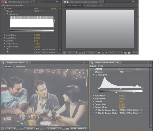
Levels
Levels may be the most-used
tool in After Effects. It consists of five basic controls—Input Black,
Input White, Output Black, Output White, and Gamma—each of which can be
adjusted in five separate contexts (the four individual image channels
R, G, B, and A, as well as all three color channels, RGB, at once).
There are two different ways to adjust these controls: via their
numerical sliders or by dragging their respective caret sliders on the
histogram (which is the more typical method).
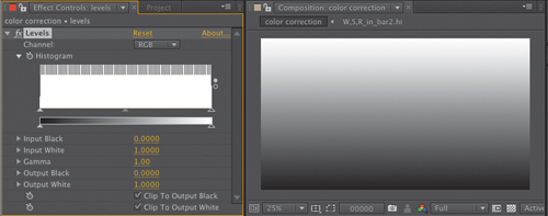
Contrast: Input and Output Levels
Four of the five controls—Input Black, Input White, Output Black, and Output White (Figure 1)—determine
brightness and contrast, and combined with the fifth, Gamma, they offer
more precision than is possible with the Brightness & Contrast
effect.
(Image from the film Dopamine, courtesy of Mark Decena, Kontent Films.)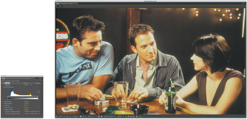
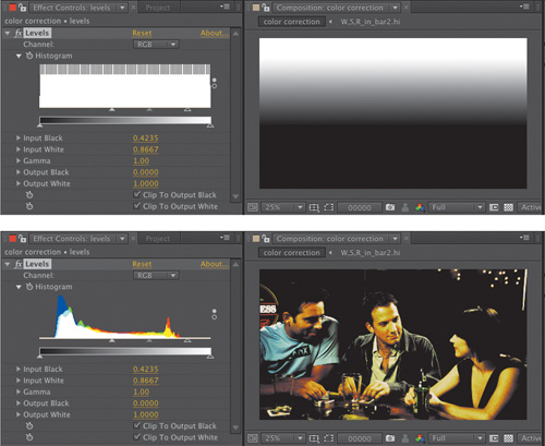
Figure 2
shows a Ramp effect applied to a solid using the default settings,
followed by the Levels effect. Move the black caret at the lower left of
the histogram—the Input Black level—to the right, and values below its
threshold (the numerical Input Black setting, which changes as you move
the caret) are pushed to black. The further you move the caret, the more
values are “crushed” to pure black.
Move
the Input White caret at the right end of the histogram to the left,
toward the Input Black caret. The effect is similar to Input Black’s but
inverted: More and more white values are “blown out” to pure white (Figure 3).
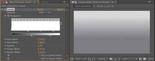
Either adjustment
effectively increases contrast, but note that the midpoint of the
gradient also changes as each endpoint is moved in. In Figure 3,
Input Black has been adjusted more heavily than Input White, causing
the horizon of the gradient to move closer to white and the shadows to
darken. You can re-create this adjustment with Brightness & Contrast
(Figure 4), but there’s no direct control of the midpoint (gamma) of the image (Figure 5).

Reset
Levels (click Reset at the top of the Levels effect controls) and try
adjusting Output Black and Output White, whose controls sit below the
gradient. Output Black specifies the darkest black that can appear in
the image; adjust it upward and the minimum value is raised.
Tip
You can reset any individual effect control by context-clicking it and choosing Reset. You know it’s an individual effect if it has its own stopwatch. |
Lowering Input White is
something like dimming the image, cutting off the maximum white value at
the given threshold. Adjust both and you effectively reduce contrast in
the image. Bring them alongside one another, and the gradient becomes a
solid gray (Figure 6).
So
Input and Output controls have inverse effects. But you will find
situations where you might use them together, first balancing the image,
then reducing contrast in the whites, blacks, or both.
As is the case
throughout After Effects, the controls operate in the order listed in
the interface. In other words, raising the Input Black level first
raises black density, and a higher Output Black level raises all of the
resulting black levels together (Figure 7).
If you’ve crushed the blacks with Input Black they remain crushed, and
they all just appear lighter.
If you’re thinking, “So what?” at this point, just stay with this until we move to a situation in which to apply it.
Brightness: Gamma
As you adjust the Input Black
and White values, you may have noticed the third caret that maintains
its place between them. This is the Gamma control, affecting midtones
(the middle gray point in the gradient) without touching
the white and black points. Adjust gamma of the gradient image and
notice that you can push the grays in the image brighter (by moving it
to the left) or darker (by moving it to the right) without changing the
black and white levels.
Many images have healthy
contrast, but a gamma boost gives them extra punch. Similarly, an image
that looks a bit too “hot” may be instantly adjusted simply by lowering
gamma.
In most cases, the image itself
rather than the histogram offers the best clue as to whether the gamma
needs adjustment.
So what is your guideline for how much to adjust gamma, if at all? I
first learned always to go too far before dialing back, which is
especially helpful when learning. An even more powerful gamma adjustment
tool that scares novices away is Curves (coming up).
Close-up: What Is Gamma, Anyway?
It
would be nice but inaccurate simply to say, “Gamma is the midpoint of
your color range” and leave it at that. The more accurate the discussion
of gamma becomes, the more purely mathematical it becomes. Plenty of
artists out there understand gamma intuitively and are able to work with
it without knowing the math behind it—but here it is anyway. Gamma
adjustment shifts the midpoint of a color range without affecting the
black or white points. This is done by taking a pixel value and raising
it to the inverse power of the gamma value: newPixel = pixel (1/gamma)
You’re probably used to thinking of pixel values as fitting into the range 0 to 255, but this formula works with values normalized to 1. 0 is 0, 255 is 1, and 128 is 0.5—which is how the math “normally” operates behind the scenes in computer graphics. Gamma
operates according to the magic of logarithms: Any number to the power
of 0 is 1, any number to the power of 1 is itself, and any fractional
value (less than 1) raised to a higher power approaches 0 without ever
reaching it. Lower the power closer to 0 and the value approaches 1,
again without ever reaching it. Not only that, but the values distribute
proportionally, along a curve, so the closer an initial value is to
pure black (0) or pure white (1) the less it is affected by a gamma
adjustment. |
By mixing these five
controls together, have we covered Levels? No—because there are not, in
fact, five basic controls in Levels (Input and Output White and Black
plus Gamma), but instead, five times five (RGB, Red, Green, Blue, and
Alpha).