Ratings: 4/5
Price: $118.5
From: adobe.com
Adobe is celebrating the 11th
version of Elements with a fresh new look. Many of the photo manipulation
enthusiasts who form its target audience are getting on in years, and the light
grey text on dark grey background of earlier releases was proving increasingly
contentious: they simply couldn’t read the labels.
So Elements now gets a bright, cheerful
interface, while Adobe’s high-end Creative Suite apps borrow the dark and
restful look. But the changes here go far beyond a mere color overhaul: the
whole feel of the app is bolder, more accessible and more immediate, and should
entice new users too.

Adobe
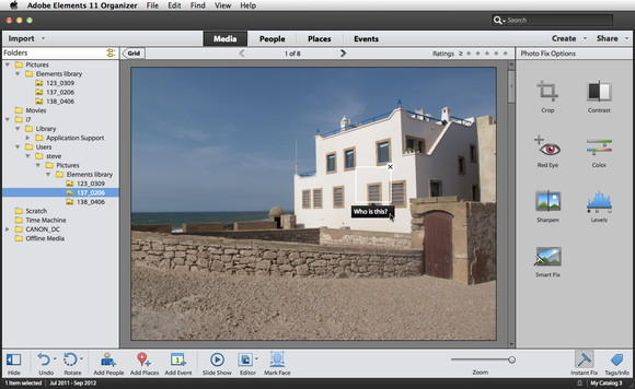
Elements 11 Organizer
As before, the software is divided into two
halves, the Organizer and the Editor. The Organizer works like iPhoto, with a
zoom-able thumbnail view of your image collection; face recognition;
geo-location mapping; and the ability to bundle images into events. You can
jump to photos taken on a particular date using a pop-up calendar. Faces are
hit-and-miss: you’re often asked to name a piece of furniture.
A number of quick fix tools are built into
the Organizer, including a global Smart Fix as well as Sharpen, Levels, Red
Eye, Color, Crop and Contrast. They work reasonably well, although there’s no
user control: it’s a one-shot, take-it-or-leave-it process. The Organizer can
display and fix Camera Raw images, but can’t write that format, so processed
images are saved as JPEGs, TIFFs or PSDs. This is surprising, since the Editor
uses a Camera Raw dialog similar to Photoshop’s.
Like iPhoto, the Organizer’s Create tab lets
you build calendars and photo books. Unlike iPhoto, it doesn’t make this a
slick process; Elements first has to download the templates, then perform a
complex series of Actions to assemble the pages. Editing is tricky, and we had
difficulty using a camera card: although Elements claimed to be copying photos
from it – and certainly took long enough – we couldn’t find the copies, and the
clumsy file navigation system didn’t help.
Overall, Mac users installing Elements may
as well by pass the Organizer altogether. As in previous versions, all the real
work in done in the Editor, with its three modes: Quick, Guided and Expert.
This turns out to be an ingenious solution, as the three works smoothly
together.

Quick
mode
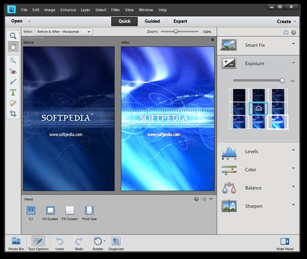
Quick Edit mode uses a cut-down tool panel
with basic selection tools and everyday extras, including not only red-eye but
a tooth brush tool to whiten teeth. On the right, you’ll find the same basic
edits as in the Organizer, but this time you can pop them open to reveal a grid
of nine adjustments, each showing a tiny thumbnail of the current image.
Rolling over any of these performs the adjustment; clicking it commits the
changes.
There are more degrees of subtlety here. In
the Levels control, for example, separate tabs adjust shadows, mid tones and
high lights.
Guided mode offers more complex operations,
such as removing color casts, fixing blemishes and optimizing portraits, as
well as more photographic effects such as tilt-shift and high key, and ‘photo
play’ effects including Out of Bounds and Pop Art. In each case you’re walked
through the process in simple numbered steps that perform each task according
to your specification. When creating reflections, for instance, you add a basic
translucent reflection, choose a background color, adjust the intensity, add an
optional distortion, then add a gradient. It makes light work of complex tasks.
Where Elements gets really clever is when
you then switch from Guided to Expert mode. Rather than seeing a flat image with
all the effects you’ve applied, you see all the layers that make up the result,
complete with gradients, masks, adjustment layers and more. If you have the
know-how, you can go into the layers and edit them individually; and if you
don’t have the know-how, there’s no better way to learn it than by taking it
apart the effect you just applied to see how it’s been constructed. We’d like
smarter naming of the layers, but we commend this approach.

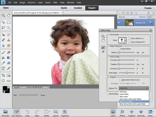
Expert
mode
The Options panel now appears below the
image, larger and alternating with the Photo Bin. While this gives instant
access to all the parameters for each tool as it’s selected, it also cuts down
the available working space. You can opt to open floating panels instead using a
button at the bottom right.
Beyond the interface changes, Elements 11
is a little light on new features, but there’s enough to justify the upgrade.
The Refine Edge dialog that previously made a tentative appearance has been
updated to provide nearly all the functionality of its Photoshop equivalent.
It’s a highly sophisticated system for creating cut outs with soft edges,
smoothing, feathering and color fringe correction, returning selections or new
masked layers.
Support For Actions is a welcome new
feature. They perform multiple operations with a keystroke, carrying out sophisticated
tasks in an instant. But you can’t create new Actions; you have to find a friend
with full Photoshop to build them for you (or download them from Adobe). It’s
just one example of the way Elements is deliberately limited.
New filters include Tilt Shift, Vignette and
a powerful Lens Blur, as well as three new sketch effects: Comic, Graphic Novel
and Pen & Ink. These are based on the Oil Paint filter in Photoshop CS6, but
take it to a higher plane; they’re powerful, useful filters that can produce a
convincing hand-drawn look.
Elements 11 is snappy without being
lightning-fast. To keep it accessible to the greatest number of users, the
Mercury Graphics Engine that now powers Photoshop hasn’t been used. While the
Mac version is still 32-bit, there’s no feeling of sluggishness in most
operations.
The few new features in Elements 11 are
very good. While the Organizer remains disappointing, the Editor offers greater
discoverability, a more powerful feature set and the ability to modify guided
edits using more professional tools. With the friendly new interface, Elements
is now both more capable and easier to learn – a combination of which Adobe
should be proud.