1. Enhanced Strokes and Brushes
In the past, strokes were
always the limited functionality add-on to fills: Want to surround an
object with a frame? Use a stroke. Need to outline text? Use a stroke.
But strokes have always had limitations, the most common being that they
were a constant width; if you wanted a stroke to taper from one size to
another along its length, you needed to use a brush, a very different
beast (though in fairness, you could always apply a brush to a stroke,
essentially replacing it). Although most users have learned to live with
these limitations, Version CS5 makes strokes vastly more powerful by
allowing the width of the stroke to be modified with a new tool: the
Width tool, which is shown manipulating the width of a stroke in Figure 1.

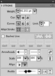
When the width of a stroke is adjusted, it can be viewed at the bottom of the Stroke panel in the new Profile section.
Another welcome enhancement
to strokes is the ability to add arrowheads to the ends of strokes
directly from the Stroke panel, shown in Figure 2.
Art brushes can now have nonstretchable sections by using the new Segmented Art Brush feature.
Finally, a new brush type has been added that simulates natural media: the Bristle brush. Figure 3 shows a pretzel with a Bristle brush applied to it.


2. Path Join Enhancement
If you've ever chosen Object => Path =>
Join and had that horrible dialog box appear stating essentially that
you can't join the selected objects because it wasn't the third Thursday
of May, or for some other seemingly arbitrary reason, you'll love how
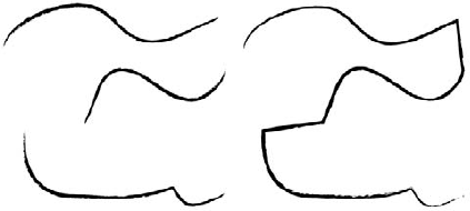
Join works now: Simply select any number of open paths and choose Object => Path => Join, and Illustrator joins those paths, typically just how you'd expect it to work. Figure 4
shows paths before and after being joined automatically using this
feature, which in many ways is really a bug fix that was really hard for
Adobe to do.

3. Select Behind Downgrade
If you've ever been irritated by how InDesign's Select Behind feature works, where  +clicking/Ctrl+clicking
on an object when using another tool (like the Type tool) selects the
object behind the one you just clicked, then you'll be just as
irritated, and probably even more so by Adobe's poorly conceived
decision to make Illustrator act the same way. Now when you press
  /Ctrl,
you'll select behind the topmost object (if the edge of the next object
is under your cursor), with subsequent clicks taking you deeper into
the stack of objects. Get used to pressing V to change your tool to the
regular selection tool instead of holding the
  /Ctrl
key ... unless you're using the Type tool and are editing text, in
which case you'll need to manually choose a Selection tool first.
You can avoid this new
feature by ensuring that you don't click anywhere where an edge of an
open object appears below your cursor.
4. Drawing Modes
Masking objects has always been a confusing area of Illustrator. The new Drawing modes in Illustrator (shown in Figure 5)
allow you to easily draw inside selected objects, and even allow you to
draw behind something. It's not exactly a fix for masking woes, but it
does provide new functionality that had been tedious to re-create in the
past.

5. Perspective Grid
Illustrator has always
treated you like a 2-D artist/designer. With Perspective Grids, you can
simulate depth in addition to location. This is a very powerful new
feature that solves an outstanding need, but most Illustrator users
probably won't take advantage of the new tool, as it requires a
significant investment in time and effort to understand and use the new
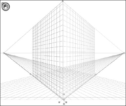
functionality. Figure 6 shows the Perspective Grid as created by the new Perspective Grid tool.
