4. Forms
Developers are often tempted to make the mobile
version of a website far more of a read-only experience than its desktop
equivalent. It's certainly true that entering large amounts of text
into a mobile device can be a trying experience, and a design decision
to temper, say, the account registration functionality on a mobile site
may be a wise one. Nevertheless, forms and data entry are unavoidable
parts of a modern web experience, if only so the user can enter text
into a search box on the site. Large forms can be usefully broken up
into sections — a wizard-like experience — to try to mitigate the
daunting nature of a page full of form fields for the user.
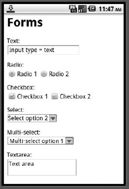
Mobile devices adequately support most types of input field, at least in their own particular way. You can certainly rely on <input type='text'/>, <input type='password'/>, <input type='radio'/>, <input type='checkbox'/> and <select> widgets — although, as you can see in Figures 9 to 12
(which show iPhone, Android, Nokia Series 40, and Windows Mobile
rendering of the same form), their appearance can vary wildly. It can
certainly be very frustrating trying to create consistent layouts for
forms across multiple devices, so leave lots of space and limit your
expectations of pixel-perfect precision.


Advanced form widgets and behaviors can wisely be avoided. <input type='file'>
elements for uploads are risky, because not all devices allow
unfettered access to all parts of their file system (and indeed the
iPhone disables such form elements altogether). Clickable image maps may
work as expected for devices with suitable pointers, but are likely to
be of dubious reliability across all devices. And, although using AJAX
for background form submission would provide lots of usability benefits
in mobile, it is asking a lot of a device's JavaScript support to be
able to post forms reliably. Regular form submission, using GET and POST
methods, is recommended.
Because the act of filling in and submitting a form
can often be a lengthy and fiddly one for the user, it is highly
advantageous to ensure that form validation is as intelligent as
possible. If the device supports the required level of JavaScript, you
should try to detect any validation errors before the form is submitted —
or even as the offending field is in focus, so that the user does not
have to scroll back up the form to reach it. As an alternative, older
devices that support XHTML-MP may honor the {-wap-input-format:} property in CSS that allows you to construct simple input masks for freeform data input fields.
On the server-side of the
form processing, you should try to be as flexible as possible with the
submitted data, being tolerant of obvious data entry errors. (A
location-based search for "londob uk" can reasonably be assumed to have
been for 'London, UK', and it's probably not necessary to present
another page asking the user to confirm her mistake — proceed as though
she got it right in the first place.)