3. Breadcrumbs
If your main navigation tree
is going to consume most of a page, and you need to present actual
content on different pages, then the mechanisms for allowing users to
toggle between navigating and reading or doing something on the site
must be as efficient as possible. Going forward (downward in the
hierarchy) is simple enough, but allowing the user to retrace her steps
is important.
Most browsers present a
back button, of course, and this allows a user to directly return
through the history of pages that he has visited. Note however, that
this paradigm still has some peculiarities on mobile browsers. If the
Apple iPhone is running in full-screen web application mode, for
example, the browser's navigation bar is omitted from the screen, and on
some Nokia devices, the back button pulls up a visual thumbnail list of
previous pages: clever to be sure, but an approach that adds
frustrating extra clicks to the simple matter of reversing up a
navigation hierarchy.
Therefore, many mobile web designers implement their own user interface elements — or breadcrumbs
— for allowing users both to see where they are within the site and to
quickly traverse or reverse their way through the site's hierarchy.
Breadcrumbs are common on desktop sites too, but on mobile sites, their
importance is arguably even greater: On a given page, they may be the
only navigation elements available, as shown at the top of Figure 6.
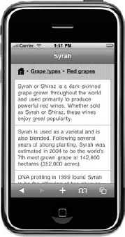
With this particular
breadcrumb example, there are three links serving a dual purpose. On one
hand, they show that the current topic (Syrah) is three levels down
inside the hierarchy and serve to remind you that Syrah is a red grape.
On the other, they provide a quick way to back up the hierarchy one or
two levels or to return the home page of the site.
There is a certain elegance
to ensuring that the breadcrumbs do not get too long on the screen. If
you have a deep hierarchy with long category names, the breadcrumbs
could easily take up two or more lines, eating into valuable screen
space above the content itself. To avoid this, you could show only the
links of the two preceding levels or codify a short version of each
point in the navigation hierarchy for use in the breadcrumb list. Such a
technique might turn breadcrumbs like this:
Home > Find wines by grape type > Red grape types > Syrah
into this:
Home > Grapes > Red > Syrah
The latter form conveys the same semantics to the user, but it's more succinct and more likely to fit on a single line.
Breadcrumbs work well and
are easiest to implement when a site is organized into a strict,
single-dimensional hierarchy. A challenge arises if the page can be
reached by multiple routes through the site, and the breadcrumb logic
needs to decide which ancestral path through the hierarchy or
hierarchies it should display. In these cases, web applications can use
the (incorrectly spelled!) "referer" header sent in the device's HTTP
request to try to deduce which route has been taken to reach it.
4. Header and Footer Navigation
Unlike desktop sites where
huge arrays of links and menus are often presented at the top of a page,
you have to be extremely sparing with the mobile user interface. The
header of your page — which might already be displaying a title, some
sort of branding, and perhaps even a small mobile ad — is in danger of
taking over the whole screen if you also put primary and secondary
navigation into it.
For this reason, mobile sites
with a large number of static links in a header are rare. Some have a
small number of links — say, no more than four or five — that can be
squeezed into the page above the content of every page. But it's smarter
for sites to display context-sensitive navigation in the header instead
— which means that the links that are present vary depending on where
the user is in the site. These could easily be breadcrumbs that also
help indicate location, as just discussed, but there may also be an
opportunity to place a small number of auxiliary links in the header and
make these highly relevant to the user's current context in the site.
If the header bar of the page
is being used for a page title, you can use the space to the left and
right of it. It's a common pattern to place a back button on the left
side of the bar, but if there is space, a compressed breadcrumb sequence
can also be placed there, as shown in Figure 7.
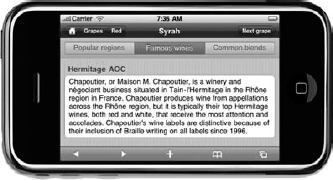
In this figure, you have breadcrumbs, a title, and
a context-sensitive link on the right, which encourages the user to go
forward through the site's content — in this case, sideways across the
hierarchy to a peer page.
However, the landscape mode
of the screen blesses you with enough space to have all three elements
in the header bar. In portrait mode on most devices, you rarely have
room for more than a single button on each side of a short title. Bear
this in mind when designing the upper part of your page, and consider
using a style sheet that alters between the two orientation modes of the
device (if it even supports rotation!).
In the previous
example, a secondary navigation bar is also placed at the top of the
page. These should also be context-sensitive because the user may well
perceive these to be "tabs" that relate to different views on the
current content or a small selection of subpages. Again, you are
constrained by length, so these links should not be too numerous or
long-winded. The same navigation does not require fancy styling of
course: With a little surreptitious text separation, you can present the
same navigation without having to use significant CSS, as shown in Figure 8.
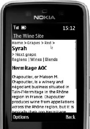
Note also that some devices will display the contents of the page's <title>
tag in a bar at the top of the page. (It's an optional feature of the
Nokia Series 40 browser, and it's been enabled in the example above for
illustration.) If you are able to detect that the user is visiting your
site with a browser that does render the title in such a way, you may
want to use that tag for the page name to save yourself some real estate
in the main part of the page — or at least avoid duplication of the
title at the top of the screen.
There is slightly less
concern for the number of links used in the page's footer, because its
size is not relegating primary content. However, the links in a footer
may not always be reached by the user, because they are almost always
going to require scrolling on the part of the user to reach them. So,
much like the footer on a desktop site, the links at the bottom of a
mobile page are best used for auxiliary activities that are consistent
across the site, such as links to feedback, contact, legal, or "about"
pages. Some mobile CMS plug-ins will also attempt to serialize sidebar
widgets as compressed panels in the footer below the page.