5. Paving Mobile Pathways
So far, you've rather assumed
that the site you are building is an elegant hierarchy with neat and
consistent navigation that lets users descend, traverse, and ascend your
beautifully nested content. It's probably no surprise that sites in the
real world are rarely as well disciplined. Legacy content or poorly
modeled taxonomies can make your navigational design decisions much
harder to make. But this reminds you that, ultimately, the priority when
designing a mobile site is to help the user get to the vital
information or activities that you provide as quickly and efficiently as
possible. Remember, it is most probable that a mobile user has a very
particular task in mind when visiting your site. It's possible that he
is an idle surfer, just clicking around the site, but it's more likely
that he is on a mission — and your site should aid him in achieving it
as fast as possible.
What that exact mission
might be depends, of course, entirely on the service your site provides.
If it is a simple blog, then a user entering your site at the home page
should be one or zero clicks away from perusing your most recent posts
or summaries thereof. If you provide a location-based service, the form
for entering or checking the user's location should be front and
foremost, not an obscure link buried away in the footer.
Even if you provide a seemingly
straightforward corporate site, thinking about the different needs of a
mobile user is important. Imagine an airline website, for example. The
desktop site should probably focus users' attention on booking tickets,
the comfort of the airline's seats, marketing promotions, corporate
mission statements, shareholder reports, and so on. But the average
mobile visitor is unlikely to want any of this. If she's taken the
effort to access your site with her mobile device, she's probably
looking to check flight times, view departure or arrival status, or
quickly check-in online as she dashes for the airport in a taxi. These
are actions that should be brought to the forefront on the mobile
version of the site, and users should be quickly guided to them using
the home page content and navigation structure. That's not to say that
the other, less urgent content should not
be available on the mobile site — just that its prominence can be
suppressed in the interest of guiding users more efficiently elsewhere.
The process of modeling
your site to suit user behavior is, naturally, a very inexact science,
and one that you can do only with a deep understanding of the business
or project priorities for the site and the likely behaviors of your
target users. No doubt it is a science that can be constantly tweaked
and adjusted for most sites using analytics, A/B split-style techniques,
focus groups, and so on to gauge when the workflow for typical mobile
users is being best served. But the most important thing to remember is
that these decisions need to be made afresh for your mobile design:
Those users may well want to do different things.
6. Switcher Links
A final note on links and
navigation on your site concerns the switching between the mobile and
desktop versions of the site. About
entry points for the different sites and how you might be able to use
browser detection to guide the user to the right version of the site.
But if the server mis-detects a device, it is important for the user to
be able to switch to the other version of the site (preferably to the
corresponding page within it). And even if your detection is perfect,
there are still times when a user might want to switch experience
deliberately. Consider a smart-phone-owning user who does want to visit the airline site to leisurely learn about the flat beds in business class or read the corporate report.
All good dual-mode
sites should have such switcher links. You should be careful to
implement them in such a way that the user's choice is remembered for
next time he visits, but also you should think about where he is placed
on the page. For a mobile rendering of the site, it's probably
acceptable to place the link in the footer of the page. If a desktop
browser has been inadvertently shown on that page, then scrolling down
is no big deal for the user.
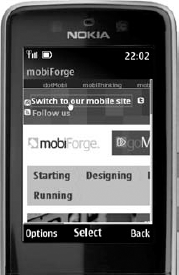
However, the placement of the
"Visit your mobile site" link on the desktop page should be as early as
possible. If indeed you have presented the desktop page to a mobile
user, you should let them escape the situation as soon as possible —
preferably before too much of the (probably relatively large) desktop
page has loaded. Figure 9
shows mobiForge, a mobile developer community site. Although the
WebKit-based Nokia Series 40 browser renders the desktop site tolerably
well, the prominent link at the top of the site lets users quickly hop
across to the mobile version, which contains the same information but is
far better themed for mobile usage (as shown in Figure 10).
