2. Adding a Launch Image
One of the ways in which the iPhone and the iPod touch cheat is by
providing launch images. A launch image is immediately displayed on the screen when
the application is started before the UI is displayed. Your application
displays the launch image file while loading, which means there are no
more blank screens while the application loads.


Let’s add one of these to the City Guide application. Build and
deploy the City Guide application onto your iPhone or iPod touch. While
your device is still connected and your
application is still running, open the Organizer window by
going to Window→Organizer in the Xcode menu bar. You will see a
glowing green dot next to your device. Select your device, and in the
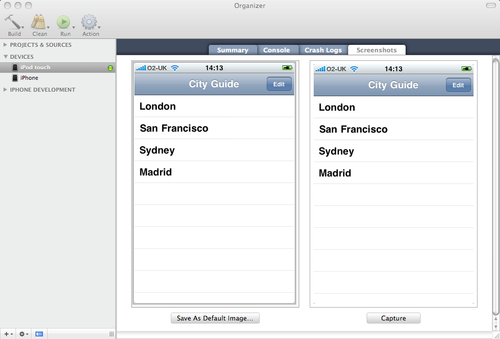
Screenshots tab click the Capture button. Xcode will take a screen capture from your
application, as shown in Figure 5.

Click the Save As Default Image button and select your project
from the menu. When you return to the project in Xcode, you’ll notice a
Default.png image file appear in the Resources
group in your project. If you rebuild the City Guide application at this
point and redeploy it, the application will apparently now load
instantly.
Although many developers have chosen to use the launch image as a
splash screen, that’s not how Apple intended this image to be used.
Instead, it is intended to improve the user experience. Its presence
adds to the user’s perception that your application is quick to load and
immediately ready for use when it does load.
Because this is a mobile platform, users will switch between
applications frequently. Even more than on the Web, where users’
attention spans are notoriously short, on the iPhone and iPod touch,
users will become frustrated with applications that take a long time to
launch (or shut down). You need to work to keep the launch time of your
application to a minimum, and use the launch image to make a subtle
transition into your application.
The launch image measures 320×480 pixels, and generally should be
identical to the first screen of your application. However, since this
is an image, the content is static, so you should not include any
interface elements that may change from launch to launch. Therefore,
avoid displaying elements that might look different between the launch
image and your first screen. For instance, the
Default.png image file we generated for our City
Guide application includes a list of cities, but what happens if the
user adds more cities? The list will change. We can’t update the list of
cities in the launch image, so it’s probably best to remove them,
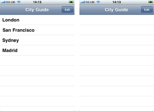
leaving only the table view as shown in Figure 6. (This also has the
benefit of hinting to the user that she can’t interact with the app just
yet.)
To do this, right-click on the Default.png
image file in Xcode and select Reveal in Finder. This will open the
Finder and highlight the image in your project folder. You can now open
this image in your preferred image editor and make any changes you want.
Remember, you need to save it back as a single-layer PNG file without
transparency; otherwise, your application will have problems loading the
file at launch.

Most applications’ launch images will be very plain; this is not a
problem, as they are there solely to convince your users that your
application is quick to load. If you interrupt the user experience with
a splash screen, your users might ask themselves why you’re wasting
their time displaying such a screen, and why you don’t just get on with
it and load the application. If you make use of the launch image
correctly, they’ll know that you’re doing your best to give them a
seamless experience.