Scenario/Problem: When authoring or editing a page, you want to add different content to different sections of the page.
Solution:
The following sections explain some of the choices you have when adding
a web part to a page. Although you can choose from many more web parts,
the ones described here are the most common ones.
Use the App Part (List View) Web Part
You can add a list view web part to a page in
two ways. The first is to click the App Part button instead of the Web
Part button in the Insert ribbon. The second is to select the Lists and
Libraries category in the web part selection pane. Both options show
you the list of all the lists and libraries available in the current
site as web parts. The only difference is that clicking the Existing
List button hides the categories, showing you only the web parts that
belong to the Lists and Libraries category.
By selecting one of the lists or libraries
and adding it to the page, you actually add a List View web part to the
page. After you add the web part to the page, the page displays the
items in the list or library that you selected. What view is displayed
by default depends on the type of list.
If you want to change what information is
displayed, you can do this by using the same method you use to edit a
view in a list or library. To edit the view the web part is displaying,
you hover over the web part with your mouse. Doing this exposes a check
box that allows you to select the web part in the web part’s title row.
When you check the check box, you see the List Tools ribbon or Library
Tools ribbon, with the List or Library tab available.
Note
The view you will be modifying does not exist
in the list but instead is configured in the web part. So even if it
looks like you are editing the default view of the list itself, you
needn’t worry: You are only modifying the view of the web part and not
the view used in the list.
In addition to changing the view, you can
configure additional settings for the web part, using the web part’s
settings pane.
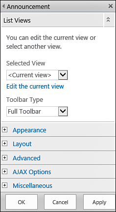
When you’re viewing the editing pane for a
list view web part, you can select from the list of views that were
created for the list or library different views for the web part. You
can also create a view just for the web part by clicking the Edit the
Current View link if you want the web part to display a view that was
not created in the list or library.
You can also select the toolbar type for the
web part. This setting defines whether the web part displays a summary
toolbar (that is, a link at the bottom for adding a new item to the
list or creating a new document in the library), no toolbar, or a full
toolbar as shown in Figure 1. A full toolbar is used only for picture libraries and surveys because they do not have ribbons.

FIGURE 1 The List View web part’s settings pane.
Use the Content Editor Web Part
You can type any kind of text in a Content
Editor web part, including scripts. To add a Content Editor web part to
a page, switch the web part selection pane to the Media and Content
category and select the Content Editor web part from the list of web
parts.
After you add the web part, it does not
appear with any text. Instead, you see an instruction telling you that
you need to add text (content) to the web part by opening the tool
ribbons for the web part. To do so, click the link in the text. The web
part switches into text editing mode, exposing the Editing Tools
ribbon, with the Format Text and Insert tabs.
However, unlike the text editing control, the
content editor web part does not support inserting some types of
content, such as web parts and video and audio.
Use the Image Viewer Web Part
The Image Viewer web part enables you to
display just an image. To add an Image web part, select it from the
list of available web parts under the Media and Content category.
When you add the web part to the page, it
doesn’t have any image set. Instead, it offers instructions on how to
specify the image: by clicking the Open the Tool Pane link.
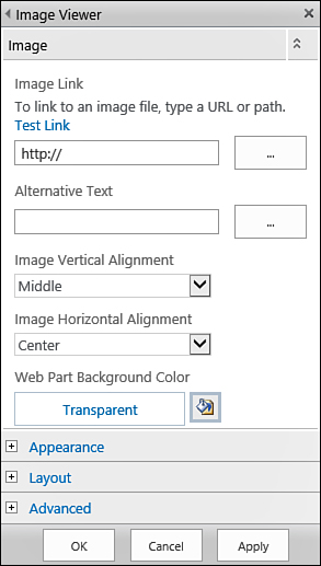
When the tool pane is
open, you can specify the link to the image that should be displayed,
as well as some settings for how it will be displayed (see Figure 2).

FIGURE 2 The tool pane for the Image Viewer web part.
The first setting is the link to the image.
You just type (or paste) the link into the Image Link box, and then
click the Test Link hyperlink above the box to make sure the link you
typed is correct and points to the correct picture. If the link is
fine, the picture opens in a new window, which you can then close.
In the Alternative Text box, type
the text that you want to appear in the web part if the user who is
browsing the site is using a browser that doesn’t support images or has
that option turned off. This text is also displayed when the user
hovers the mouse cursor over the picture.