Few people actually enjoy having to author,
deliver or sit through a PowerPoint presentation, but whatever area of business
you're in, it's likely to be an important part of your software toolkit,
PowerPoint 2013 is an all-round upgrade, with improvements across the board,
aimed at helping users deliver more effective presentations as well as create
attractive slides.
Presenter view
At the launch, the big "new"
feature Microsoft chose to focus on was Presenter View. In fact, it isn't new
at all - but it's received a major, Metro- style makeover in this release. It's
far slicker than what went before, giving presenters a more streamlined,
blacked out, cockpit-style view from which to control the progress of their
presentations.

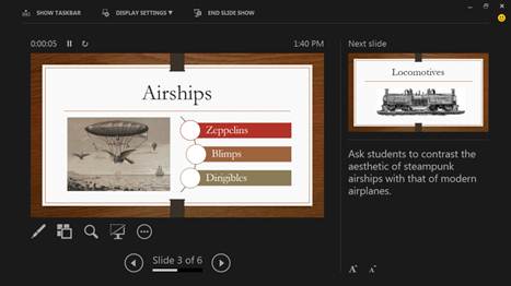
For those who aren't familiar with
Presenter View, it's aimed at those who deliver presentations on a big screen
or projector. Instead of simply mirroring the current slide on each display, it
shows a control screen to the presenter, with the current slide in a box on the
left, the next slide as a smaller thumbnail in the top right of the screen, and
any notes you might have made about the current slide tucked in the bottom
right. It's a useful feature that allows presenters to mentally prepare for the
next slide before actually getting to it.
It isn't all about forward planning,
though. The Presenter View also plays host to a number of other useful controls
and tools to help add interest to what may otherwise be flat, lifeless slides,
and here further improvements have been made. Click the Pen icon and you'll see
a laser pointer mode has been added to the existing highlighter and Pen tools -
useful for drawing your audience's attention to specific data on a graph, for
example, or highlighting a bullet point in a list.
Tapping the icon next to the pen brings up
the Navigation grid - another new feature that gives an overview of all the
slides in your presentation. It replaces the old filmstrip view, and should
make it a little easier to navigate back and forth between slides. Next is the
Slide Zoom, which allows presenters to hone in on a particular area of a slide,
either by pinching with a finger or clicking with the mouse. There's a shortcut
icon for blanking the screen, and an options menu gives access to, among other
things, a Slide Show Help box listing keyboard shortcuts.
Ul and touch
The other big change, as with the rest of
the Office 2013 applications, is the new look and feel, with its flat, sharp-
edged windows and touch-enhanced collapsing ribbon.

Whether this appeals or not depends largely
on personal taste. Far more important are the implications the redesign has for
touch. In terms of slide creation, our comments remain the same as for Word,
Excel and the rest: Microsoft hasn’t done enough. Sure, the ability to zoom in
and pan around is nice, but start to edit an existing presentation with only
your fingers and you'll quickly become frustrated.
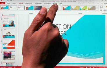
Despite the new touch mode, which enlarges
some elements and spaces out buttons on the ribbon, many elements of the UI
remain small and fiddly: the windowing controls in the top-right corner; the
zoom slider in the bottom right; and, bizarrely, the touch mode switch itself,
which is hidden behind the tiniest dropdown imaginable.
In another odd move, many of PowerPoint's
dialog boxes have been completely done away with and replaced by a pane that
smoothly appears from the right-hand side. We like this approach, but it isn't
consistent with the other Office apps, and could cause confusion. Neither
Microsoft Word nor Excel uses this approach.
For presenting, it's a different story Run
your slideshow on a touchscreen tablet and it has the potential to transform
your performance. You can swipe to navigate back and forth, and pinch and tap
directly on a slide to zoom in leaving you to focus your attention on the
presentation.
Design and layout
None of this really matters, though, unless
you can create compelling slides in the first place, and Microsoft has provided
a number of tools to make things easier.

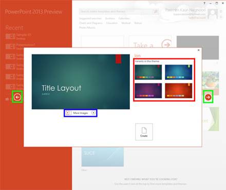
First on the list of improvements is a
library of new templates designed specifically for 16:9 format screens - a long
overdue introduction that will be welcomed by users of modern laptops and
tablets. All the core templates that appear on the new-style welcome splash
screen are compatible with this format and many existing templates on
Office.com, which can be browsed or searched directly from the splash screen,
have been converted too.