1. What Is a Picture Library?
A picture library is a special type of a
document library that is dedicated to images. A picture library is
useful for sharing photos with other people. For example, you can have
a picture library as your stock photo repository, as shown in Figure 1. A picture library includes a special view that shows the images as thumbnails, as shown in Figure 1.
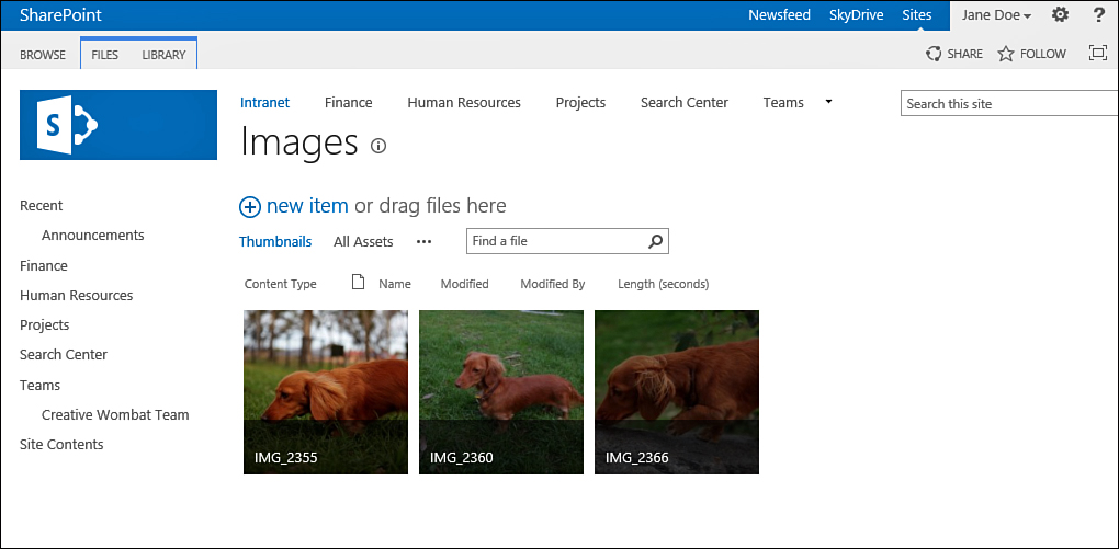
FIGURE 1 A picture library showing thumbnails of the pictures in it.
What Is a View?
Using views is a useful way for a list
manager to create different ways to show the information in a list or
library. Different views can show different columns and have different
sorting and filtering, grouping, and styles.
In SharePoint, views can be either public or private:
Public—The list’s or library’s managers create public views, and these views are available to anyone to use.
Private—Users
create private views. Only the user who created a private view can use
that view. You may, for example, create a private view and customize it
to show the information that you usually need to find the items or
files that you usually work with.
Several types of views are available in
SharePoint. Most of the views that you will see are the standard
tabular views that resemble printed worksheets—with column headers and
values in rows, but no ability to edit the data directly. However, some
special views styles show the information in the
list in different ways. For example, the Datasheet view (also known as
the Quick Edit view) allows directly editing the data, and a Calendar
view shows items as part of a calendar.
A Calendar view shows the items in a list
based on dates that are set on the items. Other views include the Gantt
view and the Datasheet view. The Gantt view is similar to the Calendar
view: It shows information based on dates in the list items’
properties. The Datasheet view is a Microsoft Excel-like view that
allows copying and pasting of data into the list or library, as well as
editing multiple items using drag-and-drop.
Let’s look at an example of a possible
difference between two views. One view for an announcement list might
show the title of the announcement and the date that the announcement
was changed (see Figure 2). A different view of the same list might show the body of the announcement and the date on which it will expire (see Figure 3).
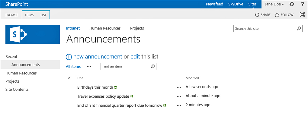
FIGURE 2 An announcement list in a view that shows the Title and Modified columns.
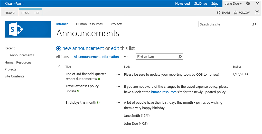
FIGURE 3 An announcement list in a view that shows the Title, Body, and Expires columns.
If you have multiple
announcements, you can have different views sort the announcements in
various ways. For example, one might sort by the title of the
announcement, and the other might sort by the modification date. Figure 3 shows a view sorting the announcements by their creation date (with the one created first on top). Figure 4 shows a view that sorts on the title of the announcement.
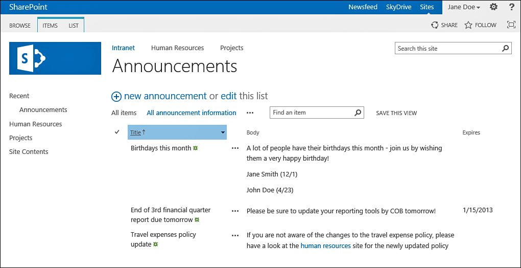
FIGURE 4 The announcement list in a view that sorts by the title.
Some views change the style in which the items are displayed. For example, Figure 5 shows the announcement list in boxed style.
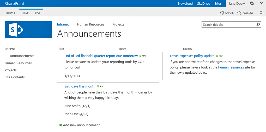
FIGURE 5 The announcement list shown with the boxed style.
An announcements list may have a filter applied to it to show only items that have not expired (refer to Figure 3).
Other views can be configured not to have that filter. If you are
viewing a list and the item you are looking for is not showing,
consider the possibility that the current view is configured to filter
that item.
Finally, some views might
display the data grouped by one column. In such cases, you can view the
groups and expand a group to see the items within the group. For
example, in a contacts list, a view may be set up to group the contacts
by their company name as shown in Figure 6. This way, you can expand the view for a specific company.
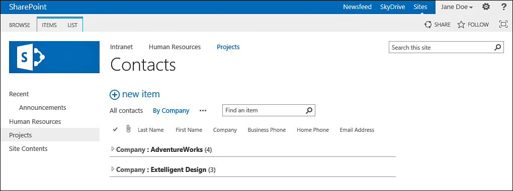
FIGURE 6 A contacts list, grouped by company.
To see the items in a group, you click the +
sign next to the group name or on the group field’s name that shows up
as a link (in this example, the Company: link). The group expands,
showing you the items that belong to that group (see Figure 7).
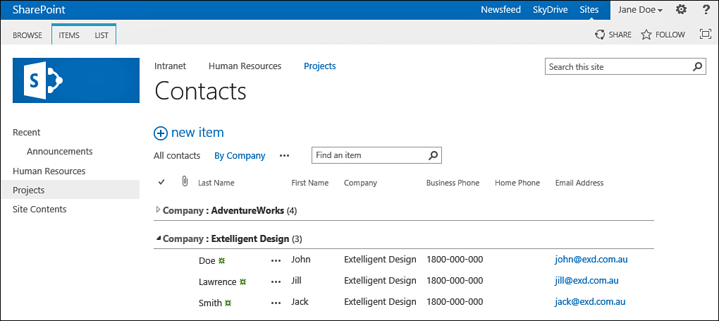
FIGURE 7 A contacts list, grouped by company, with Extelligent Design expanded.
SharePoint supports up to two grouping levels (for example, by country and then by company, as shown in Figure 8).
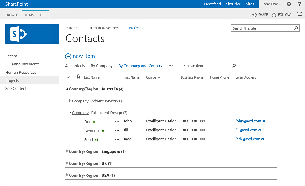
FIGURE 8 A contacts list, grouped by country and then by company, with Australia and Extelligent Design expanded.
As mentioned earlier,
picture libraries have their own special views that show the pictures
that are in the library as either thumbnails or filmstrips of the
pictures.
Some views support paging. Paging is
a common method in websites for showing large amounts of data without
overloading the page. Using paging, the data in a list or library is
split into pages, with each page showing only a certain number of the
items. The user can navigate back and forth between the pages, using
the paging buttons at the bottom of the page or the paging button in
the Library ribbon or List ribbon (see Figures 9 and 10).
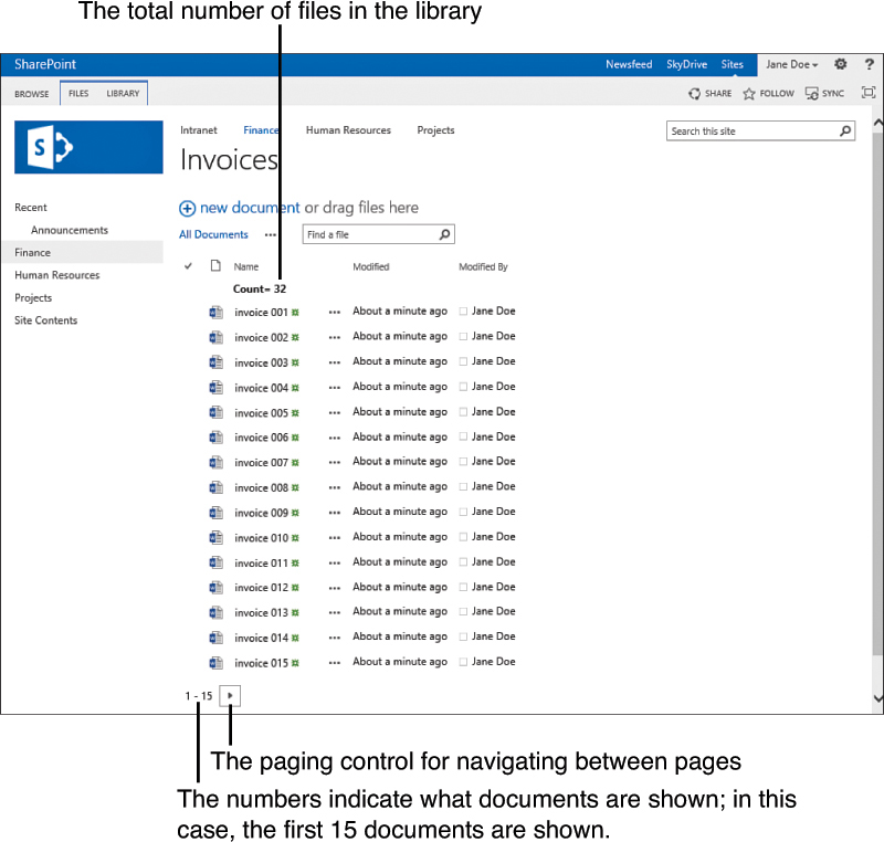
FIGURE 9 The first page of a view of a document library with 32 documents, showing the first 15 documents.
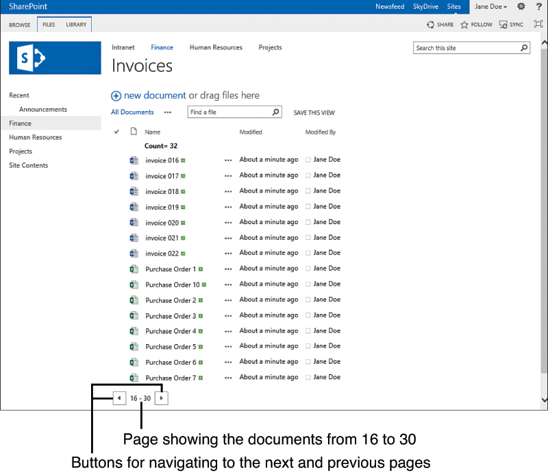
FIGURE 10 The second page of the view of the document library shows the next 15 documents.
For example, say that you have a document
library that contains 1,000 documents. Showing all the documents to the
user at once might cause the page loading time to be quite slow, and a
user might have difficulty finding a particular document. A more
sensible approach would be to display the files in batches of 15 (for
example), which makes it easier for the reader to see what information
is available on the page. This is true even if you don’t have thousands
of documents! As your document library or list grows to have more and
more files or rows, you will want to separate them into pages, as shown
in Figures 9 and 10.
Finally,
advanced users can create custom views by using Microsoft SharePoint
Designer. Custom views can look totally different from anything that is
available for regular views.