Formatting characters
Character
attributes apply to selected text or to the text insertion point (so
you can start typing text with the specified attributes). You’ll find
most of the character attributes you need in the Classic tab (Figure 1)
or the Character Attributes tab of the Measurements palette. If you’re
not sure what a control does, point at it to display its tool tip.
Commands in the top portion of the Style menu and in the Character
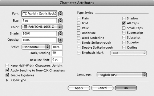
Attributes dialog box (Style > Character) round out all the character
attributes available in QuarkXPress (Figure 2).


Tip: Special Effects for Type
In
addition to familiar controls such as font, size, color, and type
style, QuarkXPress offers character attributes such as opacity and
scaling. Other special effects for text are box based, such as the
ability to skew or flip all the text in a box.
The
important thing to understand about fonts is that they are not part of
QuarkXPress. They are individual files that are activated (turned on)
through your system or through a font manager such as Suitcase Fusion.
Once activated, they show up in QuarkXPress menus.
If a font is missing, you
either need to activate it or purchase and install it. You can buy fonts
from vendors such as Linotype and Bitstream—and you should
buy them as they are licensed pieces of software (rather than, say,
“borrowing” them from friends and coworkers). Companies may have site
licenses or enforce work rules that ensure legal font usage.
When you buy fonts, keep
in mind that they come in a variety of formats: PostScript, OpenType,
TrueType, and so on. PostScript Type 1 fonts ruled high-end publishing
for a long time, but OpenType fonts are rapidly becoming the standard as
the same files can be used on both Mac and Windows. Fonts also come
from different vendors such as International Typeface Corporation and
Adobe. Generally, fonts include multiple “faces” such as bold, italic,
and condensed versions. If multiple faces of a font are active, the
QuarkXPress Font menus display a submenu for selecting just the right
font face (Figure 3).
Note that for proper output, you must apply the bold or italic face of a
font rather than the QuarkXPress Bold or Italic type style.

When it comes to fonts,
the name is not a unique identifier. Fonts in different formats, from
different vendors—and even in different versions from the same
vendor—are not
interchangeable. Small variations in fonts can and will cause text to
reflow, possibly ruining a layout. As a result, it’s important that a
workgroup use precisely the same fonts and that fonts are provided with
QuarkXPress layouts as necessary for output. You can package fonts with a
layout through File > Collect for Output.
Formatting paragraphs
Paragraph
attributes apply to selected paragraphs or to the paragraph containing
the text insertion point. A few paragraph attributes are available in
the Classic tab of the Measurements palette, but you’ll find more
complete controls in the Paragraph Attributes tab (Figure 4).
Use tool tips to help identify the palette icons. The Paragraph
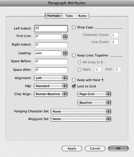
Attributes dialog box (Style > Formats) consolidates all the
paragraph attributes available in QuarkXPress (Figure 5).


|
In
typography, the spacing between lines is referred to as leading—an
antiquated term derived from the actual strips of lead used to add space
in 19th-century era hot metal typesetting. In QuarkXPress, leading is a
paragraph attribute that is measured from baseline to baseline (the
baseline is the invisible line that text rests on).
In general, it’s better to
use an absolute amount of leading, such as 12 point, rather than the
default option of Auto. The Auto leading feature calculates the amount
of space between lines based on the largest character in each line—which
can lead to inconsistent line spacing within a paragraph. QuarkXPress
also accepts incremental leading values, such as +2, that are added to
the font size to calculate the leading. So 12 point type with +2
incremental leading places 14 points of space between lines. Incremental
leading can also lead to inconsistent line spacing.
|
Tip: Hanging Indents for Bulleted and Numbered Lists
To
create bulleted lists and numbered lists in QuarkXPress, you need to
create a hanging indent through tabs and paragraph attributes. Set a tab
stop and left indent for the paragraph at the same location, then set a
negative first line indent. For example, if you set a tab stop at .25″
and a left indent of .25″, the first line indent should be –.25″. Place
the bullet or numeral—formatted with a character style sheet—before the
tab stop.