4. CheckBoxes, RadioButtons, and Spinners
The Views we present in this section are probably familiar to
you from other user interfaces. Their purpose is to allow the user to
choose from multiple options. CheckBoxes are typically used when you
want to offer multiple selections with a yes/no or true/false choice for
each. RadioButtons are used when only one choice is allowed at a
time.
Spinners are similar to combo boxes in some frameworks. A combo
box typically displays the currently selected option, along with a
pull-down list from which the user can click on another option to select
it.
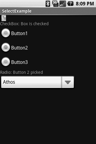
Android has adapted these familiar components to make them more
useful in a touchscreen environment. Figure 3 shows the three types
of multiple-choice Views laid out on an Android application, with the
Spinner pulled down to show the options.
The layout XML file that created the screen in the figure looks
like this:
<?xml version="1.0" encoding="utf-8"?>
<LinearLayout xmlns:android="http://schemas.android.com/apk/res/android"
    android:orientation="vertical"
    android:layout_width="fill_parent"
    android:layout_height="fill_parent"
    >
<CheckBox
  android:id="@+id/cbxBox1"
  android:layout_width="20dp"
  android:layout_height="20dp"
  android:checked="false"
  />
<TextView
  android:id="@+id/txtCheckBox"
    android:layout_width="fill_parent"
    android:layout_height="wrap_content"
    android:text="CheckBox: Not checked"
    />
<RadioGroup
  android:id="@+id/rgGroup1"
  android:layout_width="fill_parent"
  android:layout_height="wrap_content"
  android:orientation="vertical">
  <RadioButton android:id="@+id/RB1" android:text="Button1" />
  <RadioButton android:id="@+id/RB2" android:text="Button2" />
  <RadioButton android:id="@+id/RB3" android:text="Button3" />
  </RadioGroup>
<TextView
  android:id="@+id/txtRadio"
  android:layout_width="fill_parent"
  android:layout_height="wrap_content"
  android:text="RadioGroup: Nothing picked"
  />
<Spinner
  android:id="@+id/spnMusketeers"
  android:layout_width="250dp"
  android:layout_height="wrap_content"
  android:layout_centerHorizontal="true"
  android:layout_marginTop="2dp"
  />
</LinearLayout>
The file just lists each View we want on the screen along with the
attributes we want. A RadioGroup is really a ViewGroup, so it contains
the appropriate RadioButton Views. Example 3 shows the Java file that
responds to user clicks.
Example 3. Java for CheckBox, RadioButtons, and Spinner
package com.oreilly.select;

import java.util.ArrayList;
import java.util.HashMap;
import java.util.List;

import com.google.android.maps.GeoPoint;

import android.app.Activity;
import android.os.Bundle;
import android.util.Log;
import android.view.View;
import android.widget.AdapterView;
import android.widget.ArrayAdapter;
import android.widget.CheckBox;
import android.widget.RadioButton;
import android.widget.RadioGroup;
import android.widget.Spinner;
import android.widget.TextView;
import android.widget.AdapterView.OnItemSelectedListener;

public class SelectExample extends Activity {

  private CheckBox checkBox;
  private TextView txtCheckBox, txtRadio;
  private RadioButton rb1, rb2, rb3;
  private Spinner spnMusketeers;

    /** Called when the activity is first created. */
    @Override
    public void onCreate(Bundle savedInstanceState) {
        super.onCreate(savedInstanceState);
        setContentView(R.layout.main);

        checkBox = (CheckBox) findViewById(R.id.cbxBox1);
        txtCheckBox = (TextView) findViewById(R.id.txtCheckBox);
        txtRadio = (TextView) findViewById(R.id.txtRadio);
        rb1 = (RadioButton) findViewById(R.id.RB1);
        rb2 = (RadioButton) findViewById(R.id.RB2);
        rb3 = (RadioButton) findViewById(R.id.RB3);
        spnMusketeers = (Spinner) findViewById(R.id.spnMusketeers);

        // React to events from the CheckBox
        checkBox.setOnClickListener(new CheckBox.OnClickListener() {
          public void onClick(View v){
                if (checkBox.isChecked()) {
                    txtCheckBox.setText("CheckBox: Box is checked");
                }
                else
                {
                  txtCheckBox.setText("CheckBox: Not checked");
                }
          }
        });

        // React to events from the RadioGroup
        rb1.setOnClickListener(new RadioGroup.OnClickListener() {
          public void onClick(View v){
            txtRadio.setText("Radio: Button 1 picked");
          }
        });

        rb2.setOnClickListener(new RadioGroup.OnClickListener() {
          public void onClick(View v){
            txtRadio.setText("Radio: Button 2 picked");
          }
        });

        rb3.setOnClickListener(new RadioGroup.OnClickListener() {
          public void onClick(View v){
            txtRadio.setText("Radio: Button 3 picked");
          }
        });

        // Set up the Spinner entries
        List<String> lsMusketeers = new ArrayList<String>();
        lsMusketeers.add("Athos");
        lsMusketeers.add("Porthos");
        lsMusketeers.add("Aramis");

        ArrayAdapter<String> aspnMusketeers =
          new ArrayAdapter<String>(this, android.R.layout.simple_spinner_item,
           lsMusketeers);
        aspnMusketeers.setDropDownViewResource
           (android.R.layout.simple_spinner_dropdown_item);
        spnMusketeers.setAdapter(aspnMusketeers);

    // Set up a callback for the spinner
    spnMusketeers.setOnItemSelectedListener(
        new OnItemSelectedListener() {
            public void onNothingSelected(AdapterView<?> arg0) { }

            public void onItemSelected(AdapterView<?> parent, View v,
             int position, long id)  {

              // Code that does something when the Spinner value changes
            }
        });
    }
}
|
The Views work as follows:
CheckBox
The CheckBox View takes care of flipping its state back and
forth and displaying the appropriate checkmark when the state is
true. All you have to do is create an “OnClickListener” to
catch click events, and you can add whatever code you
want to react.
RadioGroup
As mentioned earlier, the RadioGroup View is really a
ViewGroup that contains any number of RadioButton Views. The user
can select only one of the buttons at a time, and you capture the
selections by setting OnClickListeners for each RadioButton. Note that clicking on
one of the RadioButtons does not fire a click
event for the RadioGroup.
Spinner
Spinners require the most work of these three Views, but can
also provide the best use of scarce screen real estate. As shown,
the Spinner is normally collapsed to the currently selected entry,
and when you touch the down arrow on the right, it presents a
drop-down list of the other choices. To make that happen, you
must:
Create a list of the selections (which can be a dynamic
list built and changed by your application).
Create an ArrayAdapter from the list that the Spinner
can use for its drop-down list. Note that the formats shown
for the ArrayAdapter (simple_spinner_item and simple_spinner_dropdown_item) are
defined by Android; they do not appear in your resource XML
files.
Create an onItemSelectedListener for the Spinner to
capture select events. The
listener has to contain both an onItemSelected method and an onNothingSelected
method.