Several chart types in Excel
lend themselves beautifully to the visual representation of numeric
variables.
Charting Two Variables
Two chart
types that use a category variable on one axis and a numeric variable on
the other: Column charts and Bar charts. There are other, similar types
of charts, such as Line charts, that are useful for analyzing a numeric
variable in terms of different categories—especially time categories
such as months, quarters, and years. However, one particular type of
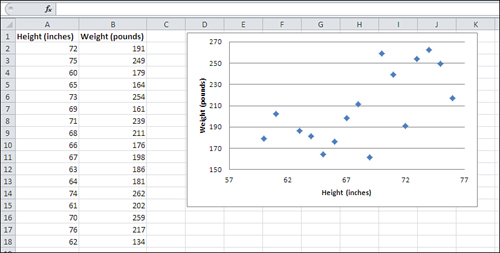
Excel chart, called an XY (Scatter) chart, shows the relationship between two numeric variables. Figure 1 provides an example.
Note
Since the 1990s at least, Excel has called this sort of chart an XY (Scatter) chart.
In its 2007 version, Excel started referring to it as an XY chart in
some places, as a Scatter chart in others, and as an XY (Scatter) chart
in still others.
The markers in an XY chart show where a particular
person or object falls on each of two numeric variables. The overall
pattern of the markers can tell you quite a bit about the relationship
between the variables, as expressed in each record’s measurement.
In Figure 1,
for example, you can see the relationship between a person’s height and
weight: Generally, the greater the height, the greater the weight. The
relationship between the two variables is fundamentally different, where the emphasis is placed on
the sum or average of a numeric variable, such as number of vehicles,
according to the category of a nominal variable, such as make of car.
However, when you are interested in the way that two
numeric variables are related, you are asking a different sort of
question, and you use a different sort of statistical analysis. How are
height and weight related, and how strong is the relationship? Does the
amount of time spent on a cell phone correspond in some way to the
likelihood of contracting cancer? Do people who spend more years in
school eventually make more money? (And if so, does that relationship
hold all the way from elementary school to post-graduate degrees?) This
is another major class of empirical research and statistical analysis:
the investigation of how different variables change together—or, in
statistical lingo, how they covary.
Excel’s XY charts can tell you a considerable amount about how two numeric variables are related. Figure 2 adds a trendline to the XY chart in Figure 1.
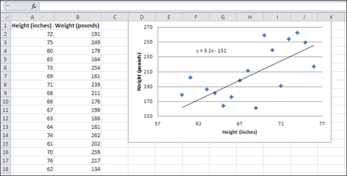
The diagonal line you see in Figure 2 is a trendline.
It is an idealized representation of the relationship between men’s
height and weight, at least as determined from the sample of 17 men
whose measures are charted in the figure. The trendline is based on this
formula:
Weight = 5.2 * Height − 152
Excel calculates the formula based on what’s called the least squares criterion.
Suppose that you picked several—say, 20—different
values for height in inches, plugged them into that formula, and then
found the resulting weight. If you now created an Excel XY chart that
shows those values of height and weight, you would get a chart that
shows the straight trendline you see in Figure 2.
That’s because arithmetic is nice and clean and
doesn’t involve errors. Reality, though, is seldom free from errors.
Some people weigh more than a formula thinks they should, given their
height. Other people weigh less. (Statistical analysis terms these
discrepancies errors.) The result is
that if you chart the measures you get from actual people instead of
from a mechanical formula, you’re going to get data that look like the
scattered markers in Figures 1 and 2.
Reality is messy, and the statistician’s approach to
cleaning it up is to seek to identify regular patterns lurking behind
the real-world measures. If those real-world measures don’t precisely
fit the pattern that has been identified, there are several
explanations, including these (and they’re not mutually exclusive):
People and things just don’t always conform to ideal mathematical patterns. Deal with it.
There may be some problem with the way the measures were taken. Get better yardsticks.
There
may be some other, unexamined variable that causes the deviations from
the underlying pattern. Come up with some more theory, and then carry
out more research.