It must seem odd to start a
book about statistical analysis using Excel with a discussion of
ordinary, everyday notions such as variables and values. But variables
and values, along with scales of measurement (covered in the next
section), are at the heart of how you represent data in Excel. And how
you choose to represent data in Excel has implications for how you run
the numbers.
With your data laid out properly, you can easily and
efficiently combine records into groups, pull groups of records apart to
examine them more closely, and create charts that give you insight into
what the raw numbers are really doing. When you put the statistics into
tables and charts, you begin to understand what the numbers have to
say.
When you lay out your data without considering how
you will use the data later, it becomes much more difficult to do any
sort of analysis. Excel is generally very flexible about how and where
you put the data you’re interested in, but when it comes to preparing a
formal analysis, you want to follow some guidelines. In fact, some of
Excel’s features don’t work at all if your data doesn’t conform to what
Excel expects. To illustrate one useful arrangement, you won’t go wrong
if you put different variables in different columns and different
records in different rows.
A variable is an
attribute or property that describes a person or a thing. Age is a
variable that describes you. It describes all humans, all living
organisms, all objects—anything that exists for some period of time.
Surname is a variable, and so are weight in pounds and brand of car.
Database jargon often refers to variables as fields, and some Excel tools use that terminology, but in statistics you generally use the term variable.
Variables have values.
The number “20” is a value of the variable “age,” the name “Smith” is a
value of the variable “surname,” “130” is a value of the variable
“weight in pounds,” and “Ford” is a value of the variable “brand of
car.” Values vary from person to person and from object to object—hence
the term variable.
Recording Data in Lists
When you run a statistical analysis, your purpose is
generally to summarize a group of numeric values that belong to the same
variable. For example, you might have obtained and recorded the weight
in pounds for 20 people, as shown in Figure 1.
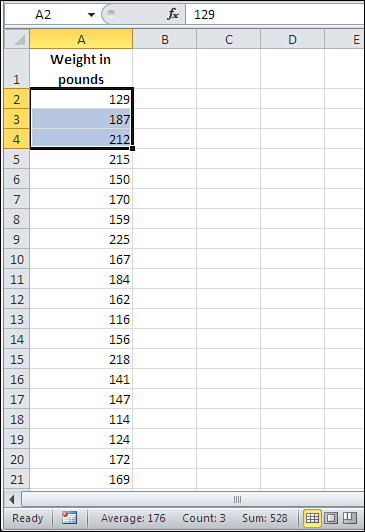
The way the data is arranged in Figure 1 is what Excel calls a list—a
variable that occupies a column, records that each occupy a different
row, and values in the cells where the records’ rows intersect the
variable’s column. (The record is the individual being, object, location—whatever—that the list brings together with similar records. If the list in Figure 1 is made up of students in a classroom, each student constitutes a record.)
A list always has a header, usually the name of the variable, at the top of the column. In Figure 1, the header is the label “Weight in Pounds” in cell A1.
Note
A list is an
informal arrangement of headers and values on a worksheet. It’s not a
formal structure that has a name and properties, such as a chart or a
pivot table. Excel 2007 and 2010 offer a formal structure called a table
that acts much like a list, but has some bells and whistles that a list
doesn’t have.
There are some interesting questions that you can answer with a single-column list such as the one in Figure 1.
You could select all the values and look at the status bar at the
bottom of the Excel window to see summary information such as the
average, the sum, and the count of the selected values. Those are just
the quickest and simplest statistical analyses you might do with this
basic single-column list.
Tip
You can turn the display of indicators such as simple
statistics on and off. Right-click the status bar and select or
deselect the items you want to see. However, you won’t see a statistic
unless the current selection contains at least two values. The status
bar of Figure 1 shows the average, count, and sum of the selected values. (The worksheet tabs have been suppressed to unclutter the figure.)
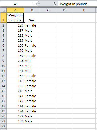
You might get something like the two-column list in Figure 2. All the values for a particular record—here, a particular person—are found in the same row. So, in Figure 1.2, the person whose weight is 129 pounds is female (row 2), the person who weighs 187 pounds is male (row 3), and so on.
Using the list structure, you can easily do the simple analyses that appear in Figure 3, where you see a pivot table and a pivot chart. These are powerful tools and well suited to statistical analysis, but they’re also very easy to use.
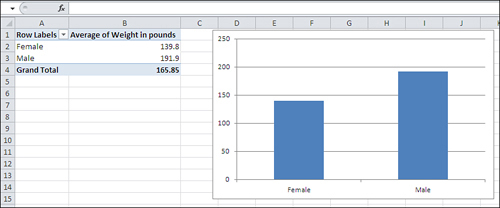
All that’s needed for the pivot chart and pivot table in Figure 3 is the simple, informal, unglamorous list in Figure 2.
But that list, and the fact that it keeps related values of weight and
sex together in records, makes it possible to do the analyses shown in Figure 3. With the list in Figure 2, you’re literally seven mouse clicks away from analyzing and charting weight by sex.
Note that you cannot create a column chart directly from the data as displayed in Figure 2.
You first need to get the average weight of men and women, then
associate those averages with the appropriate labels, and finally create
the chart. A pivot chart is much quicker, more convenient, and more
powerful.