Microsoft is making big accommodations for
tablet users in Office 2013, and Word is one of the apps that's best optimized
for touchscreens.
A new Read Mode, touch-friendly wizards and
a ribbon menu that fades out of view when it isn't needed are all signs that
Word 2013 is aimed at the Windows 8 crowd. That said, there are notable
additions for users of Windows 7 PCs and laptops too.
Read Mode
Read Mode is obviously targeted at tablet
owners. The default view when you first open a saved document, it reflows the
text into columns appropriate for the width of the screen. So on 16:9 tablets
held in landscape mode, you'll get two columns per screen, with all of the
editing tools tucked away. You can flick to the next page with a swipe of a
finger, or pinch and zoom to alter the size of the text.

For those who frequently plough through
reports, Read Mode automatically bookmarks your last position in a document, so
that if you come back to the document - or even open it on another PC - you can
pick up where you left off.
Read Mode also includes a feature called
Object Zoom, which theoretically allows you to hone in on tables, charts or
photos embedded in documents at the tap of a finger or mouse click. In tests we
found it erratic, especially for tables, where Word seems unsure whether you
want to zoom in or edit the table when you click. Hopefully, Microsoft can
smooth out the kinks before the full release.
Read Mode is also the default for laptop
and desktop users, and here its benefits are less obvious. In fact, we suspect
most people will switch it off and opt for normal editing mode.
New template
If you're creating a document from scratch,
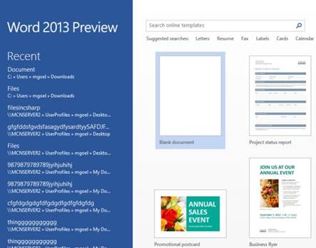
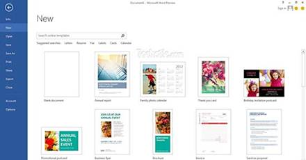
you'll notice another big change to Word right away: the new Start page.
Instead of opening into a blank document (or whatever was saved in your
normal.dot template), Word now presents a list of recently opened documents in
the left-hand pane, and a series of predefined templates on the right. If you
can't find anything suitable from the predefined list, you can search
Microsoft's online library - it contains thousands of different templates, many
of them perfectly presentable.
It's also worth noting that one of the
default templates is a "single-spaced" blank document, suggesting
Microsoft's decision to insert an extra line of space between every paragraph
by default since Office 2007 hasn't met with universal approval.

The
new Start screen presents recent documents and commonly used templates.
Another new feature you'll notice from the
off is the smooth-scrolling cursor. Now, instead of jumping from character to
character as you type, the cursor glides smoothly across the page. This
seemingly innocuous change has divided the PC&TA office: some admire
the attention to detail; others regard it as a needless distraction. Either
way, there's no option to switch it off.
Advanced document layout
Many of the new tools in Word 2013 are
aimed at people who plug more than words into their documents. In fact, Word
2013 is drifting more towards a desktop publishing suite than a traditional
word processor.
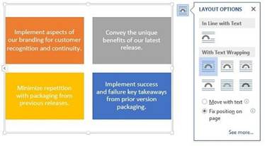
Live Layout sees text reflow automatically
when you drag photos and videos around documents. Green guidelines appear as
you drag photos, allowing you to line them up with the top of paragraphs or
text boxes, helping to keep documents looking tidy and professional.

Guidelines
allow you to line up photos with the top of text boxes, to make documents look
more professional.
In the Insert menu, you'll now find two new
options to embed online photos and videos into your documents. Images provide
the option to search Microsoft's online Clip Art collection, Bing Images, and
your SkyDrive and Flickr accounts for relevant photos. The returned Bing search
results include (by default) only images released under Creative Commons;
although the pop-up menu urges you to review the license for each photo before
pasting it into your documents, it provides no easy way of doing so.
The Insert Online Video pop-up allows you
to search Bing or YouTube for videos, and preview clips before dropping them
into documents. There's also the option to simply insert the embed code
provided by sites such as YouTube. Although Word allows you to dynamically
resize the video window, clicking the Play button creates a full- width pop-up
on top of your document, which slightly defeats the purpose. Readers of your
document will also need to be connected to the net to play back clips.
It's worth noting that we experienced
layout glitches when attempting to insert both online photos and videos, but
hopefully these will be dealt with before the final release.