Most of the selecting jobs you’ll ever have to do in
Photoshop are pretty easy, and you can usually get away with using the
Magic Wand, Lasso, or Pen tools for most jobs, but the one that has
always kicked our butts is when we have to select hair.
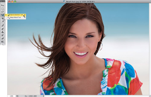
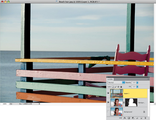
Step One. | Start
by opening the image you want to make a selection in, and getting the
Quick Selection tool from the Toolbox (as shown here). If you’re
thinking this is the same tool from Photoshop CS4...well, you’re right.
But, it’s the new features in Refine Edge that make it really powerful.
If you never used the Quick Selection tool back in CS4, here’s how it
works: you just take it and paint loosely over the areas you want to
select, and it kind of expands to select the area (kind of like a much
smarter version of the Magic Wand tool, but using different technology).
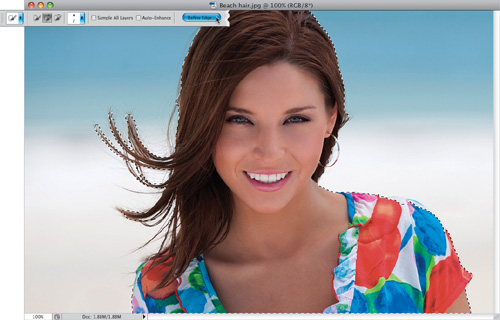
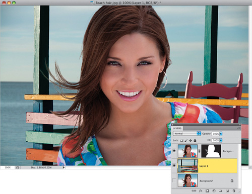
 | Step Two. | Take
the tool and paint over your subject. Don’t forget the flyaway hair on
the left side. If it selects too much, press-and-hold the Option key and
paint over that accidentally selected area to remove it from your
selection. Remember, it’s not going to look perfect at this point, but
that’s what the Refine Edge control is for, so go ahead and click the
Refine Edge button up in the Options Bar (as shown here).
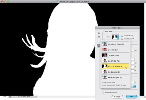
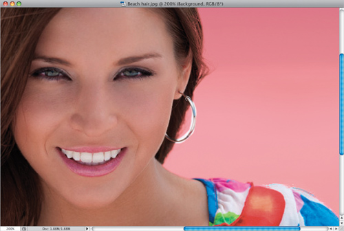
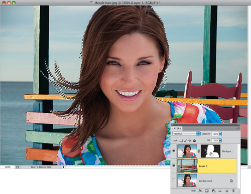
 | Step Three. | When
the Refine Edge dialog appears, you have a lot of choices for your View
Mode (including just the standard old Marching Ants), but to really see
how your selection looks, I think the best View is Black & White,
which shows your selection as a standard layer mask. As you can see,
the Quick Selection tool, by itself, isn’t gettin’ the job done (the
edges are jaggy and harsh, and there’s no wispy hair selected at all),
which is why we need Refine Edge to help us out. However, the trick to
working effectively in this dialog is to use just the Edge Detection
section and, honestly, I would avoid the Adjust Edge section in the
center altogether, because you’ll spend too much time fussing with
sliders, trying to make it work. I figure you guys want me to tell you
when to avoid stuff, too, and this is one of those cases.
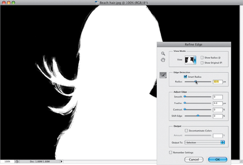
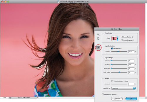
 | Step Four. | Next,
turn on the Smart Radius check-box, which is the edge technology that
knows the difference between a soft edge and a hard edge, so it can make
a mask that includes both. This checkbox is so important that I leave
it on all the time (if you want it always on, as well, just turn it on
and then turn on the Remember Settings checkbox at the bottom of the
dialog). Now, drag the Radius slider to the right, and as you do, watch
the hair on the left side. It doesn’t take a big move with this slider
before you start seeing hair detail magically appear (as seen here). For
simple selections, leave the Radius amount down low. When you have a
tricky selection, like fine hair blowing in the wind, you’ll have to
increase it higher, so remember: trickier selections mean higher Radius
amounts.
 | Step Five. | Now
let’s change our view to see if there are any areas we missed. For this
part of the process, I use the Overlay view (seen here), because the
parts that didn’t get selected show up in white. So, choose Overlay from the View pop-up menu (as shown here).
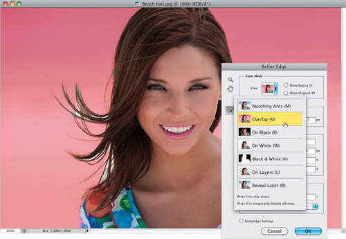
Tip: Which View Is Which
Although I generally only use
the Black & White mask view and the Overlay view, here’s what the
rest do: Marching Ants gives you just what you’d expect—a standard
marching ants selection, just like always. On Black puts your selected
area on a solid black background, while On White is on a solid white
background (helpful if you’re doing selections of product photography,
because you can see what the final image will look like). On Layers
shows your selection on a transparent layer, and Reveal Layer just shows
the original image without any selection in place (so it’s the before
view). Like it says right there on the View menu, you can press F to toggle through the views.
 | Step Six. | What
you need to do next is tell Photoshop exactly where the problem areas
are, so it can better define those areas. You do that with the Redefine
Radius tool (E), shown circled here
in red. Get the brush and simply paint over the areas where you see
white peeking through, and it redefines those areas. This is what gives
you that fine hair detail.
| Step Seven. | If you look closely, you’ll see that her hoop earring on the right side didn’t get selected at all, so use the Left Bracket key
to shrink the size of the brush down to where it’s just slightly larger
than the hoop, then paint over it. It’ll look like it’s painting in
white, but when you’re done, it just redefines the area and tells
Photoshop that this area needs some work, and it “redoes” its thing.
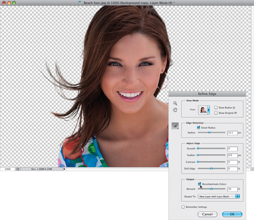
 | Step Eight. | Now
skip down to the Output section, where you’ll find a checkbox to
Decontaminate Colors. What this does is remove the color spillover on
your subject from the old original background. It basically desaturates
the edge pixels a bit so when you place this image on a different
background, the edge color doesn’t give you away. Also, just below that,
you get to choose what the result of all this will be: Will your
selected subject be sent over to a new blank document, or just a new
layer in this document, or a new layer with a layer mask already
attached? I always choose to make a new layer (with a layer mask) in the
same document. That way, if I really mess up, I can just grab the Brush
tool and paint over those areas on the layer mask to bring them back to
how they looked when I first opened the image.
 | Step Nine. | Now,
open the new background image you want to use in your composite. (You
knew we were going to put her on a different background, right? I mean,
why else would we be worrying about selecting her hair?) Get the Move
tool (V), press-and-hold the Shift
key to keep the background photo centered, then click-and-drag this
background image into your working document. (Note: This is easier if you have the Application Frame turned off and can see at least part of both images on your screen.)
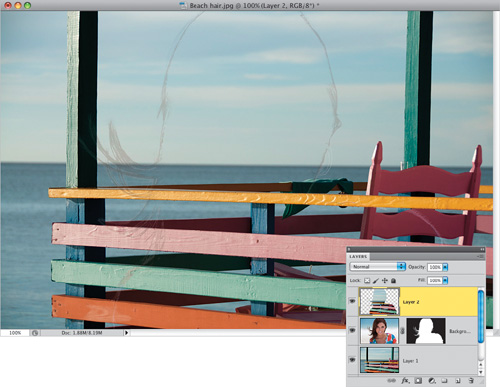
 | Step 10. | In
the Layers panel, click on the background image’s layer (Layer 1 here),
and drag it beneath the layer with your subject on it, so it appears
behind her (as seen here). Chances are that the colors from the two
images aren’t going to be right on the money, because they came from two
different lighting scenarios. Her overall color looks much warmer than
the background setting we’ve put her into, but I’ve got a trick you can
use that will help make the colors work between the two.
 | Step 11. | First,
we need to load the layer mask on the top layer as a selection, so
press-and-hold the Command (PC: Ctrl) key and click directly on the
layer mask thumbnail (as shown here), and it loads the layer mask as a
selection.
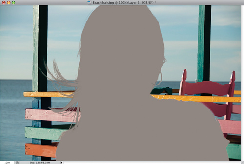
 | Step 12. | Make sure Layer 1 (the background image you dragged in earlier) is still the active layer, then press Command-J (PC: Ctrl-J)
to put this selected area up on its own separate layer. Now, drag this
layer to the top of the layer stack (as shown here). Since this is a
selection of the background, in the exact shape of your subject, you get
what you see here—it looks like the background image, but with a thin
outline around your subject. Well, that’s about to change.
 | Step 13. | We
need a selection around this layer again, so press-and-hold the Command
(PC: Ctrl) key and click on the top layer’s thumbnail to load it as a
selection. Once the selection is in place, we’re going to need to get a
blend of all the background colors, so go under the Filter menu, under
Blur, and choose Average.
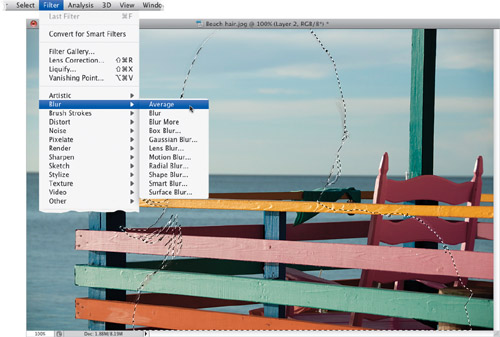 | Step 14. | It
doesn’t bring up a dialog or anything, it just does its thing, and
creates a blur that averages all the colors in the selected area
together (as shown here). Press Command-D (PC: Ctrl-D) to Deselect. It doesn’t look right yet, but it will in just a moment.
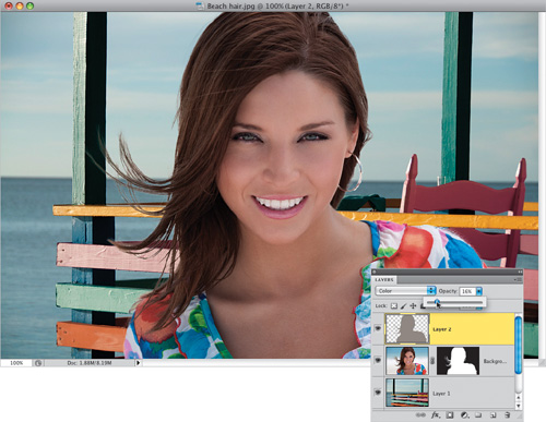
 | Step 15. | To make this blend, there are two things you need to do: (1) change the layer’s blend mode from Normal to Color
(so just the color shows through, instead of being solid); and then (2)
lower the Opacity to around 15%, so a hint of the Average blur color
from the background appears as a tint over your subject, and this ties
the color of the two together (as seen here, where her overall color is
more muted, like the background colors).
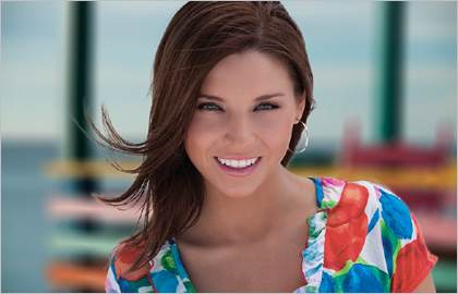
 | Step 16. | This
last step is totally optional and is based on the-depth-of field
project, but you can add a blurred effect
to the background image to make it look like the photo was taken using a
wide-open f-stop to get a very shallow depth-of-field. You do that by
clicking on the layer that has your background image (Layer 1 here),
then going under the Filter menu, under Blur, and choosing Lens Blur
(this gives a more realistic depth-of-field blur than a standard
Gaussian blur). In the Iris section in the middle, set the Radius amount
to 44 (that’s the amount of blur), then click OK to get the final
effect you see here.
|
|