3. Let Yourself Go
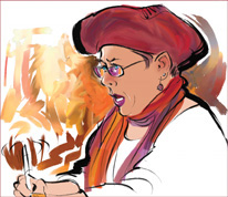
Multicolor Clumpy Brush strokes look great on the scarf and not bad on the hat. Figure 8
has a detail of this state. I’m going to use my artistic license
(before it expires) and explore some painterly effects on the
background. What follows is a combination of experimentation (what some
people call “trial and error” I like to call “trial and success”) and a
bit of inspiration. I saved half a dozen layered stages as I created
this piece, using Iterative Save. They are all available in the Lessons
folder on the CD for your examination.
I retrieved some background color from the
abstract paintings behind me in the photo, using Dry Ink with Clone
Color enabled. I liked some of these strokes: the area behind my hat and
back, and the brown squiggles near my arm echoing the line of my right
sleeve. Figure 9
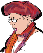
shows that more work was done on the face, with darker skin tone and a
couple of highlights added. Also added was a pinkish hue on the nose and
ears. Another tool was dragged into my custom palette, a Blender
variant for smoothing these skin tones and the rough strokes on the hat.
Colorful reflections on the eyeglasses were made with the Scratchboard
Tool.
The face is finished, but I will take the pink
color off the ear. I also take out the yellow and orange stuff I had
cloned in from the abstract painting in the photo. Those just aren’t my
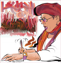
colors. Then I have an inspiration. There is a perfectly good abstract
painting with my favorite colors waiting for me in a practice file I
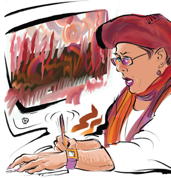
just made for testing new brushes (similar to the one in Figure 5.16). So I create a new layer for it and paste it in. Figure 10 shows the changes. The shading on the hands was drawn with some scribbly hatching by the Scratchboard Tool.
Experimenting
once again, I use Effects > Orientation > Distort to manipulate
the shape of the abstract painting layer so it will fit the space
better. Then comes my second inspiration—I unlock the line layer and
draw a stylized monitor with Dry Ink. After a little erasing, everything
kinda fits together. Figure 11
could be the final stage, but I confess to doing a bit more fiddling.
The image at the beginning of this lesson shows a later version with a
few more changes. For example, I realized I hadn’t used Smeary Varnish
at all, so I worked on the abstract painting layer with it, mostly to
blend color over the black background.