From a usability point of view, the navigation and
layout of your mobile site are of great importance. But turn your
attention to the content that the site exists to display and present. In
this section, you look at the "body" of the site's pages, for want of a
better word, and the material and information that users are on your
site to see.
1. Text and Typography
Even if your site is, say, a
dedicated photo gallery, many parts of it need to display textual
content. Your goal, obviously, is to make this as readable and
accessible as possible. Many older or less-capable mobile handsets do
not encourage lots of variation in how textual content is displayed.
Until quite recently, mobile devices had little concept of font
families, and the web browsers displayed text in the native system font
of the operating system — often at one fixed size, regardless of how the
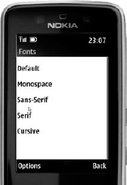
web developer wanted it to be styled. Figure 1
shows a Nokia Series 40 browser, displaying the platform's default font
family, despite each line of the web page being styled with different {font-family:} CSS rules.

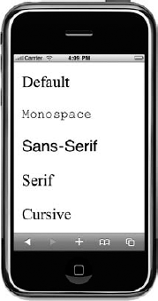
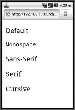
Other WebKit-based browsers
do better, but are still inconsistent: Apple iPhone and Android devices
do at least have multiple fonts, but default differently (serif for the
former, sans-serif for the latter), as shown in Figures 2 and 3. Some variability also results when using {font-size:} and {font-weight:} rules on different devices.


Although you can invest
effort in styling fonts differently for different devices, and perhaps
trying to reduce the point size of text for links in headers and footers
and so on, there's a good argument for just leaving the body text's
font, weight, size, and line-spacing alone and letting the device render
it with native defaults. At least you can expect some consistency with
the rest of the device's operating system, and you can be sure that the
font will be legible. You certainly cannot assume pixel-level control
over font display on all mobile devices.
For sites that absolutely require specific typography, it is worth considering the usage of CSS3 @font-face,
which allows you to package suitably-licensed font files that the
browser can use in addition to its native fonts. This is currently
supported on a very limited number of devices and often requires the
right format of font file. Apple's iPhone only supports font-face with
SVG-format fonts, for example. However, you are bound to see increasing
support for font-face across other types of devices in the years to
come.
2. Pagination
Page size is a
perennial consideration for mobile web developers. Historically, there
were actually hard limits on the (byte) size of page that many devices
could display and cache, and slower network speeds meant that large
pages might simply take too long to load.
On more contemporary mobile
devices, the memory capacity of the browser is no longer an absolute
limit, and faster mobile networks mean that large portions of text are
relatively quick to download. But large page size is still a
consideration from a usability point of view. Remember that the physical
screen is much smaller and the user can view far less text without
having to scroll.
About five paragraphs, 800
words, or 5,000 bytes of default-styled text (on a web page with fluid
width) will fill an average laptop screen. The same text on an Apple
iPhone, for example, will fill five full pages in portrait mode, or
about nine pages in landscape mode (due to the way the iPhone rescales
fonts by default for the two orientations). This requires the user to
make at least that number of scrolling flicks to read the same text.
For a large smart phone
device, this is tolerable, and the smooth, continuous nature of
touch-screen panning makes the act of scroll-as-I-read almost a
subconscious one to the user. On a non-touch screen device — even with a
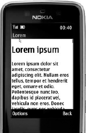
good browser — the impact is far higher though. On the Nokia Series 40
browser shown in Figure 4,
for example, the same text occupies 15 screens of 12 lines each. If
each click moves the scroll bar down a few lines at a time, the user is
required to do lots of downward cursor movement simply to view the whole
article. And on some older handsets, the mere act of patiently
scrolling a sluggish browser down through a large page can become an
ordeal in itself.

For this reason, many
sites add aggressive pagination for long articles of text, breaking them
up into bite-sized pieces that both the user and the device can consume
efficiently. In theory, this doesn't reduce the time taken to read
through a large article — in fact, it may increase it — but it does make
the user interface more responsive, and it allows the user to "snack"
on the content rather than download the whole thing and scroll
painstakingly down through it.
The good news about
pagination is that most CMS support it natively or with plug-ins, and
the platform should be able to slice up articles and content
automatically, placing "next" and "previous" or "page M of N" links at
the bottom of each page, while being smart enough not to break pages in
the middle of sentences, paragraphs, tables, or lists. The bad news is
that to do it properly for mobile, the pagination algorithm should
ideally be parameterized by knowledge about the device requesting the
page: For a smart touch-screen handset with a small font, the pages can
be larger and fewer; for an older handset with a limited memory, they
should be smaller and more numerous.
With regard to URLs for
pagination, the most reasonable solution is to use the query string to
indicate ordinality: /article-1?page=2, article-1?page=3, and so on. If
you are slicing the article in different places according to the device,
the page number in the query string might be offset slightly if users
share deep paginated links between different browsers — but this is
hardly a major issue and at least the base part of the URL can be
guaranteed to take the user to the top of the article.