In addition to charts that
show two variables—such as numbers broken down by categories in a Column
chart, or the relationship between two numeric variables in an XY
chart—there is another sort of Excel chart that deals with one variable
only. It’s the visual representation of a frequency distribution, a concept that’s absolutely fundamental to intermediate and advanced statistical methods.
A frequency distribution is intended to show how many instances there are of each value of a variable. For example:
The number of people who weigh 100 pounds, 101 pounds, 102 pounds, and so on.
The number of cars that get 18 miles per gallon (mpg), 19 mpg, 20 mpg, and so on.
The number of houses that cost between $200,001 and $205,000, between $205,001 and $210,000, and so on.
Because we usually round measurements to some
convenient level of precision, a frequency distribution tends to group
individual measurements into classes. Using the examples just given, two
people who weigh 100.2 and 100.4 pounds might each be classed as 100
pounds; two cars that get 18.8 and 19.2 mpg might be grouped together at
19 mpg; and any number of houses that cost between $220,001 and
$225,000 would be treated as in the same price level.
As it’s usually shown, the chart of a frequency
distribution puts the variable’s values on its horizontal axis and the
count of instances on the vertical axis. Figure 1 shows a typical frequency distribution.
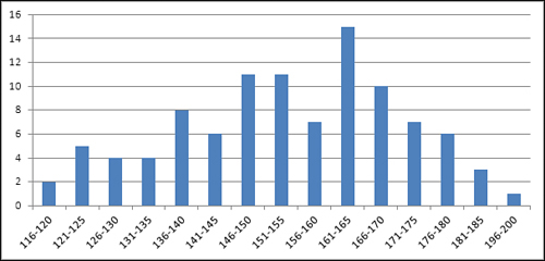
You can tell quite a bit about a variable by looking at a chart of its frequency distribution. For example, Figure 1
shows the weights of a sample of 100 people. Most of them are between
140 and 180 pounds. In this sample, there are about as many people who
weigh a lot (say, over 175 pounds) as there are whose weight is
relatively low (say, up to 130). The range of weights—that is, the
difference between the lightest and the heaviest weights—is about 85
pounds, from 116 to 200.
There are lots of ways that a different sample of people might provide a different set of weights than those shown in Figure 1. For example, Figure 2
shows a sample of 100 vegans—notice that the distribution of their
weights is shifted down the scale somewhat from the sample of the
general population shown in Figure 1.
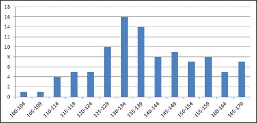
The frequency distributions in Figures 1 and 2
are relatively symmetric. Their general shapes are not far from the
idealized normal “bell” curve, which depicts the distribution of many
variables that describe living beings.
Still, many variables follow a different sort of frequency distribution. Some are skewed right (see Figure 3) and others left (see Figure 4).
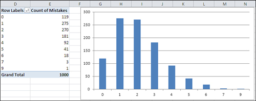
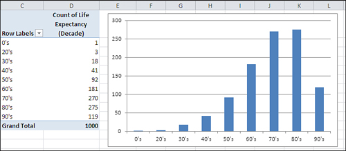
Figure 3
shows counts of the number of mistakes on individual Federal tax forms.
It’s normal to make a few mistakes (say, one or two), and it’s abnormal
to make several (say, five or more). This distribution is positively
skewed.
Another
variable, home prices, tends to be positively skewed, because although
there’s a real lower limit (a house cannot cost less than $0) there is
no theoretical upper limit to the price of a house. House prices
therefore tend to bunch up between $100,000 and $200,000, with a few
between $200,000 and $300,000, and fewer still as you go up the scale.
A quality control engineer might sample 100 ceramic
tiles from a production run of 10,000 and count the number of defects on
each tile. Most would have zero, one, or two defects, several would
have three or four, and a very few would have five or six. This is
another positively skewed distribution—quite a common situation in
manufacturing process control.
Because true lower limits are more common than true
upper limits, you tend to encounter more positively skewed frequency
distributions than negatively skewed. But they certainly occur. Figure 4
might represent personal longevity: relatively few people die in their
twenties, thirties, and forties, compared to the numbers who die in
their fifties through their eighties.
1. Using Frequency Distributions
It’s helpful to use frequency distributions in
statistical analysis for two broad reasons. One concerns visualizing how
a variable is distributed across people or objects. The other concerns
how to make inferences about a population of people or objects on the
basis of a sample.
Those two reasons help define the two general branches of statistics: descriptive statistics and inferential
statistics. Along with descriptive statistics such as averages, ranges
of values, and percentages or counts, the chart of a frequency
distribution puts you in a stronger position to understand a set of
people or things because it helps you visualize how a variable behaves
across its range of possible values.
In the area of inferential statistics, frequency
distributions based on samples help you determine the type of analysis
you should use to make inferences about the population.
Visualizing the Distribution: Descriptive Statistics
It’s usually much easier to understand a variable—how
it behaves in different groups, how it may change over time, and even
just what it looks like—when you see it in a chart. For example, here’s
the formula that defines the normal distribution:
| u = (1 / ((2π).5) σ) e ∧ (− (X − μ)2 / 2 σ2) |
And Figure 5 shows the normal distribution in chart form.
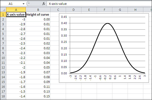
The
formula itself is indispensable, but it doesn’t convey understanding. In
contrast, the chart informs you that the frequency distribution of the
normal curve is symmetric and that most of the records cluster around
the center of the horizontal axis.
Note
The formula was developed by a 17th century French mathematician named Abraham De Moivre. Excel simplifies it to this:
=NORMDIST(1,0,1,FALSE)
In Excel 2010, it’s this:
=NORM.S.DIST(1,FALSE)
Those are major simplifications.
Again, personal longevity tends to bulge in the higher levels of its range (and therefore skews left as in Figure 1.13).
Home prices tend to bulge in the lower levels of their range (and
therefore skew right). The height of human beings creates a bulge in the
center of the range, and is therefore symmetric and not skewed.
Some statistical analyses assume that the data comes
from a normal distribution, and in some statistical analyses that
assumption is an important one. Be aware, though, that if you
want to analyze a skewed distribution there are ways to normalize it and
therefore comply with the requirements of the analysis. In general, you
can use Excel’s SQRT() and LOG() functions to help normalize a
negatively skewed distribution, and an exponentiation operator (for
example, =A2∧2 to square the value in A2) to help normalize a positively
skewed distribution.
Visualizing the Population: Inferential Statistics
The other general rationale for examining frequency
distributions has to do with making an inference about a population,
using the information you get from a sample as a basis. This is the
field of inferential statistics.
A familiar example is the political survey. When a
pollster announces that 53% of those who were asked preferred Smith, he
is reporting a descriptive statistic. Fifty-three percent of the sample
preferred Smith, and no inference is needed.
But when another pollster reports that the margin of
error around that 53% statistic was plus or minus 3%, she is reporting
an inferential statistic. She is extrapolating from the sample to the
larger population and inferring, with some specified degree of
confidence, that between 50% and 56% of all voters prefer Smith.
The size of the reported margin of error, six
percentage points, depends in part on how confident the pollster wants
to be. In general, the greater degree of confidence you want in your
extrapolation, the greater the margin of error that you allow. If you’re
on an archery range and you want to be virtually certain of hitting
your target, you make the target as large as necessary.
Similarly, if the pollster wants to be 99.9%
confident of her projection into the population, the margin might be so
great as to be useless—say, plus or minus 20%. And it’s not headline
material to report that somewhere between 33% and 73% of the voters
prefer Smith.
But the size of the margin of error also depends on
certain aspects of the frequency distribution in the sample of the
variable. In this particular (and relatively straightforward) case, the
accuracy of the projection from the sample to the population depends in
part on the level of confidence desired (as just briefly discussed), in
part on the size of the sample, and in part on the percent favoring
Smith in the sample. The latter two issues, sample size and percent in
favor, are both aspects of the frequency distribution you determine by
examining the sample’s responses.
Of course, it’s not just political polling that
depends on sample frequency distributions to make inferences about
populations. Here are some other typical questions posed by empirical
researchers:
What percent of the nation’s homes went into foreclosure last quarter?
What
is the incidence of cardiovascular disease today among persons who took
the pain medication Vioxx prior to its removal from the marketplace in
2004? Is that incidence reliably different from the incidence of
cardiovascular disease among those who did not take the medication?
A
sample of 100 cars from a particular manufacturer, made during 2010,
had average highway gas mileage of 26.5 mpg. How likely is it that the
average highway mpg, for all that manufacturer’s cars made during that
year, is greater than 26.0 mpg?
Your
company manufactures custom glassware and uses lasers to etch company
logos onto wine bottles, tumblers, sales awards, and so on. Your
contract with a customer calls for no more than 2% defective items in a
production lot. You sample 100 units from your latest production run and
find five that are defective. What is the likelihood that the entire
production run of 1,000 units has a maximum of 20 that are defective?
In
each of these four cases, the specific statistical procedures to
use—and therefore the specific Excel tools—would be different. But the
basic approach would be the same: Using the characteristics of a
frequency distribution from a sample, compare the sample to a population
whose frequency distribution is either known or founded in good
theoretical work. Use the numeric functions in Excel to estimate how
likely it is that your sample accurately represents the population
you’re interested in.