2. Building a Frequency Distribution from a Sample
Conceptually, it’s easy to build a frequency
distribution. Take a sample of people or things and measure each member
of the sample on the variable that interests you. Your next step depends
on how much sophistication you want to bring to the project.
Tallying a Sample
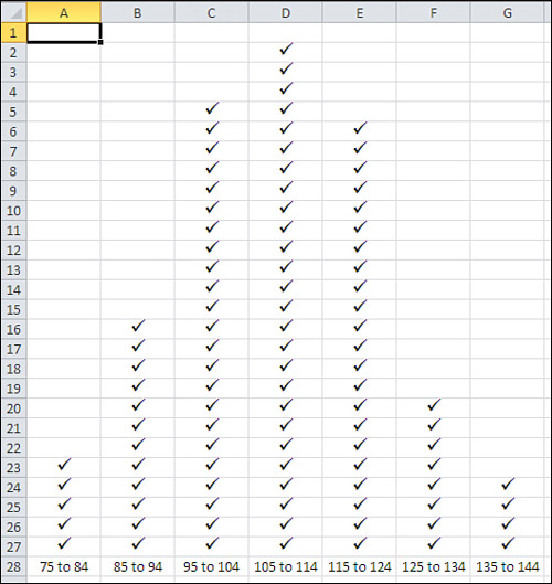
One straightforward approach continues by dividing
the relevant range of the variable into manageable groups. For example,
suppose you obtained the weight in pounds of each of 100 people. You
might decide that it’s reasonable and feasible to assign each person to a
weight class that is ten pounds wide: 75 to 84, 85 to 94, 95 to 104,
and so on. Then, on a sheet of graph paper, make a tally in the
appropriate column for each person, as suggested in Figure 6.
The approach shown in Figure 1.15 uses a grouped
frequency distribution, and tallying by hand into groups was the only
practical option as recently as the 1980s, before personal computers
came into truly widespread use. But using an Excel function named
FREQUENCY(), you can get the benefits of grouping individual
observations without the tedium of manually assigning individual records
to groups.
Grouping with FREQUENCY()
If
you assemble a frequency distribution as just described, you have to
count up all the records that belong to each of the groups that you
define. Excel has a function, FREQUENCY(), that will do the heavy
lifting for you. All you have to do is decide on the boundaries for the
groups and then point the FREQUENCY() function at those boundaries and
at the raw data.
Figure 7 shows one way to lay out the data.
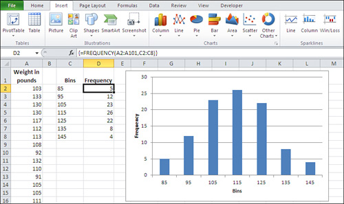
In Figure 7,
the weight of each person in your sample is recorded in column A. The
numbers in cells C2:C8 define the upper boundaries of what this section
has called groups, and what Excel calls bins. Up to 85 pounds defines one bin; from 86 to 95 defines another; from 96 to 105 defines another, and so on.
Note
There’s no special need to use the column headers shown in Figure 1.16,
cells A1, C1, and D1. In fact, if you’re creating a standard Excel
chart as described here, there’s no great need to supply column headers
at all. If you don’t include the headers, Excel names the data Series1
and Series2. If you use the pivot chart instead of a standard chart,
though, you will need to supply a column header for the data shown in
Column A in Figure 1.16.
The count of records within each bin appears in
D2:D8. You don’t count them yourself—you call on Excel to do that for
you, and you do that by means of a special kind of Excel formula, called
an array formula. Y
1. | Select the range of cells that the results will occupy. In this case, that’s the range of cells D2:D8.
|
2. | Type, but don’t yet enter, the formula
=FREQUENCY(A2:A101,C2:C8)
which tells Excel to count the number of records in A2:A101 that are in each bin defined by the numeric boundaries in C2:C8.
|
3. | After
you have typed the formula, hold down the Ctrl and Shift keys
simultaneously and press Enter. Then release all three keys. This
keyboard sequence notifies Excel that you want it to interpret the
formula as an array formula.
|
Note
When Excel interprets a formula as an array formula, it places curly brackets around the formula in the formula box.
The results appear very much like those in cells D2:D8 of Figure 1.16,
of course depending on the actual values in A2:A101 and the bins
defined in C2:C8. You now have the frequency distribution but you still
should create the chart. Here are the steps, assuming the data is
located as in Figure 1.16:
1. | Select the data you want to chart—that is, the range C1:D8.
|
2. | Click the Insert tab, and then click the Column button in the Charts group.
|
3. | Choose the Clustered Column chart type from the 2-D charts. A new chart appears, as shown in Figure 8.
Because columns C and D on the worksheet both contain numeric values,
Excel initially thinks that there are two data series to chart: one
named Bins and one named Frequency.
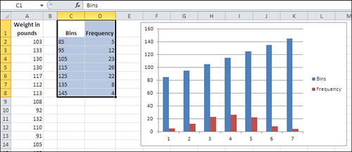
|
4. | Fix the chart by clicking Select Data in the Design tab that appears when a chart is active. The dialog box shown in Figure 9 appears.
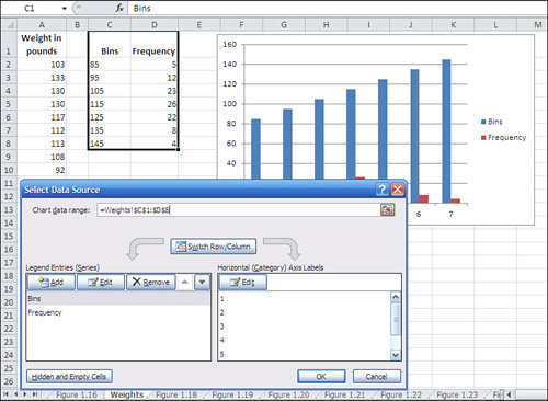
|
5. | Click
the Edit button under Horizontal (Category) Axis Labels. A new Axis
Labels dialog box appears; drag through cells C2:C8 to establish that
range as the basis for the horizontal axis. Click OK.
|
6. | Click the Bins label in the left list box shown in Figure 9. Click the Remove button to delete it as a charted series. Click OK to return to the chart.
|
7. | Remove the chart title and series legend, if you want, by clicking each and pressing Delete.
|
At this point you will have a normal Excel chart that looks much like the one shown in Figure 7.
Tip
You can use the same range for the Data argument and
the Bins argument in the FREQUENCY() function: for example,
=FREQUENCY(A1:A101,A1:A101). Don’t forget to enter it as an array
formula. This is a convenient way to get Excel to treat every recorded
value as its own bin, and you get the count for every unique value in
the range A1:A101.
Grouping with Pivot Tables
Another approach to constructing the frequency
distribution is to use a pivot table. A related tool, the pivot chart,
is based on the analysis that the pivot table does. I prefer this method
to using an array formula that employs FREQUENCY() because once the
initial groundwork is done, I can use the same pivot table to do
analyses that go beyond the basic frequency distribution. But if all I
want is a quick group count, FREQUENCY() is usually the faster way.
Building the pivot table (and the pivot chart)
requires you to specify bins, just as the use of FREQUENCY() does, but
that happens a little further on.
Note
A reminder: When you use the FREQUENCY() method
described in the prior section, a header at the top of the column of raw
data is helpful but not required. When you use the pivot table method,
the header is required.
Begin with your sample data in A1:A101, just as before. Select any one of the cells in that range and then follow these steps:
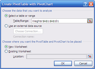
1. | Click
the Insert tab. Click the PivotTable drop-down in the Tables group and
choose PivotChart from the drop-down list. (When you choose a pivot
chart, you automatically get a pivot table along with it.) The dialog
box in Figure 10 appears.
|
2. | Click
the Existing Worksheet option button. Click in the Location range edit
box and then click some blank cell in the worksheet that has other empty
cells to its right and below it.
|
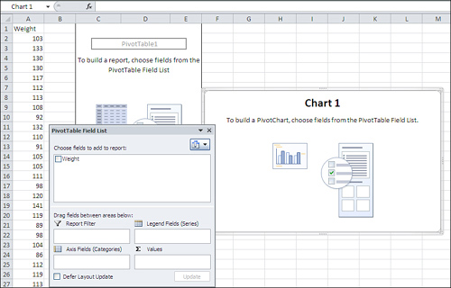
3. | Click OK. The worksheet now appears as shown in Figure 11.
|
4. | Click the Weight field in the PivotTable Field List and drag it into the Axis Fields (Categories) area.
|
5. | Click the Weight field again and drag it into the Σ Values area. Despite the uppercase Greek sigma, which is a summation symbol, the Σ Values
in a pivot table can show averages, counts, standard deviations, and a
variety of statistics other than the sum. However, Sum is the default
statistic for a numeric field.
|
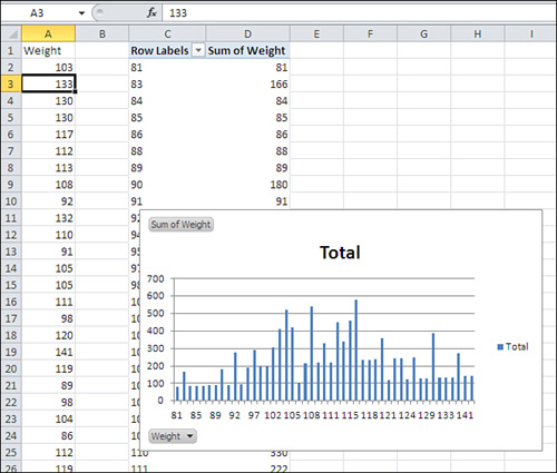
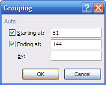
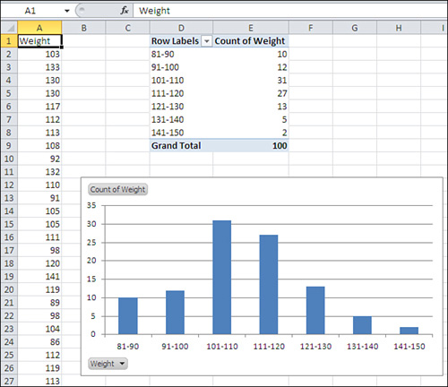
6. | The pivot table and pivot chart are both populated as shown in Figure 12. Right-click any cell that contains a row label, such as C2. Choose Group from the shortcut menu.
The Grouping dialog box shown in Figure 13 appears.
|
7. | In the Grouping dialog box, set the Starting At value to 81 and enter 10 in the By box. Click OK.
|
8. | Right-click
a cell in the pivot table under the header Sum of Weight. Choose Value
Field Settings from the shortcut menu. Select Count in the Summarize
Value Field By list box, and then click OK.
|
9. | The pivot table and chart reconfigure themselves to appear as in Figure 14.
To remove the field buttons in the upper- and lower-left corners of the
pivot chart, select the chart, click the Analyze tab, click the Field
Buttons button, and select Hide All.
|