You cannot go through life without encountering the
normal distribution, or “bell curve,” on an almost daily basis. It’s the
foundation for grading “on the curve” when you were in elementary and
high school. The height and weight of people in your family, in your
neighborhood, in your country each follow a normal curve. The number of
times a fair coin comes up heads in ten flips follows a normal curve.
The normal distribution
occupies a special niche in the theory of statistics and probability,
and that’s a principal reason Excel offers more worksheet functions that
pertain to the normal distribution than to any other, such as the t,
the binomial, the Poisson, and so on. Another reason Excel pays so much
attention to the normal distribution is that so many variables that
interest researchers—in addition to the few just mentioned—follow a
normal distribution.
Characteristics of the Normal Distribution
There isn’t just one normal
distribution, but an infinite number. Despite the fact that there are so
many of them, you never encounter one in nature.
Those are not contradictory
statements. There is a normal curve—or, if you prefer, normal
distribution or bell curve or Gaussian curve—for every number, because
the normal curve can have any mean and any standard deviation. A normal
curve can have a mean of 100 and a standard deviation of 16, or a mean
of 54.3 and a standard deviation of 10. It all depends on the variable
you’re measuring.
The
reason you never see a normal distribution in nature is that nature is
messy. You see a huge number of variables whose distributions follow a
normal distribution very closely. But the normal distribution is the
result of an equation, and can therefore be drawn precisely. If you
attempt to emulate a normal curve by charting the number of people whose
height is 56″, all those whose height is 57″, and so on, you will start
seeing a distribution that resembles a normal curve when you get to
somewhere around 30 people.
As your sample gets into the
hundreds, you’ll find that the frequency distribution looks pretty
normal—not quite, but nearly. As you get into the thousands you’ll find
your frequency distribution is not visually distinguishable from a
normal curve.
Skewness
A normal distribution is not
skewed to the left or the right but is symmetric. A skewed distribution
has values whose frequencies bunch up in one tail and stretch out in the
other tail.
Skewness and Standard Deviations
The asymmetry in a
skewed distribution causes the meaning of a standard deviation to differ
from its meaning in a symmetric distribution, such as the normal curve
or the t-distribution . In a symmetric distribution
such as the normal, close to 34% of the area under the curve falls
between the mean and one standard deviation below the mean. Because the
distribution is symmetric, an additional 34% of the area also falls
between the mean and one standard deviation above the mean.
But the asymmetry in a skewed
distribution causes the equal percentages in a symmetric distribution to
become unequal. For example, in a distribution that skews right you
might find 45% of the area under the curve between the mean and one
standard deviation below the mean; another 25% might be between the mean
and one standard deviation above it.
In that case, you still have
about 68% of the area under the curve between one standard deviation
below and one standard deviation above the mean. But that 68% is split
so that its bulk is primarily below the mean.
Visualizing Skewed Distributions
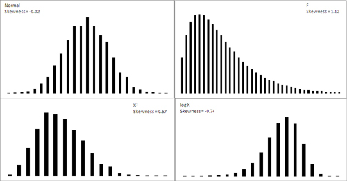
Figure 1 shows several distributions with different degrees of skewness.

The normal curve shown in Figure 7.1
(based on a random sample of 5,000 numbers, generated by Excel’s Data
Analysis add-in) is not the idealized normal curve but a close
approximation. Its skewness, calculated by Excel’s SKEW() function, is
−0.02. That’s very close to zero; a purely normal curve has a skewness
of exactly 0.
The X2 and log X curves in Figure 7.1 are based on the same X values as form the figure’s normal distribution. The X2
curve tails to the right and skews positively at 0.57. The log X curve
tails to the left and skews negatively at −0.74. It’s generally true
that a negative skewness measure indicates a distribution that tails off
left, and a positive skewness measure tails off right.
The F curve in Figure 1
is based on a true F-distribution with 4 and 100 degrees of freedom.
F-distributions always skew
right. It is included here so that you can compare it with another
important distribution, t, which appears in the next section on a
curve’s kurtosis.
Quantifying Skewness
Several methods are
used to calculate the skewness of a set of numbers. Although the values
they return are close to one another, no two methods yield exactly the
same result. Unfortunately, no real consensus has formed on one method. I
mention most of them here so that you’ll be aware of the lack of
consensus. More researchers report some measure of skewness than was
once the case, to help the consumers of that research better understand
the nature of the data under study. It’s much more effective to report a
measure of skewness than to print a chart in a journal and expect the
reader to decide how far the distribution departs from the normal. That
departure can affect everything from the meaning of correlation
coefficients to whether inferential tests have any meaning with the data
in question.
For example, one measure of skewness proposed by Karl Pearson (of the Pearson correlation coefficient) is shown here:
Skewness = (Mean − Mode) / Standard Deviation
But
it’s more typical to use the sum of the cubed z-scores in the
distribution to calculate its skewness. One such method calculates
skewness as follows:

This is simply the average cubed z-score.
Excel uses a variation of that formula in its SKEW() function:

A little thought will
show that the Excel function always returns a larger value than the
simple average of the cubed z-scores. If the number of values in the
distribution is large, the two approaches are nearly equivalent. But for
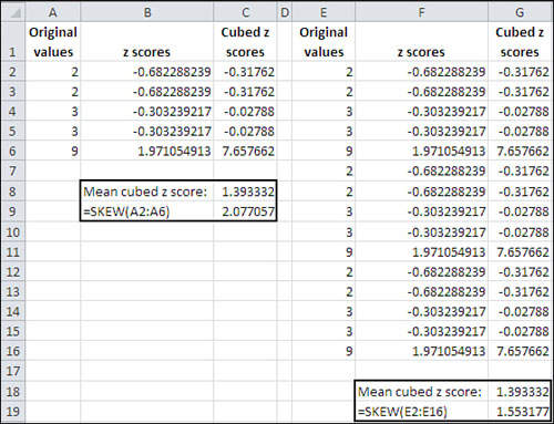
a sample of only five values, Excel’s SKEW() function can easily return
a value half again as large as the average cubed z-score. See Figure 2,
where the original values in Column A are simply replicated (twice) in
Column E. Notice that the value returned by SKEW() depends on the number
of values it evaluates.

Kurtosis
A distribution might be
symmetric but still depart from the normal pattern by being taller or
flatter than the true normal curve. This quality is called a curve’s kurtosis.
Types of Kurtosis
Several adjectives that further describe the nature of a curve’s kurtosis appear almost exclusively in statistics textbooks:
A platykurtic curve is flatter and broader than a normal curve. (A platypus is so named because of its broad foot.)
A mesokurtic curve occupies a middle ground as to its kurtosis. A normal curve is mesokurtic.
A leptokurtic
curve is more peaked than a normal curve: Its central area is more
slender. This forces more of the curve’s area into the tails. Or you can
think of it as thicker tails pulling more of the curve’s area out of
the middle.
The t-distribution
is leptokurtic, but the more observations in a sample the more closely
the t-distribution resembles the normal curve. Because there is more
area in the tails of a t-distribution, special comparisons are needed to
use the t-distribution as a way to test the mean of a relatively small
sample.
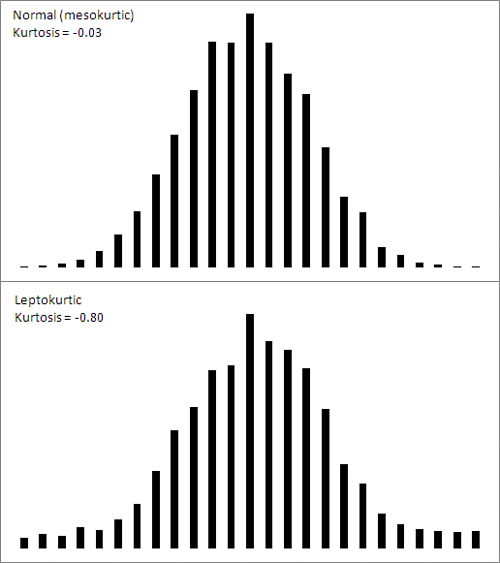
Figure 3
shows a normal curve—at any rate, one with a very small amount of
kurtosis, −0.03. It also shows a somewhat leptokurtic curve, with
kurtosis equal to −0.80.

Notice that more of the area
under the leptokurtic curve is in the tails of the distribution, with
less occupying the middle. The t-distribution follows this pattern, and
tests of such statistics as means take account of this when, for
example, the population standard deviation is unknown and the sample
size is small. With more of the area in the tails of the distribution,
the critical values needed to reject a null hypothesis are larger than
when the distribution is normal. The effect also finds its way into the
construction of confidence intervals .
Quantifying Kurtosis
The
rationale to quantify kurtosis is the same as the rationale to quantify
skewness: A number is often a more efficient descriptor than a chart.
Furthermore, knowing how far a distribution departs from the normal
helps the consumer of the research put other reported findings in
context.
Excel offers the KURT()
worksheet function to calculate the kurtosis in a set of numbers.
Unfortunately there is no more consensus regarding a formula for
kurtosis than there is for skewness. But the recommended formulas do
tend to agree on using some variation on the z-scores raised to the
fourth power.
Here’s one textbook definition of kurtosis:

In this definition, N is the
number of values in the distribution and z represents the associated
z-scores: that is, each value less the mean, divided by the standard
deviation.
The number 3 is subtracted to
set the result equal to 0 for the normal curve. Then, positive values
for the kurtosis indicate a leptokurtic distribution whereas negative
values indicate a platykurtic distribution. Because the z-scores are
raised to an even power, their sum (and therefore their mean) cannot be
negative. Subtracting 3 is a convenient way to give platykurtic curves a
negative kurtosis. Some versions of the formula do not subtract 3.
Those versions would return the value 3 for a normal curve.
Excel’s KURT() function is
calculated in this fashion, following an approach that’s intended to
correct bias in the sample’s estimation of the population parameter:

The Unit Normal Distribution
One particular version of the normal distribution has special importance. It’s called the unit normal or standard normal
distribution. Its shape is the same as any normal distribution but its
mean is 0 and its standard deviation is 1. That location (the mean of 0)
and spread (the standard deviation of 1) makes it a standard, and
that’s handy.
Because of those
two characteristics, you immediately know the cumulative area below any
value. In the unit normal distribution, the value 1 is one standard
deviation above the mean of 0, and so 84% of the area falls to its left.
The value −2 is two standard deviations below the mean of 0, and so
2.275% of the area falls to its left.
On the other hand, suppose
that you were working with a distribution that has a mean of 7.63
centimeters and a standard deviation of .124 centimeters—perhaps that
represents the diameter of a machine part whose size must be precise. If
someone told you that one of the machine parts has a diameter of 7.816,
you’d probably have to think for a moment before you
realized that’s one-and-one-half standard deviations above the mean.
But if you’re using the unit normal distribution as a yardstick, hearing
of a score of 1.5 tells you exactly where that machine part is in the
distribution.
So it’s quicker and easier to
interpret the meaning of a value if you use the unit normal distribution
as your framework. Excel has worksheet functions tailored for the
normal distribution, and they are easy to use. Excel also has worksheet
functions tailored specifically for the unit normal distribution, and
they are even easier to use: You don’t need to supply the distribution’s
mean and standard deviation, because they’re known. The next section
discusses those functions, for both Excel 2010 and earlier versions.