Opening PDF files
Office 2007 and above have had the native
ability to save PDF files (and Microsoft’s rival XPS format) for “final format
documents” – that is, ones you’ve finished editing and are now publishing for
other people to read. Ever since the release of Office 2007, Microsoft’s own
implementation of saving as PDF has been the fastest, and yielded the most
accurate rendering of your document when compared with any add-on from Adobe or
third-party utilities.
Now Office 2013 also includes the ability
to “open” PDF files in Word, but when Microsoft says “open” it actually means
“convert”, since the PDF file is converted into a Word document for editing
sometimes, not all that successfully. PDF files don’t include all the
information necessary to accurately recreate an editable document because they
weren’t designed to do that. PDF files just place characters and images onto
the page; they don’t need to worry about how the text flows from one area to
another because they’re not designed to work out what to do if you add, delete
or edit that text. Neither do they need to know how to push text from one
column to another if text is inserted or deleted, so they don’t contain any
mechanism for describing that the text in the first column should be “followed”
by text in the second.

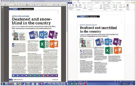
A
moderately complex PDF file opened in Adobe Reader and for editing in Word. The
fonts, spacing and placement of images are all wrong
When Word 2013 “opens” a PDF file, it
therefore has to infer plenty of this layout and flow information that just
isn’t there in the PDF file. If the PDF contains a relatively simple layout a
couple of columns, a heading and an image then it can do a reasonable job. If,
however, the layout is more complex such as a magazine page with pull quotes,
box outs, tables and so on – then while the text and images may convert
reasonably well, the layout may become so messed up that it would take you a
couple of hours to untangle that mess. Other, third-party, software such as
IRIScan may suffer from the same problems. These products promise that you can
“edit” any PDF file, but they can’t deliver 100% fidelity because the PDF file
format just doesn’t contain all the necessary information.
If you’re going to need to edit a document
again, save it in an editable format such as DOCX. If you only want to publish
the document for other people to read then save it in a final format such as
PDF or XPS. If you’re not sure whether you’ve finished editing yet, don’t throw
away the DOCX file; you can always create a new PDF or XPS document from the
DOCX file whenever you need, but getting back to an editable format from a
final format is far more difficult and can be a time-consuming process.
Office 2013 feature update
Last month, in my rant about things I
didn’t like about Office 2013, I mentioned that you couldn’t separately adjust
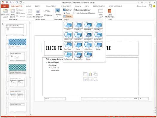
the Theme colours, fonts and effects in PowerPoint. Well, it turns out you can,
but only by editing the Slide Master in the PowerPoint 2013 Preview. Click
View/ Master Views/ Slide Master and the Colors, Fonts and Effects controls are
there in the Slide Master/ Background group. Why they’ve been placed here is
anyone’s guess, since they don’t only affect the background, but the foreground
text and graphics too.
In a posting on the PowerPoint blog,
Christopher Maloney said that Microsoft has added these controls to the
dropdown on the Design/ Variants gallery for the final version of PowerPoint,
so you can control these Theme elements without having to edit the Slide
Master. He also points out that you can right-click the Theme Variants in the
gallery and apply a variant to only the selected slides, rather than all slides
in the presentation, giving you flexibility to vary the Theme for some slides
while staying with a general look within your presentation. There are only
eight Themes included in the PowerPoint 2013 Preview, but we’re promised “many
more” for the release version, and still more to come after the suite ships
since the start screen and the Design tab can be dynamically updated with new
Themes. I have to say that none of the new Themes released so far are to my
taste, being too washed out, too bold or too wacky, so I think I’ll continue to
use our custom corporate theme, which uses our choice of fonts, colours and subtle
effects.

Microsoft
Office 2013 - Ten new features
A new feature in Word 2013 that didn’t make
it into last month’s column is Simple Markup, which applies to Tracked Changes
and comments. When there are lots of changes to a document or comments, they
can overwhelm the user with coloured lines and boxes, even when those changes
and comments are gathered into balloons down the right of the page. Simple
Markup view indicates changes with a red line in the left margin, and you can
click this line to view the details; click the markup line again to hide the
detail. This is equivalent to changing in Review/ Tracking to All Markup and
back to Simple Markup. The display of comments has also been simplified with
fewer boxes and lines and more muted colours for different reviewers. The
overall impression is much cleaner. Two further very welcome new features are
the ability to reply to a comment and to mark a comment as Done – this
collapses a comment to only one line and fades it to a light grey so that it’s
less intrusive.
Simple Markup view is easier on the eye,
but you can still hit problems with documents that are densely packed with
changes. The red line in the margin can end up being the height of the entire
paragraph, and in All Markup mode, clicking the down arrow in a collapsed
balloon summarising many edits doesn’t expand the balloon as you might expect
but turns on the Reviewing pane on the opposite side of the window. What’s
more, this pane (now called “Revisions” in its caption) doesn’t highlight
changes at the same time as the main document pane when you click the
Next/Previous Change buttons, depriving you of much-needed context.
Even after six weeks of using the Office
2013 Preview I can’t say that I like it. Despite there being a few good new
features, if I didn’t have to learn about it for my job I’d happily go back to
Office 2010. Outlook in particular is a bit of a mess: it’s difficult to use
with confidence on either a big desktop system or a small tablet. There just
isn’t any rapid positive feedback when you do something: mark a folder as read
and the unread count will take a second or longer to fade away.
Even tasks as simple as just finding the
right button to click can take some time, since all the icons and their labels
are quite washed out. There’s hardly any black in the button text anymore;
everything is just a different shade of grey.
When Microsoft made similar changes to
Visual Studio 2012, it claimed that it was so your content would stand out from
the application’s borders and menus. In Office 2013, the Themes have also changed
so that they employ more muted colours and fonts with thinner strokes, such as
Calibri Light (the new default font for headings and titles), which make your
documents look washed out too: in Office 2010, particularly when you use the
application’s Blue colour scheme, you could quite easily distinguish your
document from the application.

Some
of the Themes in PowerPoint 2013 have wacky backgrounds, but you can edit them
if you go to the Slide Master view
Look at me!
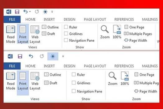
In Office 2013, where the page of your
document is white, the ribbon is white and the area around your document is a
very light grey, the only thing that stands out is the status bar – a bright
line of colour with words in white capitals on it. In effect it’s screaming
“LOOK AT ME!” all the time.