3. Embedding Images and Media
Few websites are solely
textual, and most both decorate the theme of the site with graphical
elements and embed images and media into the body of the content. As you
might imagine, the watchword for doing this for the mobile variant of
your site is efficiency: Graphics can represent a significant part of
the overall download size of a page, and because each requires a
separate request to be fetched from the server, graphics can exacerbate
the effect of latency in the mobile network.
It's advisable to keep the
number of images in your overall page template to a minimum: perhaps a
logo, a gradient fill, and a few icons. Graphical elements that appear
on each and every page should ideally be cached, so make sure the web
server is specifying a liberal expiry time for such images.
For images within the content of
the site (such as illustrations accompanying articles, images in blog
posts, and the like), common sense should also prevail to give your
users a good experience. Don't use excessively high resolutions for your
images: Although desktop browsers (and some mobile browsers) easily
resize a large image if its dimensions exceed the boundary, you can
waste valuable bandwidth in getting redundant extra pixels to the mobile
device. You may also want to provide highly compressed versions of
photos — using JPEG format, in particular — that mobile devices can
download quickly, even if the quality is slightly degraded. As for
placement within the text, the usage of floating or inline images is
somewhat riskier than simply having full-width images between
paragraphs. Device support for CSS {float:}
rules is erratic, and you probably want to use the full width of the
screen to make the image as discernable as possible anyway.
With images in mobile
sites, you typically need to understand the characteristics of the
target device. Whether it is a logo across the header of the site or an
inline image inside the body of a page, it is important to know what the
width of the screen is, in particular.
Screen dimensions are a vital
part of a good mobile device characteristics database, and you should be
able to key their values off the user-agent header that arrives in the
HTTP request (or the mobile plug-in will do it automatically for you).
Some mobile browsers also provide their screen dimensions explicitly in
the headers: Microsoft Windows Mobile devices use the UA-pixels header
(although its values are sometime wildly inaccurate).
Knowing the physical dimension
of the screen hardware of a device is only a start though. If you are
placing an image in an article, for example, you probably want to
provide a margin around it that matches that given to the adjacent text.
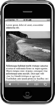
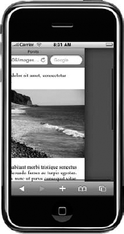
Figure 5
shows an embedded image perfectly sized for the physical screen of an
Apple iPhone (320 pixels wide), but which, with the page's default
padding of 8 pixels, runs off the right side of the screen. First, this
looks bad as it is, but the device now renders a page wider than its
screen. On the iPhone, the browser responds to this by introducing a
horizontal scroll bar (as shown in Figure 6). This is likely to be disconcerting when the user is scrolling down the article and it "plays" from side to side.
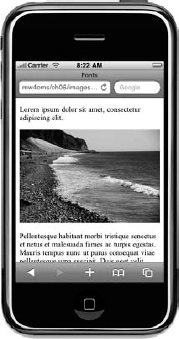
An image that takes the
padding and margins of the containing layout into account looks much
nicer and eliminates any horizontal scroll issues the browser might
introduce. In Figure 7, the same image has been reduced to 304 pixels in width (which is the physical screen minus 8 pixels on each side).
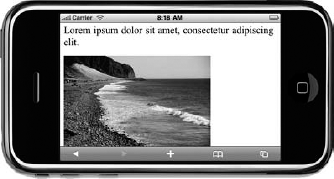
But on a rotatable touch-screen device, of course, you immediately have a new problem. When viewed in landscape mode, as in Figure 8, it is the other dimension of the device that becomes the constraint or target.
When faced with these
various dimension-related challenges, you must decide how much work you
want your web server to do to address them and how much you expect of
the device. Will your web server be emitting images perfectly scaled to
the dimensions you need for each type of device and each possible
rotation? Are these scaled on the fly (and presumably cached)? Do you
have vast directories of preprocessed images? If your images are hosted
on another service, such as Flickr, how do you rescale them?
Or should you simply send a
standard resolution of the image to the device, hoping that the browser
can rescale it appropriately? Or explicitly set image scaling in the
embedding markup, using <img> width and height attributes or CSS {width:} and {height:} rules — and hope that the fidelity of the image does not suffer too much?
All of these techniques may
have a role to play. Relying on the device to rescale images is
certainly an option if the target devices are known to be capable smart
phones with fast connections and good graphics acceleration: You can
send overly high-resolution images that the device can scale down and
decide that the increased download time and client-side rescaling
overhead are tolerable. And using conditional CSS is one of the easiest
ways to rescale images for dealing with screen rotation.
But on the whole,
experience would suggest that server-side manipulation of images is
ultimately unavoidable. Some older devices will struggle badly with the
memory overhead of receiving a large image, let alone then having to
scale it — and the responsiveness of the scaling and page rendering
suffers badly as a result.
3.1. Other Media
You can assume that all
mobile devices can support most image formats on a page. You can also
assume that support for any other sort of embedded media is highly
variable.
Embedded video is feasible on
some devices, but the exact nature of its delivery is itself a
challenge. Apple devices don't support Flash, for example, so trying to
embed a classic YouTube video player into a page targeting that device
(and indeed many mid- and low-end devices) is fruitless. If delivery of
video is critical for your website, it's probably advisable to use image
thumbnails that, when clicked, download a video file or start a stream,
rather than trying to embed them in-line to the page. It is still
important to know which video formats, frame rates, codecs, and so on
are supported by each of your target devices, and this is important
information that you can gather from mobile device capabilities
databases.
Flash — or at least on mobile,
Flash Lite — is installed on a large number of devices worldwide and is
available as a plug-in for mobile browsers. However, it is very rare to
see mobile websites using Flash extensively and deliberately, perhaps
because of the well-publicized lack of support for it in Apple's iconic
iPhone device.
The Scalable Vector Graphics
(SVG) standard is supported on many device operating systems and is a
viable option for embedding and displaying line art (such as diagrams or
maps) in a mobile page. However, native support in desktop browsers has
been slow in coming, so few desktop websites use SVG extensively.
Mobile developers may be wary of relying on SVG for their mobile medium
alone.
Support for code-based
elements in pages, such as Java applets or Microsoft ActiveX objects,
should be considered non-existent on mobile devices — although,
fortunately, these are little used on contemporary websites anyway.