Now, having laid the groundwork with the toolset,
it’s time for the bread-and-butter work of compositing: to match
separate foreground and background elements so that the scene appears to
have been shot all together, at once. You can learn this skill and
produce measurable, objective results. The process obeys such strict
rules that you can do it without an experienced eye for color. You can
satisfactorily complete a shot on a monitor that is nowhere near
correctly calibrated, and the result would not even suffer from
color-blindness on your part.
How is that possible?
It’s simply a question of
breaking down the problem. In this case, the job of matching one image
to another obeys rules that can be observed channel by channel,
independent of the final, full-color result.
Of course, compositing
goes beyond simply matching color values; in many cases that is only the
first step. Observation of nature plays a part. And even with correctly
matched colors, any flaws in edge interpretation , a procedural matte , lighting , camera view, or motion can sink an otherwise successful shot.
These
same basic techniques can also be used to match clips from a source
precisely—for example, color correcting a sequence to match a hero shot (usually based on facial skin tones and other essentials), a process also sometimes known as color timing.
The Fundamental Technique
Integration of a foreground element into a background scene often follows the same basic steps:
1. | Match overall contrast
without regard to color, using Levels (and likely examining only the
Green channel). Align the black and white points, with any necessary
adjustments for variations in atmospheric conditions.
|
2. | Next, study each color channel individually as a grayscale image and use Levels to match the contrast of each channel.
|
3. | Align midtones (gamma), also channel by channel, using Levels or Curves. This is sometimes known as gray matching and is easiest when foreground and background contain areas that are something like a colorless midgray.
|
4. | Evaluate the overall result
for other factors influencing the integration of image
elements—lighting direction, atmospheric conditions, perspective, and
grain or other ambient movement. Here you get to work a bit more subjectively, even
artistically.
|
This uncomplicated approach
propels you to make adjustments your brain doesn’t necessarily
understand because of its habit of stereotyping based on assumptions. An
image that “looks green” may have a good deal of blue in the shadows
but yellowish highlights, but a less experienced eye might not see these
(and even a veteran can miss them). The choices are bolder than those
derived from noodling around, and the results can be stunning (as we’ll
see on a subtle example here, followed by a couple of radical ones
thereafter).
Truthfully,
even an experienced artist can be completely fooled by the apparent
subjectivity of color because of how human vision works. Figure 1 shows an example in which seeing is most definitely not
believing. Far from some sort of crutch or nerdy detail,
channel-by-channel analysis of an image provides fundamental information
as to whether a color match is within objective range of what the eye
can accept.
Ordinary Lighting
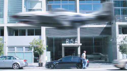
We begin with a simple example: comp a neutrally lit 3D element into an ordinary exterior day-lit scene. Figure 2 shows a simple A over B result in which the two layers are close enough
in color range that a lazy or hurried compositor might be tempted to
leave it as is, other than adding a bit of motion blur to match the car
entering the frame. For an inexperienced comper, this shot is a bit of a
challenge, as it may be difficult with the naked eye to say exactly how
or why the color doesn’t match.
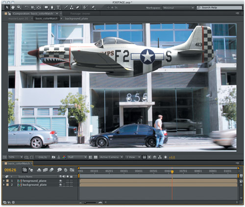
To begin, make certain that you are working in 16-bpc mode (Alt- or Opt-click
on the indicator at the bottom of the Project panel to toggle). This
prevents banding and enhances accuracy when adjusting color of
low-dynamic-range images. Now reveal the Info panel, and choose Decimal
(0.0 - 1.0) under the panel menu at the upper right  to align with the settings used in this section. If you like, tear off the Info panel by Ctrl-dragging (Cmd-dragging) it over the Composition viewer.
This particular
background plate helps us a lot, as it’s filled with monochromatic
elements: a concrete landscape and a silver car, black shadows and car
tires, little white details such as a sign, license plate, reverse
lights, and the stripe of a loading zone. The foreground aircraft is
also predominantly monochromatic, with many black details and white
highlights.
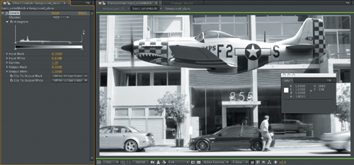
The first step is to match
overall contrast with the Levels effect, so apply that to the foreground
layer. This adjustment can be performed while viewing regular RGB but
it may be easier with only the green channel displayed (Alt+2/Opt+2, or select from the  menu). Move the cursor over the highlight areas along the top of the
plane (or just look at the Levels histogram) and you’ll notice that some
of the highlights are clipped to 1.00 on all three color channels, as
are highlights. Clipping is part of life and not necessarily a bad thing
unless those highlights need to be recovered for some reason; in this
case, let’s suppose we don’t need to worry about Levels and just want to
match the clipped foreground to the clipped background.
menu). Move the cursor over the highlight areas along the top of the
plane (or just look at the Levels histogram) and you’ll notice that some
of the highlights are clipped to 1.00 on all three color channels, as
are highlights. Clipping is part of life and not necessarily a bad thing
unless those highlights need to be recovered for some reason; in this
case, let’s suppose we don’t need to worry about Levels and just want to
match the clipped foreground to the clipped background.
Here,
the white foreground contrast doesn’t appear hot enough for the outdoor
lighting of the background. Even the road surface blacktop is close to
pure white in the direct sunlight, so clearly the highlights on the
plane should, if anything, be pushed further. Lower Input White to at
least the top of the visible histogram, around 0.82 (Figure 3).
Tip
The
human eye is most sensitive to green, so we begin by matching overall
RGB contrast while viewing the green channel, then adjusting the other
two channels to accommodate that adjustment. |
Black contrast areas, the
shadows, are at least as subjective. Again the histogram indicates that
some blacks are already clipped; the question is whether the shadows,
for example, under the back wing, need to be deeper (or lighter). Move
the cursor to the shadows underneath the cars and they are clearly
deeper—as low as 0.04. But higher up on the building, reflected light
from the surface lightens the shadows under the overhangs to something
like we see under the wings, in the range between 0.2 and 0.3 on all
channels. Subjectively, you can try raising Output Black slightly to get
more of the effect of shadows lightened by reflected light, or you can
crush the shadows more with Input Black to match those under the cars.
Try each before leaving them close to neutral.
Having aligned contrast,
it’s time to balance color by aligning contrast on each channel. Move
your cursor back over shadow areas and notice that although the
foreground plane’s shadows are neutral, the background shadows are
approximately 20% more intense in the blues than greens, and
around 20% less intense in red versus green. The goal is not so much to
match the blacks to the exact levels of the background as to match
these proportions on the red and blue channels.
Place the cursor under the
big plane wing and notice that the green value of that shadow is around
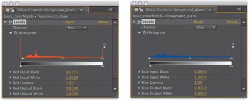
0.2. Switch Levels to Red under the Channel menu and raise Red Input
Black just a hint, to something like 0.025, until the red value under
the wing is approximately 0.18, or 20% lower than green. Now switch
Levels to Blue; this time you’ll raise Blue Output Black to lift the
darkest blue shades slightly (maybe even just 0.015, Figure 4).
Double-check with your cursor under the wing; the red, green, and blue
proportions are now similar to those of the background blacks.
Now for the whites. Take a look
at the RGB image again, and notice the silver car left of frame and the
difference between it and the plane. It’s not clear that they should be
the exact same shade, but let’s assume that they are both neutral gray
and should be made much more similar, which can be accomplished by
adjusting just white contrast on all three channels.
Starting with the Blue
channel, notice that the plane looks a little dull overall compared with
the car. Bring Blue Input White down to at least 0.95 while viewing the
blue channel (Alt+3/Opt+3) and see if it doesn’t appear to be a better match. Switch the view and Levels control to Red, and notice
that, conversely, the side of the plane looks bright compared to the
car. Bring Red Output White down about the same amount, to 0.95. A final
look at green shows that the same adjustment there, of Green Output
White to 0.95, helps the match. Notice that these edits influence not
just the highlights, but also midtones, so there’s no need to adjust
gamma directly.
Et voilá, back to RGB—you’ll see the result, which you can compare with the source image from Figure 5.26 simply by toggling Levels, in Figure 5.
Motion blur can be roughed in by adding Fast Blur, setting Blur
Dimensions to Horizontal, and raising Blurriness to approximately 100.0
to match the car entering frame right. The plane is now more effectively
integrated into the scene, and these subtle changes make a huge
difference (toggle the before and after to see for yourself).