This section looks at the overall shape and structure
of a good mobile site. Before you dive into building pages — or
tweaking their appearance — it is vital that you have a clear
understanding of how the pages fit together cohesively.
1. Information Architecture
In the simplest form, the
shape of a common website is often best modeled as a hierarchy, and
mobile websites are no exceptions. The concept of a site having a "root"
(that is, the home page), "child" sections of internally related
content, and in turn "grandchildren" pages of individual documents
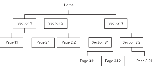
should be familiar enough to most web users. Consider the exceedingly
simple site in Figure 1.
Even if it is not physically built as such, simply organizing content
into logical hierarchies like this can be a boon for creating meaningful
menu navigation for users.
If the content of your site is
book-like — online documentation for example — this is probably a
perfect model to use. Each first-level heading is a section, and each
second-level heading is a subsection. You would probably add extra links
to propel the user "sideways" through the content sequentially.
In general,
however, a site's logical organization likely has more dimensions to it.
This means that there are different ways of navigating down inside the
site, and the site presents (ideally orthogonal) classifications that
allow users to reach the content in different but meaningful ways.
Some of these
classifications may remain well-organized hierarchies, but others may be
better suited to being "tag-based," whereby freeform words and phrases
are associated with pieces of content. Further, a search feature for
allowing users to reach lower sections of the site directly is an
expected part of a contemporary website. The wine-related site modeled
in Figure 2,
for example, shows these different classification techniques in action.
There are two hierarchies (wines by region and wines by grape), a
selection of tags, and a keyword search tool, all of which help the user
get to the content of the site — in this case, a small selection of
pages about particular wines.
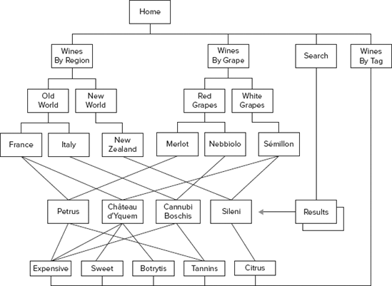
Well-designed hierarchies
and classification systems are capable of scaling well. Although the
example above shows only four wine pages (the actual interest of the
site!), it's easy to imagine how the same taxonomies could support
hundreds or thousands of such pages.
When translating
these different types of classification over to the mobile medium, you
have a few significant decisions to make. One important decision is
making sure you get the balance right between breadth and depth of the
information architecture. To illustrate this point, think about the two
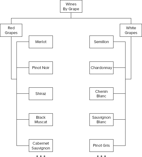
hierarchies you used in the wine site above. Wines By Grape in Figure 3
could quickly become a very wide hierarchy: Even when subdivided into
red, white, and rosé, there may still be hundreds of different grape
types in each category. The average number of children-per-parent is
very high, and the hierarchy is only two levels deep.
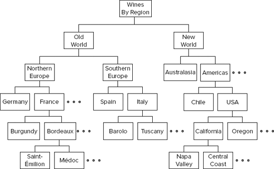
Wines By Region, on the
other hand, may end up having a similar number of leaf nodes at the
bottom. But it can easily be crafted into a much narrower hierarchy,
through the addition of extra tiers and sub-categories, as suggested by Figure 4.
Now think about a mobile user
interface and how you might need to use these two hierarchies to create a
navigation system for your users. Unlike a desktop site (where the
hierarchy might be embedded into the top menu or sidebar of the page), a
common pattern for mobile websites is to use one apparent page per menu
section, as shown in Figure 5.
And indeed, this is an efficient and generally user-friendly way to
navigate through a hierarchical site (because it mimics user interfaces
found in music players and so on, particularly for mobiles with touch
screens) — as long as the hierarchy is of a suitable shape.
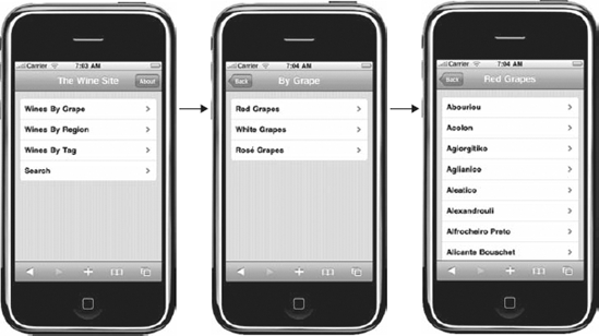
A hierarchy that is
excessively wide, such as Wines By Grape, might cause problems. As seen
in the figure above, the Red Grapes menu is running off the bottom of
the screen, even before it's reached any grapes not starting with the
letter A! Although a touch-screen user may be able to flick the screen
quickly down through a long list, a mobile user with a joystick or
cursor control will have a painstaking journey down the list to reach,
say, Zinfandel.
A different problem awaits a
hierarchy that is narrower but deeper. Although each of the sections and
subsections is more likely to fit neatly on a screen, the user has to
page through many more of them to reach the actual content. You have
removed the need to scroll so much, but you have introduced a number of
additional screens that the user must download and render. There is
likely to be user attrition for each extra click required.
The glib answer here, of
course, is that the ideal site hierarchy is somewhere between the two:
not so wide that each page is too long, and not so deep that excessive
navigation is required. But in reality, it is the subject matter of your
site that will dictate the logical
information architecture. You can't do anything about the number of
grape varieties known to science, and you can't start removing important
parts of the world. From a usability point of view, the trick will be
to bend, flex, and collapse the physical hierarchies to better suit the user's desires — rather than removing sensible taxonomies altogether.
It would make sense, for
example, to consider the way the site sorts the items in each category.
How many people are looking for obscure grapes like Abouriou or Acolon
(particularly on their mobile device)? It would be better to place
popular grapes like Merlot, Pinot Noir, and Shiraz at the top of the
list, where they can be clicked without a scroll.
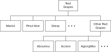
A related technique might be
to provide extra nesting for some of the entries in a given category. If
you place popular grapes at the top of the menu, you could collapse the
less-popular ones under a further menu, as illustrated by Figure 6. This allows an easy path to commonly used content, while retaining the exhaustive list of more obscure material.
You can also
combine these sorting and additional category techniques to create
alternative routes down through the hierarchy. This paradigm is often
used by music player software (where you can reach an album by sorting
by artist or by genre). You could have virtual categories of sorted
items, as shown in Figure 7, and elevate a few of the very popular items up one level too.
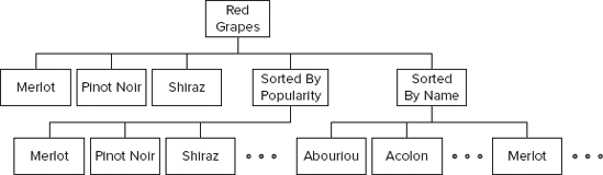
Here, a menu item (say,
Merlot) appears in multiple places within the menu, and at different
levels. This may seem confusing at first, at least when displayed on a
schematic like this. But on a mobile interface, it should appear more
intuitive, in terms of helping most users get to most of what they want,
as quickly as possible, so this would be a smart site configuration.
It may seem this is laboring
the point about menu and hierarchy structures, but this is with good
reason. The logical layout of a mobile site is paramount in dictating
its approachability and usability. Most CMS have powerful taxonomy and menu systems, and
spending a while thinking about how best to lay out your site's content
for mobile users before diving in is time very well spent.