2. Entry Points and URLs
When you talk about entry
points, you mean the page or URL through which your users enter your
site for the first time. A regular desktop website obviously has its
home page as the primary entry point, and this is universally located at
the root of the domain. It would be very surprising if http://amazon.com, say, did not take you — or at least redirect your browser — to the main page of the Amazon online store.
But a fundamental principle
of the Web is that pages within sites should also have reliable
locations that can be bookmarked, cached, e-mailed around, or linked to
by other sites. All good web developers should read "Cool URIs don't
change" by Tim Berners-Lee at www.w3.org/Provider/Style/URI for a discussion about how you can never know how a location within
your site might be used. The inventor of the World Wide Web was writing
predominantly about how to change the structure of your website without
breaking links, but many of these principles apply to how you think
about creating the mobile version of a site.
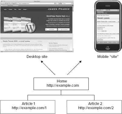
Much debate is centered about
how the entry points of a website should behave in response to a user
with a mobile browser. On one hand, it is tempting to "hide" your site's
mobile version behind the same domain and URL structure as the desktop
site, as shown in Figure 8. In your documentation, marketing, and promotion, you can continue to use one single domain (say, http://example.com)
and rely on the web server or application to serve up an appropriate
rendering in response to the headers sent by a mobile device.
The advantages of such an
approach certainly include simplicity and consistency. You don't need to
redesign the information architecture (because you are just using the
existing desktop site's architecture) and, assuming you are using a CMS
or web framework, your only two main engineering tasks are to implement
accurate recognition of the device and design a theme or template to
present the content. It's thematically consistent too: Links shared and
synched between desktop and mobile devices should still work on both
screens and present exactly the same content, more or less, to the user.
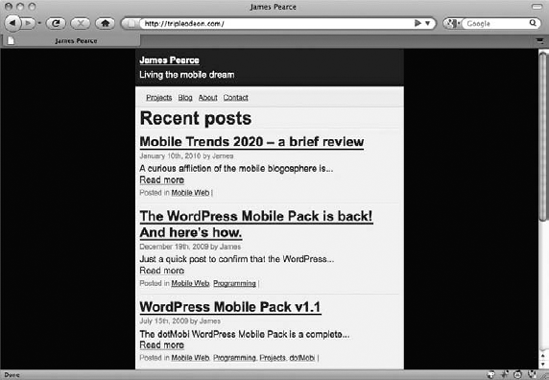
However, there are
disadvantages to this simple approach. First, you are putting lots of
importance on the server's ability to accurately detect a mobile device
and serve an appropriate experience. What happens when, say, a
little-known desktop browser is detected as a mobile one, or worse, a
new or unknown mobile browser as a desktop one? The risk is that the
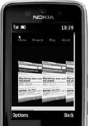
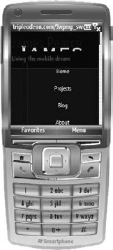
user receives an entirely inappropriate experience: A desktop browser
rendering a mobile site is an inconvenience (as in Figure 9), but a mobile browser rendering a desktop site can easily be inappropriate (as in Figure 10, on the Nokia Series 40) or rendered poorly (as in Figure 11, on Windows Mobile 6).
This approach also suffers if
the information architecture is not appropriate for a mobile user
interface. A wide hierarchy, such as wine grape types, might result in
pages that are quite suitable for a desktop user interface (where long
lists, roll-over menus, and other techniques might be used to collapse
excessive content). But even the most adept mobile designer might have
trouble making an efficient and effective mobile version of the same
list. Another similar challenge is pagination: A very long article that
appears at a single desktop URL might need to be split across several
lines for a mobile user.
At the other extreme, you
can craft an entirely different site for mobile and use an entirely
different URL schema. For instance, your mobile site could reside under a
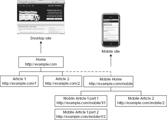
subdirectory of the existing desktop site, as shown in Figure 12. In this example, the entry point is http://example.com/mobile.
This allows you to use an
entirely different page structure for the two sites, if you want. In the
figure, you have paginated Article 2 into two parts, for example. It
also allows you to avoid having to detect a mobile device: All the pages
under the /mobile subdirectory are themed for mobile display,
regardless of which actual device views them. A different URL for the
mobile user's home page can also be used as a marketing tool: By
promoting a pithy mobile address, you are demonstrating that your
business is embracing the exciting future of the mobile web and
encouraging users to try it. (The chances are good that they wouldn't
have risked your traditional desktop URL on their handsets otherwise.)
But again, there are
disadvantages. There is no chance for thematic consistency between the
two sites, because they have entirely different URLs. If a mobile user
found an interesting page and e-mailed the bookmark to a desktop-bound
colleague, the latter's browser ends up viewing an inappropriately
themed version of the page — with no obvious way of determining what the
corresponding desktop version's URL is. If the e-mail message had
linked to http://example.com/mobile/1/2
with an exhortation to "check out this second part of the article,"
there wouldn't even be a corresponding desktop URL, even if the
recipient realized he should remove the /mobile part of the URL.
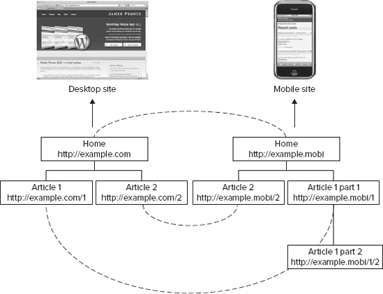
A preferable alternative to using a subdirectory is to host the mobile site under a new or dedicated subdomain, such as http://example.mobi, http://mobile.example.com, or http://m.example.com, all conventions in widespread use for mobile sites today — as shown in Figure 13. Although these still give you the flexibility to change the URL structure between the two sites, when you don't,
you can maintain symmetry and a more intuitive thematic
"pseudo-consistency" between them: altering domain or subdomain alone,
without having to hack the directory paths.
Of course, you don't
really expect users to manually change the contents of links they have
followed or received. The website itself should be sensitive to the
requesting device and the URL requested — and react to any
discrepancies. A particularly good approach, therefore, is to combine
the domain or subdomain model mentioned above with browser detection: If
a mobile browser follows a link to a desktop-domained URL, the server
should send a redirect to the corresponding page on the mobile domain,
and vice versa (as shown by the dashed lines in Figure 13).