The layout of a Data List component is determined
mainly by its repeated item properties—size, position, orientation,
spacing, and so on.
You can modify its properties in the artboard and by changing its values in the Properties panel.
Size and position the bounding box
The repeated item bounding
box indicates the visible and scrollable area in the data list. You
define this space by sizing the bounding box in the artboard or in the
Properties panel.
1. | Make sure the repeated item is still selected.
|
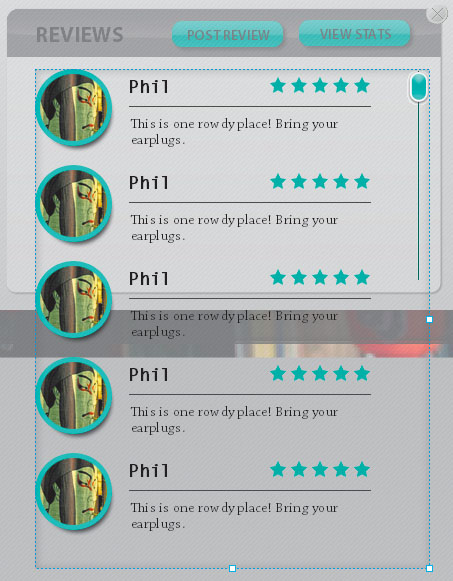
2. | In the Common section of the Properties panel, change the height (H:) value to 500.
The bounding box height adjusts. You can now see the five sample records
that were added to the list automatically. You can also size the
bounding box using its handles.
|
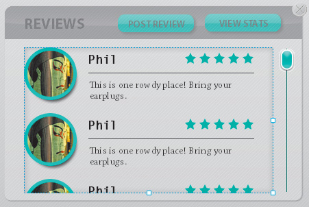
3. | Use
the handles to resize the bounding box height and width and position it
to fit in the space designed for the reviews. The height of the box
should be equal to the height of the vertical scroll bar.
|
Edit the repeated item layout
By default, the repeated
item is aligned vertically. There is a small amount of space between
each record in the list, and the artwork is positioned right up against
the left, right, top, and bottom sides of the bounding box. This is
called padding.
You can change these settings in the Layout section of the Properties
panel. You can also change the appearance of objects in the Normal,
Over, and Selected states.
1. | Make sure the repeated item is still selected.
|
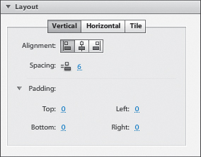
2. | Expand the Layout section of the Properties panel.
A repeated item has three possible layouts. These include Vertical,
Horizontal, and Tile. The default setting is Vertical, and that’s what
you want for the restaurant reviews. You can also change the alignment
of the list within the bounding box.
|
3. | Change the Spacing value to 10.
Spacing
is the distance between each item in the list. Padding refers to the space between the list items and the bounding box.
|
4. | Select the Horizontal layout option.
The items align horizontally.
|
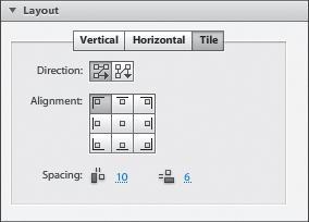
5. | Select the Tile layout option.
The Tile option is used to arrange a collection of images or text in a
tiled mosaic pattern. You can adjust the direction and alignment of the
tiles. You can also adjust the spacing between rows and columns in the
mosaic.
Tip
A data list has the same
properties as every other Flash Catalyst built-in component. For
example, you can change its size, opacity, and rotation. You can enable
or disable it, add a tooltip, or add a drop shadow.
|
6. | Change back to the Vertical layout option.
|
Edit the repeated item states
Every repeated item
begins with slightly different Normal, Over, and Selected states so that
a user can see when they are rolling over or selecting an item in the
list. You can edit the states of the repeated item template, just like
you can with components.
1. | Double-click the repeated item in the artboard to edit it in Edit-In-Place mode.
The Normal, Over, and Selected states appear in the Pages/States panel.

Note
You cannot duplicate,
add, or remove states in the repeated item, but you can modify the
artwork that appears in each of the default states (Normal, Over, and
Selected).
|
2. | Select the Over state in the Pages/States panel and open the Layers panel.
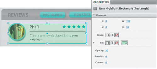
The Over state includes the Item Highlight Rectangle to show when the pointer is over the item in the list.
|
3. | Select Item Highlight Rectangle in the Layers panel.

|
4. | In the Common section of the Properties panel, change the rectangle’s fill color to pale green.
Notice, the rectangle’s opacity is already set to 30, which makes it semi-transparent.
 |
5. | Run the project in a browser.
|
6. | Click any of the restaurants in the horizontal list, and then click Reviews to see your new data list.
|
7. | Use the scroll bar to see all five items in the list.
Right now every item has the same artwork. You are going to change that next using design-time data.
|
8. | Roll over and select an item in the list to see the Normal, Over, and Selected states.
|
9. | Close the browser and return to Flash Catalyst.
|
10. | Click Review_Popup in the Breadcrumbs bar.
This closes the repeated item and the data list. The Review_Popup component is still in Edit-In-Place mode. |