Plenty of little touches make the difference between
professional typography and the text in an e-mail message. Taking the
time to use special characters such as bullets and real cent symbols,
creating fractions, taking advantage of styles built into OpenType
fonts, and applying ligatures (which combine certain character
combinations) are just some of the refinements possible.
Working with special characters
Many fonts contain far
more characters than you can see on the keyboard, including bullets,
accented characters, the euro symbol, and much more. In fact, many
characters come in more than one shape, such as multiple variations on
the ampersand symbol. So while you may have thought a character was the
smallest unit of a font, the smallest unit is in fact called a “glyph.”
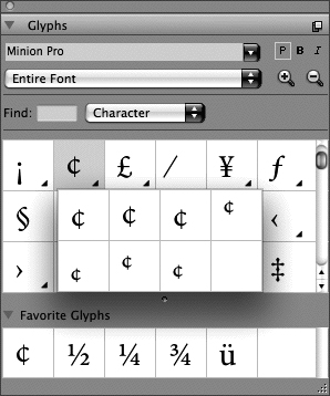
You can access all the glyphs in a font with the Glyphs palette (Window
menu).
Choose a font from the
menu at the top of the palette, then scroll to locate the character you
need. If the glyphs are too small for easy identification, click the
zoom buttons at the right. When you locate the glyph you want,
double-click to insert it at the text insertion point. A small triangle
in the corner of a glyph’s box indicates alternate glyphs (Figure 1).
If you use certain glyphs often, open the Favorite Glyphs area at the
bottom of the palette and drag glyphs into the open boxes.

Creating fractions
Combining
full-size numbers with a slash, as in 1/2, yields some very ugly
fractions. For a professionally typeset document, you need to use actual
fractions such as ½, ¼ and ¾. To automatically format selected text as a
fraction, choose Style > Type Style > Make Fraction. You can also
insert common fractions from the Glyphs palette or create fractions
from any numerals using a fraction font.
Applying OpenType styles
OpenType fonts may include special styles such as fractions (½) and ordinals (1st), Proxima Nova.
The styles available in OpenType fonts vary significantly from font to
font. (You can identify OpenType fonts in the QuarkXPress menu by the
“O” in front of the font name.)
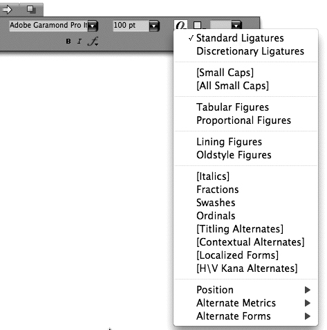
To see which styles are
available for the active font, click the OpenType menu on the Classic
tab or the Character Attributes tab of the Measurements palette (Figure 2).
Options in brackets are not available in that font. You can also see
available OpenType options in the OpenType area of the Character
Attributes dialog box (Style > Character). Note that OpenType styles
work best when applied to the appropriate text only—for example, only
apply Tabular Figures to numerals not to all the text in a paragraph.

Applying ligatures
A ligature is a glyph that represents a character pair; common ligatures include “fi” and “fl” (Figure 3).
For PostScript fonts, QuarkXPress can substitute “fi” and “fl”
ligatures automatically when Enable Ligatures is checked in the
Character tab of the Measurements palette. For OpenType fonts, you can
apply the Standard Ligatures and the Discretionary Ligatures styles (if
available for the font). The Glyphs palette (Window menu) displays all
the ligatures available in a font.
